View Layout Customization
- 2 minutes to read
This topic describes how to customize a View’s layout in the NavBar control.
Orientation of Groups and Items
You can use the NavBarViewBase.Orientation property value to specify if the NavBar’s View groups are arranged vertically or horizontally.
| Orientation = Vertical (Default) | Orientation = Horizontal |
|---|---|
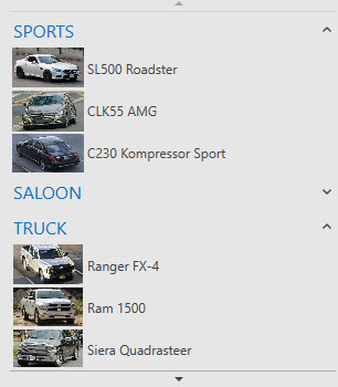 |
 |
You can use the NavBarViewBase.ItemsPanelOrientation property value to specify if the NavBar’s View group items are arranged vertically or horizontally.
| ItemsPanelOrientation = Vertical | ItemsPanelOrientation = Horizontal |
|---|---|
 |
 |
You can define a panel type (a Panel descendant) that should contain items within groups by creating a NavBarViewBase.ItemsPanelTemplate type template. You can also use the panel’s properties to control the items’ layout.
Display Mode of View Content Elements
The NavBarControl can display its groups and items as text labels, images, or images with captions. You can use the following properties to specify how the groups and items are displayed:
Group layout:
- NavBarViewBase.GroupDisplayMode (lower precedence)
- NavBarGroup.DisplayMode (higher precedence)
Item layout:
- NavBarViewBase.ItemDisplayMode (lower precedence)
- NavBarGroup.ItemDisplayMode (higher precedence)
- NavBarItem.DisplayMode (the highest precedence)
The properties listed in the table above use the DisplayMode.ImageAndText, DisplayMode.Image, and DisplayMode.Text options.
| DisplayMode = ImageAndText | DisplayMode = Image | DisplayMode = Text |
|---|---|---|
 |
 |
 |
The code sample below demonstrates how to make the NavBar display its groups using images, and display items as images with text.
<dxn:NavBarControl>
    <dxn:NavBarControl.View>
        <dxn:ExplorerBarView ItemDisplayMode="ImageAndText" GroupDisplayMode="Image"/>
    </dxn:NavBarControl.View>
    ...
</dxn:NavBarControl>
Image and Text Layout Settings
Image Settings
The NavBar control allows you to specify the dimensions and stretch mode for images displayed within groups and items.
You can pass the ImageSettings object with the image settings to the following properties to define how images are displayed within items and groups:
Group image settings:
Item image settings:
The code sample below illustrates how to define image settings for all the NavBar items and groups.
<dxn:NavBarControl>
    <dxn:NavBarControl.View>
        <dxn:ExplorerBarView>
            <dxn:ExplorerBarView.ItemImageSettings>
                <dxn:ImageSettings Width="32"/>
            </dxn:ExplorerBarView.ItemImageSettings>
            <dxn:ExplorerBarView.GroupImageSettings>
                <dxn:ImageSettings Width="30" Height="30"/>
            </dxn:ExplorerBarView.GroupImageSettings>
        </dxn:ExplorerBarView>
    </dxn:NavBarControl.View>
    ...
</dxn:NavBarControl>
Layout Settings
The NavBar control allows you to specify groups’ and items’ layout (image and text alignment, and image docking behavior).
You pass the LayoutSettings object to the following properties to define layout settings for items and groups:
Group layout settings:
Item layout settings:
The code sample below demonstrates how to make NavBar display text under the images in its items.
<dxn:NavBarControl>
    <dxn:NavBarControl.View>
        <dxn:ExplorerBarView>
            <dxn:ExplorerBarView.ItemLayoutSettings>
                <dxn:LayoutSettings ImageDocking="Top" TextHorizontalAlignment="Center" ImageHorizontalAlignment="Center" />
            </dxn:ExplorerBarView.ItemLayoutSettings>
        </dxn:ExplorerBarView>
    </dxn:NavBarControl.View>
    ...
</dxn:NavBarControl>