Time Indicator
The Time Indicator line shows the current time on your view. You can display it in the Day View, Work Week View, Week View, and TimeLine View. The line can go across the entire view or be restricted to the current date, as specified by the TimeIndicatorVisibility property.
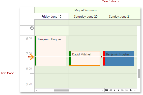
The picture below displays the Time Indicator element for the Day, Work Week, and Full Week Views.
The picture below displays the Time Indicator element for the Timeline View.

Use the following properties to specify the indicator’s visibility and behavior:
- DayViewBase.TimeIndicatorVisibility / TimelineView.TimeIndicatorVisibility
- DayViewBase.ShowTimeIndicatorOverAppointment
Customize the Time Indicator Appearance
The image below displays a customized Time Indicator in the Day View, Work Week View, Week View.

The image below displays a customized Time Indicator in the TimeLine View.

The code sample below illustrates these style settings.
<dx:ThemedWindow.Resources>
    <Style TargetType="dxschv:TimeIndicatorControl">
        <Setter Property="Template">
            <Setter.Value>
                <ControlTemplate TargetType="dxschv:TimeIndicatorControl">
                    <Border
                        x:Name="border"
                        Height="4"
                        BorderBrush="Red"
                        BorderThickness="0,1,0,1"
                        Background="Red" />
                </ControlTemplate>
            </Setter.Value>
        </Setter>
        <Style.Triggers>
            <Trigger Property="Orientation" Value="Vertical">
                <Setter Property="LayoutTransform">
                    <Setter.Value>
                        <RotateTransform Angle="90"/>
                    </Setter.Value>
                </Setter>
            </Trigger>
        </Style.Triggers>
    </Style>
</dx:ThemedWindow.Resources>
To customize the Time Indicator element, use XAML resources in your application’s code. Refer to the following article for more information: Modify Theme Resources.