Table View Tutorial. Step 4: Process and Shape Data
- 5 minutes to read
In the previous step, you enabled the View‘s auxiliary UI elements. This step describes how to shape and process data in the following ways:
- Sort and group
- Search and filter
- Calculate totals
- Apply conditional formatting

Sort Data
Select the Department and Status columns.
Set the Options.SortByDisplayText property to isbtOn. This value indicates that the View uses cell display text in sort operations. Otherwise, the View sorts data by cell values (that is, indexes).
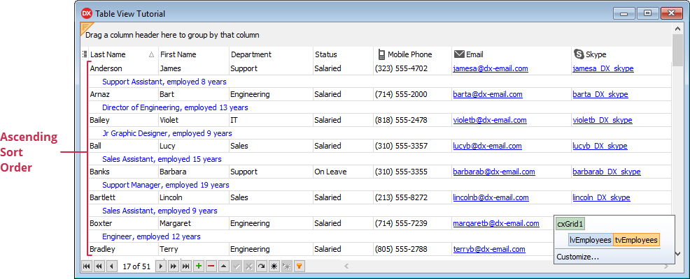
Select the Last Name column and set its SortOrder property to soAscending to sort data rows in alphabetical order.
Group Data
Set the View’s OptionsView.GroupByHeaderLayout property to ghlHorizontal. Now column headers are aligned horizontally in the Group By box panel.
Drag the Department and Status columns to the Group by box panel to group data as shown in the following image.

Find and Filter Options
Find Panel
This panel allows a user to type search requests into its Find box to filter records and highlight search results.
Expand the FindPanel property and follow the steps below:
Set the Behavior property to fcbSearch to use the panel in search mode when the control highlights text matches that meet the active search criteria.
Assign fpdmManual to the DisplayMode property. This option allows a user to press Ctrl + F when the grid View has focus or click the expand button to open the panel.
Specify fplGroupByBox as the Location property value. The panel moves to the Group by box after this change.
Switch the Layout property value to fplCompact. The panel shrinks its elements and arranges control buttons inside its Find box.
Assign True to the SearchInGroupRows and SearchInPreview properties to allow the panel to search in group rows and preview sections.
Set the UseExtendedSyntax property to
Trueto enable dedicated characters that allow a user to set up multiple filter or search criteria simultaneously.

Collapse the FindPanel property and set the ScrollbarAnnotations.Active property to True to enable scrollbar annotations. The vertical scrollbar displays annotations if the View’s data rows contain strings that match a user’s search request.
The image shows the configured Find Panel:

Filter Row
This row allows a user to filter data rows by column cell values.
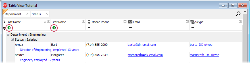
Expand the FilterRow property and assign True to the Visible and OperatorCustomization properties. Now the View displays the filter row and a user can select any filter operator for each column.
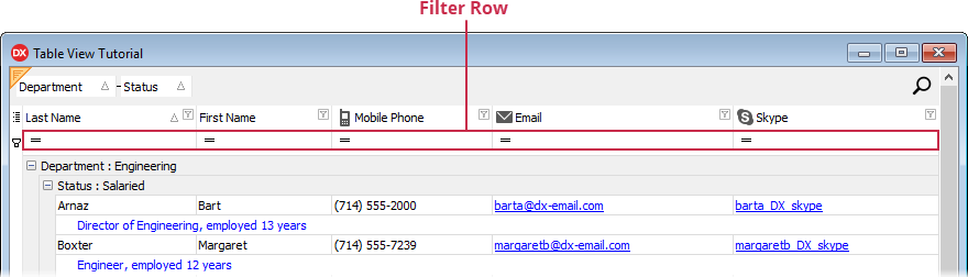
Select the Last Name and First Name columns. Assign foContains to the Options.FilterRowOperator property to associate a column with the CONTAINS operator that checks if a column’s cell values include the specified string.
Filter Dropdown
This dropdown allows a user to filter the View’s data rows. Each grid column can display a dropdown. A user should click a column’s filter button to open a dropdown.
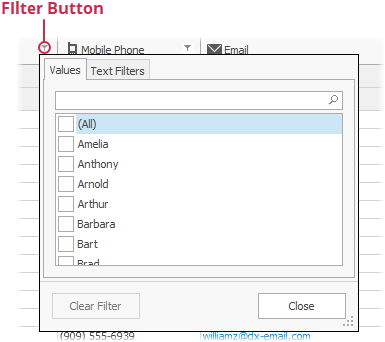
Assign sfbAlways to the OptionsView.ShowColumnFilterButtons property to display filter buttons.
Set the Filtering.ColumnPopupMode property to fpmExcel to display Excel-inspired filter dropdowns for the View columns.
Filter Criteria Appearance
Set the FilterBox.CriteriaDisplayStyle property to fcdsTokens to display filter criteria in the Filter Panel as colored tokens.
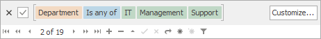
A token appears when a user specifies a new filter criterion.
Summaries
Summaries display totals calculated from column cell values. The Table View supports the following summary types: footer summaries, group summaries, and summary groups. In this tutorial, we add only footer and group summaries.
Footer Summary
Select the View and set the OptionsView.Footer property to True to display the footer summary.
Now select the Last Name column, expand its Summary property and adjust the footer summary as follows:
Set the FooterKind property to skCount to display the number of records against all records.
Assign the
Count = #string to the FooterFormat property to specify the format pattern for the footer’s display text.
The result is shown below:

Group Summary
Select the Last Name column, expand its Summary property and adjust the group summary as follows:
Set the GroupKind property to skCount to display the number of records within a group.
Assign the
Count = #string to the GroupFormat property to specify the format pattern for the group summary’s display text.

Conditional Formatting
The conditional formatting feature helps you emphasize important information for a user.
Create a rule that highlights with a light-green color all data rows that contain the "Manager" word.
Right-click the View in the Structure Navigator and select Conditional Formatting… in the context menu to open the Conditional Formatting Rules Manager dialog.

Click the “New Rule” button and select “Use formula to determine which cells to format” in the opened dialog. Then, input the following expression: FIND("Director",[Qualification])>0.

Note
This expression uses the same syntax as calculated expressions created in the second step.
Click the Format… button to open the Format Cells dialog. Open the Fill tab, select a light-green color from the palette, and click OK to close the dialog.

Click OK to close the Conditional Formatting Rule dialog.
Check the “Apply to the Record” flag, click Apply, and click OK to close the dialog.

The image shows the result:

Expand Data Rows
When you launch the application, all grouped data rows are initially collapsed, even if you previously expanded them at design time.

Handle the form’s OnShow and use the following code example to expand all data rows in the View every time you run the application:
begin
  // Expands all data rows
  tvEmployees.ViewData.Expand(False);
  // Moves focus to the first data row
  tvEmployees.Controller.FocusedRowIndex := 0;
end;
The final step describes how to use skins and other appearance-related settings to customize the application UI.