Table View Tutorial. Step 2: Enable User-Friendly Content and Layout
- 6 minutes to read
In the previous step, you populated the control with data. This step includes the following:
- Manage and customize grid columns.
- Use lookup editors and repository items.
- Create calculated expressions.
- Display column cell values in preview sections.

Column Management
Click the “Customize…” button in the Structure Navigator to open the Component Editor.

Delete
The View’s data controller now contains many columns. Delete the following columns that are not used this tutorial:
- tvEmployeesRecId
- tvEmployeesId
- tvEmployeesPersonalProfile
- tvEmployeesFullName
- tvEmployeesPrefix
- tvEmployeesHomePhone
- tvEmployeesBirthDate
- tvEmployeesPictureId
- tvEmployeesAddress_Line
- tvEmployeesAddress_City
- tvEmployeesAddress_State
- tvEmployeesAddress_ZipCode
- tvEmployeesAddress_Latitude
- tvEmployeesAddress_Longitude
- tvEmployeesProbation_ReasonId
- tvEmployeesPicture
Hold Ctrl to select multiple columns. Press Delete or click the Delete button.
Reorder
Arrange the remaining columns in the following order:
- tvEmployeesLastName
- tvEmployeesFirstName
- tvEmployeesDepartment
- tvEmployeesStatus
- tvEmployeesMobilePhone
- tvEmployeesEmail
- tvEmployeesSkype
- tvEmployeesTitle
- tvEmployeesHireDate
Select one or more columns and click “Move Up” or “Move Down” to rearrange them.

Close the dialog.
Tip
You can drag and drop column headers to rearrange columns in the control.
Resize
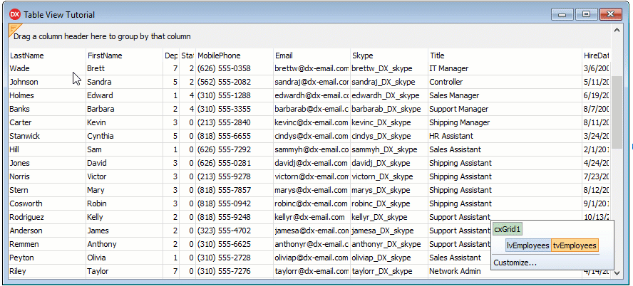
Widen the form to display more columns. Set the form’s width and height to 880 and 400 pixels.
To fit all columns in the control‘s client area without a horizontal scrollbar, click the View and set the OptionsView.ColumnAutoWidth property to True.
Now certain columns have cropped captions and content.

Double-click the right border of each column to set their width according to content size.
Tip
You can drag a column’s right border to specify a custom width.
Change Captions
You can modify a selected column’s settings in the Object Inspector. Click a column header to select a column.
Add spaces to column captions that consist of more than one word.

Add Glyphs to Captions
Add glyphs to the Mobile Phone, Email, and Skype column headers.
Select the Mobile Phone column and use the HeaderGlyph property to assign a glyph to the column. Click the ellipsis button to open the Image Picker dialog.
Open the DevExpress Icon Library tab, select the DevAv collection, enter mobilephone in the Search Box, and double-click the corresponding icon.

Resize the column (if required) to fit its content in full.
Then configure the Email and Skype columns in the same way. Assign the “mail” and “skype” glyphs to them.
The image shows the result:

Configure Visibility
Hide the tvEmployeesTitle and tvEmployeesHireDate columns because their content is intended for calculated expressions rather than user interaction.
Select the columns and follow the steps below:
Set the Visible property to False.
Set the VisibleForCustomization property to False to exclude the columns from the Customization Form and the Quick Column Customization drop-down menu.
Assign True to the VisibleForExpressionEditor property to use the selected columns as a data source for calculated expressions.

Lookup Editor
Add Lookup Data Sources
This section explains how to use lookup editors to display user-friendly text instead of IDs in the Department and Status columns. First, create two more datasets in the same manner as in the previous step:
- Add two TdxMemData components and name them mdDepartments and mdStatuses.
- Add two TDataSource components and name them dsDepartments and dsStatuses.
- Add columns from the
DepartmentandStatus.dat files to these datasets. These files are available at the following path:C:\Users\Public\Documents\DevExpress\VCL\Demos\ExpressQuantumGrid\Data\ - Load records to the datasets from the same files.
Assign a Lookup Editor
Now associate the Department and Status columns with a lookup combo box that can display values from the bound data source. Select the columns and assign LookupComboBox to the Properties property.
Specify Lookup Settings
Click the Department column to display its settings in the Object Inspector. Expand the column’s Properties property and follow the steps below to replace indexes with strings:
Assign dsDepartments to the editor’s ListSource property.
Set the KeyFieldNames property to Department_ID to specify the name of the data source field populated with values used to identify data records.
Set the ListFieldNames property to Department_Name to specify the data source field populated with values that should be displayed in column cells instead of department indexes.

Configure the same settings for the Status column:
- Set dsStatuses as the editors’s data source.
- Assign StatusID and Status_Name to the KeyFieldNames and ListFieldNames properties, respectively.
Tip
Press Ctrl + H to hide non-visual components that can overlap the View’s content.
The image below shows the result.

Hyperlink Editor
Now convert plain text in the Email and Skype columns to hyperlinks.
Add a TcxEditRepository component to the form. This component allows you to customize column editors and then re-use them within multiple columns.
Double-click the component to open the Edit Repository dialog.
Click Add… in the dialog, select a hyperlink item.

Close the dialog and rename the item erHyperLinkItem1 in the Object Inspector.
Select the Email and Skype columns and assign erHyperLinkItem1 to the RepositoryItem property.
The image below shows the result.

Display Lengthy Data in Preview Sections
Assign a Calculated Expression to a Column
You can use an expression to calculate results based on column cell values.
Create a column to populate it with expression results. Right-click a column header and select “Create Column” in the context menu.

Tip
A click on “Create Column” in the View’s context menu also appends a column to a collection. Right-click the Table View in the Structure Navigator to invoke the menu.
Select the newly created column, and change its name and caption to tvEmployeesQualification and Qualification, respectively.
Expand the column’s DataBinding property in the Object Inspector and follow the steps below:
Click the Expression property’s ellipsis button to open the Expression Editor dialog.
Input the following expression to the Expression Box:
CONCATENATE([Title],', employed ',INT(YEARFRAC(TODAY(),[Hire Date])),' years').Note
Value separator characters depend on the system locale. All expression examples listed in this tutorial are created for the English (United States) system locate. Change the locale-dependent characters in the example according to your current locale.
Click OK to assign the expression to the column and close the dialog.
Set the ValueType property to String.
Resize the
Mobile Phone,Email, andSkypecolumns to fit the newly created column in the control’s client area.
The following image shows the result:

Enable Preview Sections
Expand the View’s Preview property and configure preview sections as follows:
Set the Column property to tvEmployeesQualification to group data rows by the
Qualificationcolumn’s content.Assign True to the Visible property.
The following image shows the result:

The View now displays data in a user-friendly format. The next step enables auxiliary View elements that allow a user to interact with the control.