DataGridView.RowHeight Property
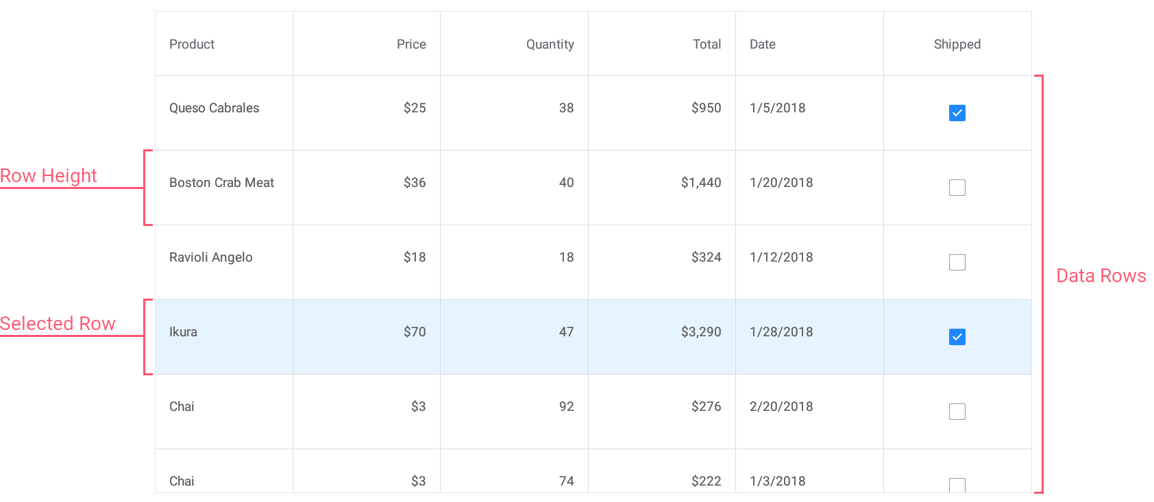
Gets or sets the height of data rows in the grid. This is a bindable property.
Namespace: DevExpress.Maui.DataGrid
Assembly: DevExpress.Maui.DataGrid.dll
NuGet Package: DevExpress.Maui.DataGrid
Declaration
public double RowHeight { get; set; }Property Value
| Type | Description |
|---|---|
| Double | The height of grid rows, in density-independent pixels. |
Remarks
The grid automatically adjusts the height of data rows to display the entire content of cells. If you specify the RowHeight property, all data rows have the same height.
When you define a custom RowHeight value, you may also need to adjust the cell’s Padding property value to avoid content clipping.
To change the height of group rows, use the GroupRowHeight property.
Example
This example shows how to modify the appearance of the following grid elements:
- Data Cells
Assign the CellAppearance object with the specified settings to the DataGridView.CellAppearance property. Use the grid’sRowHeightproperty to specify the cell height. - Columns Headers
Assign the ColumnHeaderAppearance object with the specified settings to the DataGridView.ColumnHeaderAppearance property. - Total Summary Panel
Assign the TotalSummaryAppearance object with the specified settings to the DataGridView.TotalSummaryAppearance property. Use the grid’s TotalSummaryHeight property to change the height of the total summary panel displayed at the bottom of the grid.
<ContentPage xmlns="http://schemas.microsoft.com/dotnet/2021/maui"
             xmlns:x="http://schemas.microsoft.com/winfx/2009/xaml"
             xmlns:dxg="clr-namespace:DevExpress.Maui.DataGrid;assembly=DevExpress.Maui.DataGrid"
             xmlns:local="clr-namespace:DataGrid_CustomAppearance"
             x:Class="DataGrid_CustomAppearance.MainPage">
    <ContentPage.BindingContext>
        <local:TestOrderRepository/>
    </ContentPage.BindingContext>
    <dxg:DataGridView ItemsSource="{Binding Orders}"
                      RowHeight="40" TotalSummaryHeight="40">

        <!-- Specify grid columns and total summaries here. -->

        <!--Customize the appearance of grid cells.-->
        <dxg:DataGridView.CellAppearance>
            <dxg:CellAppearance Padding="5" BackgroundColor="#333333" BorderColor="#515151"
                           FontSize="14" FontColor="White"
                           SelectionColor="#f78a09" SelectionFontColor="Black"/>
        </dxg:DataGridView.CellAppearance>

        <!--Customize the appearance of column headers.-->
        <dxg:DataGridView.ColumnHeaderAppearance>
            <dxg:ColumnHeaderAppearance BackgroundColor="#333333" BorderColor="#515151"
                                   FontSize="16" FontColor="#929292" FontAttributes="Bold"
                                   HorizontalLineThickness="2"/>
        </dxg:DataGridView.ColumnHeaderAppearance>

        <!--Customize the appearance of the total summary panel.-->
        <dxg:DataGridView.TotalSummaryAppearance>
            <dxg:TotalSummaryAppearance Padding="2,10" BackgroundColor="#666666" BorderColor="#515151"
                                   FontSize="14" FontColor="#f78a09"/>
        </dxg:DataGridView.TotalSummaryAppearance>
    </dxg:DataGridView>
</ContentPage>
