How to Filter Rows in DevExpress Data Grid for .NET MAUI
- 9 minutes to read
The DataGridView allows you to filter its data rows in different ways:
- Use built-in filter items to create a filtering UI.
- Show the auto filter row – a special row at the top of the grid that allows users to filter values in columns.
- Use API members to filter data grid rows in code.
Create Filtering UI
The DevExpress suite for MAUI allows you to use built-in filter items to create filter views with ranges, checkboxes, option lists, and much more.
The Data Grid automatically collects applied filter rules from all filter items and saves the result to the FilterExpression (FilterString) property.
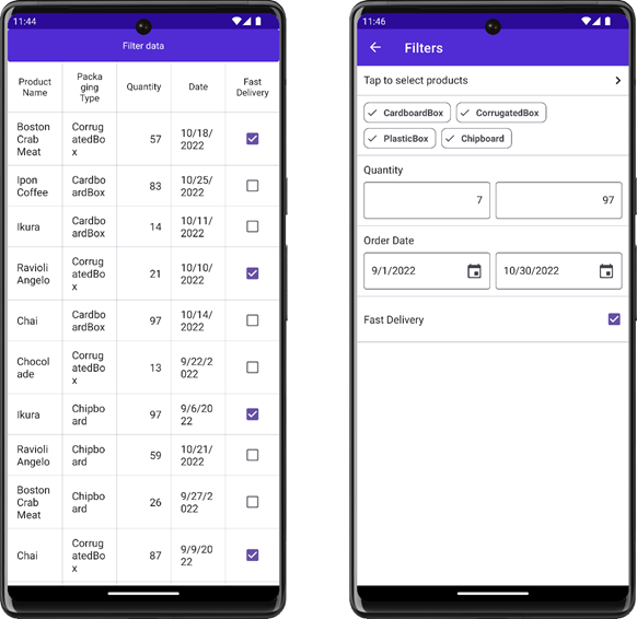
Implement and Invoke a Separate Filtering UI Page
Follow the steps below to configure a filter form and assign it to a DataGridView:
- Create a page and populate it with filter items.
- Assign the page to the FilteringUITemplate property. In this step, the DataGridView automatically binds the item
Contextproperty to DataGridView.FilteringContext. - Use the ShowFilteringUIForm command or call the ShowFilteringUIForm() method.
<ContentPage xmlns="http://schemas.microsoft.com/dotnet/2021/maui"
             xmlns:x="http://schemas.microsoft.com/winfx/2009/xaml"
             xmlns:dxg="clr-namespace:DevExpress.Maui.DataGrid;assembly=DevExpress.Maui.DataGrid"
             xmlns:ios="clr-namespace:Microsoft.Maui.Controls.PlatformConfiguration.iOSSpecific;assembly=Microsoft.Maui.Controls"
             xmlns:local="clr-namespace:DXFilteringApp"
             ios:Page.UseSafeArea="true" NavigationPage.HasNavigationBar="False" Title=""
             x:Class= "DXFilteringApp.MainPage" >
    <ContentPage.BindingContext>
        <local:TestOrderRepository/>
    </ContentPage.BindingContext>
    <ContentPage.Content>
        <Grid RowDefinitions="50,*">
            <dx:DXButton Content="Filter data" Grid.Row="0"
                    Command="{Binding Source={Reference grid}, Path=Commands.ShowFilteringUIForm}"/>
            <dxg:DataGridView x:Name="grid" Grid.Row="1"
                              ItemsSource="{Binding Orders}"
                              FilteringUITemplate="{DataTemplate local:FilterPage}">
                <dxg:TextColumn FieldName="ProductName" HeaderFontSize="14"/>
                <dxg:ComboBoxColumn FieldName="PackagingType" HeaderFontSize="14"/>
                <dxg:NumberColumn FieldName="Quantity" HeaderFontSize="14"/>
                <dxg:DateColumn FieldName="Date" HeaderFontSize="14"/>
                <dxg:CheckBoxColumn FieldName="FastDelivery" HeaderFontSize="14"/>
            </dxg:DataGridView>
        </Grid>
    </ContentPage.Content>
</ContentPage>
<ContentPage xmlns="http://schemas.microsoft.com/dotnet/2021/maui"
             xmlns:x="http://schemas.microsoft.com/winfx/2009/xaml"
             xmlns:dxe="clr-namespace:DevExpress.Maui.Editors;assembly=DevExpress.Maui.Editors"
             x:Class="DXFilteringApp.FilterPage"
             Title="Filters" Shell.NavBarIsVisible="False">
    <Grid>
        <VerticalStackLayout>
            <dxe:FilterCheckedListPickerItem PickerTitle="Select product name" FieldName="ProductName" Text="Tap to select products"/>
            <dxe:FilterCheckedChipGroupItem FieldName="PackagingType" SelectAllWhenFilterIsNull="True"/>
            <dxe:FilterNumericRangeItem Text="Quantity" FieldName="Quantity"/>
            <dxe:FilterDateRangeItem Text="Order Date" FieldName="Date"/>
            <dxe:FilterCheckItem Text="Fast Delivery" FieldName="FastDelivery" />
        </VerticalStackLayout>
    </Grid>
</ContentPage>
To customize the filter form based on a condition, handle the FilteringUIFormShowing event.
Show DataGridView and Filter Items on the Same Page
To display filter items and a DataGridView on the same page, you should explicitly bind the filter item Context property to DataGridView.FilteringContext.
The following example allows users to configure grid row filters in a bottom sheet:
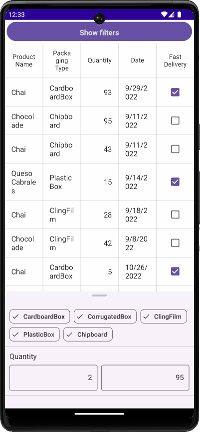
To do so, follow the steps below:
- Add a BottomSheet component to the page.
- Populate the bottom sheet with filter items.
- Set item
FieldNameproperties to data source fields used to filter grid rows. - Bind item
Contextproperties to the Data Grid’s FilteringContext.
<ContentPage ...>
    <ContentPage.BindingContext>
        <local:TestOrderRepository/>
    </ContentPage.BindingContext>
    <ContentPage.Content>
        <Grid RowDefinitions="50,*">
            <dx:DXButton x:Name="btn"
                               Clicked="btn_Clicked"
                               Grid.Row="0" Content="Show filters"
                               Margin="6"/>
            <dxg:DataGridView x:Name="grid" Grid.Row="1" SelectionMode="None"
                              ItemsSource="{Binding Orders}">
                <!-- Column definitions are skipped. -->
            </dxg:DataGridView>
            <dxco:BottomSheet x:Name="bottomSheet" HalfExpandedRatio="0.3">
                <VerticalStackLayout>
                    <dxe:FilterCheckedChipGroupItem Context="{Binding Source={x:Reference grid}, Path=FilteringContext}" FieldName="PackagingType" SelectAllWhenFilterIsNull="True"/>
                    <dxe:FilterNumericRangeItem Context="{Binding Source={x:Reference grid}, Path=FilteringContext}" Text="Quantity" FieldName="Quantity"/>
                </VerticalStackLayout>
            </dxco:BottomSheet>
        </Grid>
    </ContentPage.Content>
</ContentPage>
private void btn_Clicked(object sender, EventArgs e) {
    bottomSheet.Show(DevExpress.Maui.Controls.BottomSheetState.HalfExpanded);
}
For more information, refer to the following help topic: FilteringContext.
Filter Items
Filter items are separate controls within your application that automatically retrieve available values, format settings, and other information from the bound control – DataGridView. The following filter items are available:
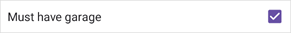
Checkbox
FilterCheckItem – Allows users to use a checkbox to filter by Boolean values.
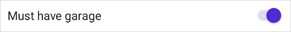
Switch
FilterSwitchItem – Allows users to use a switch to filter by Boolean values.
Chips with Single Selection
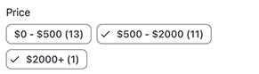
FilterChipGroupItem – Allows users to select a single option from a set.

Chips with Multiple Selection
FilterCheckedChipGroupItem – Allows users to check multiple options from a set.

Predefined Chips with Multiple Selection
PredefinedFilterCheckedChipGroupItem – Allows users to check multiple predefined options from a set.
Date Range Editor
FilterDateRangeItem – Allows users to filter by date-time values.

Numeric Range Editor
FilterNumericRangeItem – Allows users to specify a value range to filter numeric values.

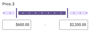
Numeric Range Slider
FilterNumericRangeSliderItem – Allows users to select a value range to filter numeric values.
List with Single Selection Using Radio Buttons
FilterRadioListItem – Allows users to select a single option from a radio-button list. Users can enter a search query in the search box to filter available options.

List with Multiple Selection Using Check Boxes
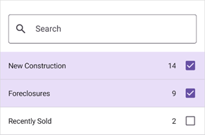
FilterCheckedListItem – Allows users to select multiple options from a checkbox list. Users can enter a search query in the search box to filter available options.
Dialog List with Single Selection Using Radio Buttons
FilterRadioListPickerItem – Allows users to select a single option from a list shown in a separate dialog. Users can enter a search query in the search box to filter available options.

Dialog List with Multiple Selection Using Check Boxes
FilterCheckedListPickerItem – Allows users to select multiple options from a list shown in a separate dialog. Users can enter a search query in the search box to filter available options.

Custom Filter Item
You can customize the value picker used in a built-in filter item. Depending on the filter item, use the following properties to implement a custom picker:
- FilterItemBase.FilterModelTemplate
- FilterFormItemBase.FilterModelTemplate
- FilterListPickerItemBase.PickerFilterModelTemplate
Show Auto Filter Row
Enable the DataGridView.ShowAutoFilterRow option to display the auto filter row. Depending on the column type, the Data Grid automatically selects an appropriate editor in the Auto Filter Row. For example, the DateEdit is used for a DateColumn.
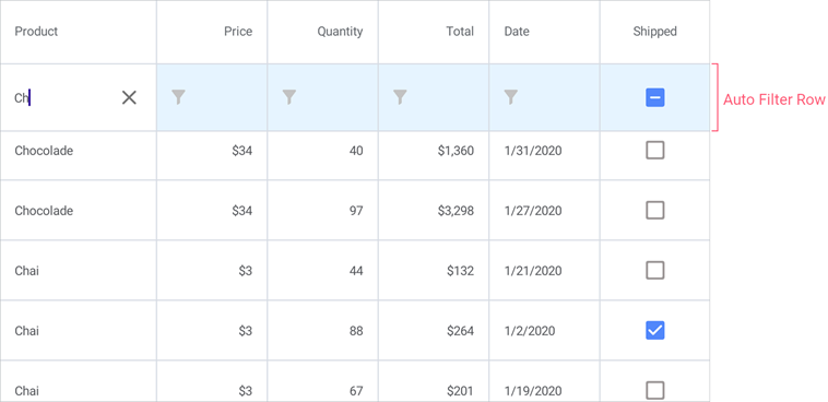
Use a column’s AllowAutoFilter property to disable the Auto Filter for an individual column.
Define the ImmediateUpdateAutoFilter property to specify whether to filter data each time a value in the auto filter row is changed or only when a cell in the auto filter row loses focus.
In code, you can call the DataGridView.ClearColumnAutoFilter method to clear the filter that is set in the Auto Filter Row.
Specify Filter Mode
The DataGridView can format data field values before they are displayed in grid cells. For example, you can use the TextColumn.Mask property to specify a mask that restricts user input and formats output. The GridColumn.FilterMode property specifies whether filters are applied to data field values or to text displayed in cells. Cell values are handled and filtered as strings when the FilterMode property value is set to DisplayText. The filter mode may affect the default filter condition. See AutoFilterCondition for more information.
Specify Filter Values and Conditions in Code
A column’s AutoFilterValue property specifies the cell value in the auto filter row. The specified value is used to create a filter criterion based on the default filter condition (equals, contains, etc.), which depends on the type of the column. Set the column’s AutoFilterCondition property to one of the following values to change the filter condition:
- Contains
- Values in the column should contain the criterion entered in the auto filter row.
- Equals
- Values in the column should be equal to the criterion entered in the auto filter row.
- StartsWith
- Values in the column should start with the criterion entered in the auto filter row.
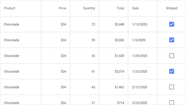
The markup below enables the auto filter row in the grid, specifies the filter condition and initial filter for the first column, and prevents users from filtering values in the second column:
<dxg:DataGridView ItemsSource="{Binding Orders}"
                  ShowAutoFilterRow="True">
    <dxg:DataGridView.Columns>
        <dxg:TextColumn FieldName="Product.Name" Caption="Product" Width="150"
                        AutoFilterCondition="Contains" AutoFilterValue="Ch"/>
        <dxg:NumberColumn FieldName="Product.UnitPrice" Caption="Price"
                          AllowAutoFilter="False"
                          DisplayFormat="C0" MinWidth="100"/>
        <dxg:NumberColumn FieldName="Quantity" MinWidth="100"/>
        <dxg:NumberColumn FieldName="Total"
                          UnboundType="Integer" UnboundExpression="[Quantity] * [Product.UnitPrice]"
                          IsReadOnly="True" DisplayFormat="C0" MinWidth="100"/>
        <dxg:CheckBoxColumn FieldName="Shipped" MinWidth="100"/>
    </dxg:DataGridView.Columns>
</dxg:DataGridView>
The AutoFilterRowHandle property returns the handle of the auto filter row. You can use this handle to identify the row.
Auto Filter Row Appearance
The following properties allow you to customize auto filter row appearance:
- DataGridView.ShowFilterIcon, GridColumn.ShowFilterIcon
- Specify whether to show filter icons in cells of the auto filter row.
- DataGridView.FilterIconColor
- Specifies the color of filter icons displayed in cells of the auto filter row.
- DataGridView.AutoFilterRowHeight
- Specifies the height of the auto filter row.
Filter Data in Code
Use the following properties to filter data rows in code:
- DataGridView.FilterString
- Specifies a string expression in the criteria language. See the following topic for more information: Criteria Language Syntax.
- DataGridView.FilterExpression
- Specifies a CriteriaOperator descendant that specifies a filter expression. See the following topic for more information: Criteria Operators.
Refer to the following help topic for sample filters: Build Criteria - Cheat Sheet.
The following example shows how to filter orders in a table by the product name:
dataGridView1.FilterString = "Contains([Product.Name], 'Choco')";
The ActualFilterString property returns the currently applied filter expression. To clear the filter, you can call the ClearColumnFilter or ClearFilter method.
Filter Data Based on a Custom Rule
The CustomFilter event allows you to filter data rows according to custom logic. The DataGridView raises this event for each record in a data source.
Use the following event argument properties to create a custom filter rule:
- SourceIndex – Specifies the index of the processed row.
- Item - Specifies the data source object that is used to create the processed row.
- Visible - Specifies whether the processed row should be visible.
The following example shows how to filter out even values in a grid’s “Value” column:
<ContentPage.BindingContext>
    <local:GridViewModel/>
</ContentPage.BindingContext>
<dxg:DataGridView x:Name="grid" ItemsSource="{Binding Data}"
                  WidthRequest="400" CustomFilter="grid_CustomFilter">
    <dxg:DataGridView.Columns>
        <dxg:NumberColumn FieldName="Index" Caption="Index" HorizontalContentAlignment="Start"/>
        <dxg:NumberColumn FieldName="Number" Caption="Value" HorizontalContentAlignment="Start"/>
    </dxg:DataGridView.Columns>
</dxg:DataGridView>
using DevExpress.Maui.DataGrid;
using DevExpress.Maui.Editors;
using System.Collections.ObjectModel;
using System.ComponentModel;

namespace DXMauiApp1 {
    public partial class MainPage : ContentPage {
        public MainPage() {
            InitializeComponent();
        }
        private void grid_CustomFilter(object sender, CustomFilterEventArgs e) {
            DataEntry item = (DataEntry)e.Item;
            if (item.Number % 2 == 1) e.Visible = false;
        }
    }
    public class GridViewModel {
        int itemCount = 8;
        Random rnd = new Random();
        public ObservableCollection<DataEntry> Data { get; private set; }
        public GridViewModel() {
            Data = new ObservableCollection<DataEntry>();
            for (int i = 0; i < itemCount; i++) {
                Data.Add(new DataEntry(i, rnd.Next(0, 100)));
            }
        }
    }
    public class DataEntry {
        public int Index { get; private set; }
        public int Number { get; private set; }
        public DataEntry(int index, int number) {
            Index = index;
            Number = number;
        }
    }
}
Enable Live Data Recalculation
Enable the DataGridView.AllowLiveDataShaping property to recalculate DataGridView values and refresh it when users filter, group, and sort data.
Add a Search Bar
The search bar allows users to enter a search query to filter data grid rows. For implementation details, refer to the following help topic: Data Grid Search Bar.