Columns and Rows
- 9 minutes to read
Columns
DataGridView displays data source properties as columns. It automatically generates columns based on a bound data source. The AutoGenerateColumnsMode property specifies how DataGridView generates columns or prevents columns from automatically being generated.
You can also add columns to DataGridView and associate them with data source properties manually. DataGridView stores its columns in the DataGridView.Columns collection. An individual column is a GridColumn class descendant that corresponds to the column’s data type.
The GridColumn.FieldName property specifies the data source field to which the column is bound. Each column object has a set of properties to adjust column settings (for example, data display format, column width, header caption, content alignment) and manage grid data (sort and group).
Supported Column Types
- NumberColumn
- A grid column used to display and edit numeric values.
- TextColumn
- A grid column used to display and edit text values.
- AutoCompleteColumn
- A grid column used to display and edit text values. The column suggests values as a user types in a cell.
- ComboBoxColumn
- A grid column used to display and edit text values. The column displays a drop-down list that contains available values.
- DateColumn
- A grid column used to display and edit date values.
- TimeColumn
- A grid column used to display and edit the time.
- CheckBoxColumn
- A grid column that displays Boolean values and allows a user to change a cell value by switching between two states.
- ImageColumn
- A grid column used to display images.
- PickerColumn
- A grid column that allows a user to edit a cell value by selecting an item from the predefined set.
- TemplateColumn
- A column type that allows you to define a custom template for column cells.
Example: Add Grid Columns Manually
This example shows how to create columns in DataGridView to display different types of data:
<dx:DataGridView ItemsSource="{Binding Employees}" EditorShowMode="DoubleTap">
    <dx:DataGridView.Columns>
        <dx:ImageColumn FieldName="Photo"
                         Width="100" VerticalContentAlignment="Center"/>
        <dx:TemplateColumn FieldName="Name" Caption="Employee"
                            IsReadOnly="true" AllowSort="False" MinWidth="200">
            <dx:TemplateColumn.DisplayTemplate>
                <DataTemplate>
                    <Grid VerticalOptions="Center" Padding="15, 0, 0, 0">
                        <Grid.RowDefinitions>
                            <RowDefinition Height="Auto" />
                            <RowDefinition Height="Auto" />
                            <RowDefinition Height="Auto" />
                        </Grid.RowDefinitions>
                        <Label Text="{Binding Item.Name}" FontAttributes="Bold" FontSize="Medium" Grid.Row="0" />
                        <Label Text="{Binding Item.Position, StringFormat = 'Job Title: {0}'}"
                               FontSize="Small" Grid.Row="1"/>
                        <Label Text="{Binding Item.HireDate, StringFormat = 'Hire Date: {0:d}'}"
                               FontSize="Small" Grid.Row="2" />
                    </Grid>
                </DataTemplate>
            </dx:TemplateColumn.DisplayTemplate>
        </dx:TemplateColumn>
        <dx:TextColumn FieldName="Phone"
                        MinWidth="130" VerticalContentAlignment="Center" />
        <dx:TextColumn FieldName="Address"
                        MinWidth="150" VerticalContentAlignment="Center" />
        <dx:DateColumn FieldName="BirthDate"
                        MinWidth="120" DisplayFormat="d" VerticalContentAlignment="Center"/>
        <dx:PickerColumn FieldName="Access" Caption="Access Level"
                          MinWidth="140" VerticalContentAlignment="Center"/>
        <dx:CheckBoxColumn FieldName="OnVacation"
                            MinWidth="130" VerticalContentAlignment="Center"/>
    </dx:DataGridView.Columns>
</dx:DataGridView>
Fix Grid Columns
DataGridView allows you to anchor (fix) columns to its left or right edge, so they always remain visible while a user scrolls the view horizontally. To fix a column, set its FixedStyle property to Start or End.
Grid Column Best-Fit Width
DataGridView can calculate the best-fit width (automatically adjusts the width according to content size) for all columns simultaneously or for individual columns. Set the AutoBestFitColumns property to true to calculate the best-fit column width.
Note
The AutoBestFitColumns property does not affect the multi-row column layout.
DataGridView recalculates the column width automatically only in response to changes in the bound data source. You can call the CalcBestFitAsync() method to force column width recalculation.
Calculate Best-Fit Width for All Columns
This example calculates the best-fit width for all columns in Data Grid:
<dx:DataGridView  ...
                  AutoBestFitColumns="True"
                  BestFitMode="Cells"
                  BestFitItemsCount="25">
    <!-- Grid columns are here. -->
</dx:DataGridView>
Use the following properties to calculate the best-fit width for all columns:
- DataGridView.AutoBestFitColumns
- Gets or sets whether to calculate the column width based on the specified BestFitMode. This is a bindable property.
- DataGridView.BestFitMode
- Gets or sets the mode used to calculate the best-fit width for each column. This is a bindable property.
- DataGridView.BestFitItemsCount
- Gets or sets the number of cells used to calculate the best-fit width for all columns. This is a bindable property.
Calculate Best-Fit Width for Individual Columns
This example calculates the best-fit width for individual columns in Data Grid:
<dx:DataGridView  ...
                  AutoBestFitColumns="True">
    <dx:DataGridView.Columns>
        <dx:ImageColumn FieldName="Photo"
                        BestFitMode="Cells"
                        BestFitItemsCount="5"/>
        <dx:TextColumn  FieldName="FirstName"
                        MinWidth="150"
                        MaxWidth="200"
                        BestFitMode="Header"
                        BestFitItemsCount="25"/>
        <dx:TextColumn  FieldName="LastName"
                        MinWidth="150"
                        MaxWidth="250"
                        BestFitMode="Header"
                        BestFitItemsCount="25"/>
        <dx:CheckBoxColumn FieldName="OnVacation"
                        Width="130"/>
        <!-- Other columns are here. -->
    </dx:DataGridView.Columns>
</dx:DataGridView>
Use the following properties to calculate the best-fit width for individual columns:
- GridColumn.BestFitMode
- Gets or sets the mode used to calculate the best-fit width for the current column. This is a bindable property.
- GridColumn.BestFitItemsCount
- Gets or sets the number of cells used to calculate the best-fit width for the current column. This is a bindable property.
Unbound Columns
In addition to columns bound to data source properties, you can create unbound columns to display data values calculated based on values of other columns. To create an unbound column in the grid, add a column object that corresponds to the type of data the column should display to the DataGridView.Columns collection, and set the following column properties:
- FieldName
- A unique string that does not match any field name in the grid’s underlying data source.
- UnboundType
- The type of data the column should display (Boolean, DateTime, Decimal, Integer, String, or Object).
- UnboundExpression
- A formula (string expression) that automatically calculates column values.
The DataGridView.CustomUnboundData event is another way to populate an unbound column with data. It allows you to implement custom logic of any complexity to supply cell values. Also, use this event (not an expression) if you need to save changes that a user made in an unbound column.
Examples
Assume that the DataGridView instance is bound to a collection of orders. An order has the Product.Name, Product.UnitPrice and Quantity fields. This example shows how to add an unbound column (Total) to the grid to calculate each order amount according to the expression: UnitPrice*Quantity.
Implement logic to calculate column values in one of the following ways:
Use the GridColumn.UnboundExpression property:
<dxg:DataGridView x:Name="grid" ItemsSource="{Binding Orders}">
    <dxg:DataGridView.Columns>
        <dxg:TextColumn FieldName="Product.Name" Caption="Product" Width="170" />
        <dxg:NumberColumn FieldName="Product.UnitPrice" Caption="Price" DisplayFormat="C0"/>
        <dxg:NumberColumn FieldName="Quantity"/>
        <dxg:NumberColumn FieldName="Total" UnboundType="Integer"
                        UnboundExpression="[Quantity] * [Product.UnitPrice]"
                        IsReadOnly="True" DisplayFormat="C0"/>
    </dxg:DataGridView.Columns>
</dxg:DataGridView>
Handle the DataGridView.CustomUnboundData event:
<dxg:DataGridView x:Name="grid" ItemsSource="{Binding Orders}" CustomUnboundData="Grid_CustomUnboundData"> <dxg:DataGridView.Columns> <dxg:TextColumn FieldName="Product.Name" Caption="Product" Width="170" /> <dxg:NumberColumn FieldName="Product.UnitPrice" Caption="Price" DisplayFormat="C0"/> <dxg:NumberColumn FieldName="Quantity"/> <dxg:NumberColumn FieldName="Total" UnboundType="Decimal" IsReadOnly="True" DisplayFormat="C0"/> </dxg:DataGridView.Columns> </dxg:DataGridView>// Returns the total for a specific row. decimal getTotalValue(DataGridView grid, int rowHandle) { decimal unitPrice = Convert.ToDecimal(grid.GetCellValue(rowHandle, "Product.UnitPrice")); decimal quantity = Convert.ToDecimal(grid.GetCellValue(rowHandle, "Quantity")); return unitPrice * quantity; } // Provides data for the Total column. void Grid_CustomUnboundData(object sender, CustomUnboundDataEventArgs e) { if (e.Column.FieldName == "Total" && e.IsGetData) e.Value = getTotalValue((DataGridView)sender, e.SourceIndex); }
Related Scenario
Refer to the following help topic to learn how to implement column chooser functionality: DataGrid Column Chooser.

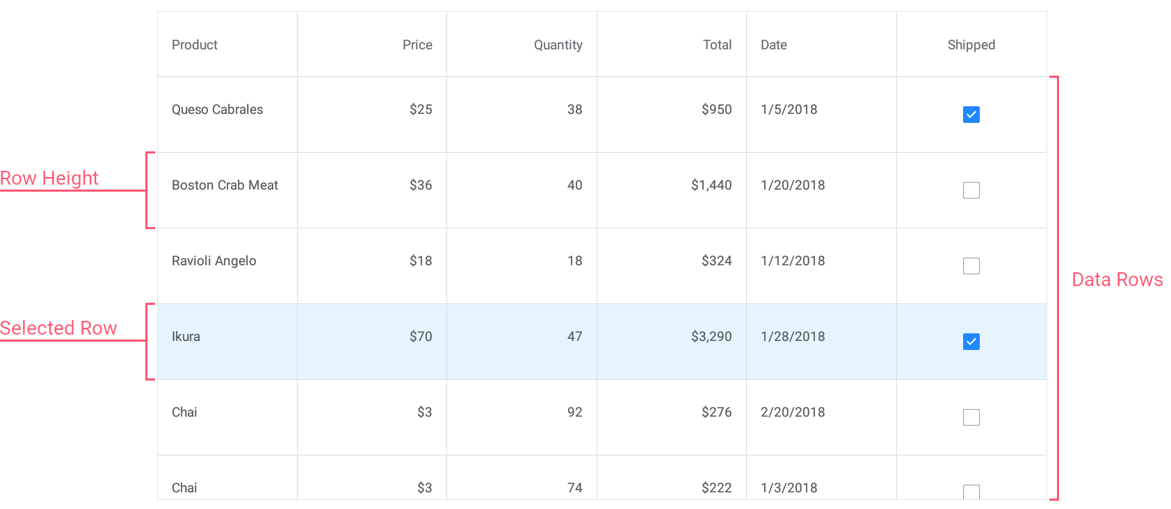
Rows
Data rows in the grid display records from the data source.
The grid automatically adjusts data row height to display the entire content of a cell. If you specify the DataGridView.RowHeight property, all data rows have the same height.
When data is grouped, the grid also displays group rows to separate groups of data rows. Users can tap group rows to expand and collapse groups. The DataGridView.GroupRowHeight property changes the height of group rows.

For more information on how to group data grid rows, refer to the following help topic: How to Group Rows in DevExpress Data Grid for .NET MAUI.
Row Handles
Grid rows are identified by unique integer values – row handles. Each row has a row handle, regardless of whether the row is currently visible (for example, the row might be scrolled off-screen or hidden within a collapsed group).
A row handle depends on the row’s current location in the grid and changes dynamically when rows are reordered (for example, when data is sorted or grouped).
- Data row handles are zero-based indexes that correspond to row order from top to bottom.
- Group row handles are negative values that start with -1. The order matches group row order from top to bottom.

The grid exposes the following methods and properties to obtain row handles:
- FindRowHandle(Predicate<Object> predicate)
- Returns the handle of the first row that matches the specified criteria.
- FindRowHandle(string fieldName, object value)
- Searches for the value in the column and returns the handle of the corresponding row.
- FindRowHandle(Object item)
- Returns the handle of the DataGridView row that corresponds to a data object passed in the parameters.
- GetRowHandle
- Returns the handle of the row that corresponds to the specified record in the data source.
- GetChildRowHandle
- Returns the handle of a row at the specified position within the specified group.
- SelectedRowHandle
- Gets or sets the selected row handle. This is a bindable property.
You can pass row handles as parameters to the following methods that operate with rows:
- GetCellValue
- Returns the value of the specified data cell.
- SetCellValue
- Sets the specified cell’s value.
- GetRowItem
- Returns an object that represents a record in the grid’s underlying data source.
- GetRowItemBySourceIndex
- Returns the data source object by its index.
- DeleteRow
- Deletes the specified data row.
- ScrollToRow
- Scrolls the grid to make the specified row visible.
- GetGroupValue
- Returns an actual value displayed in the specified group row (group header).
- GetGroupDisplayText
- Returns an actual or formatted value displayed in the specified group row (group header).
- GetGroupSummaryValue
- Returns a summary value calculated against the specified group of rows.
- GetChildRowCount
- Returns the number of data rows in a specific group.
- IsGroupCollapsed
- Indicates whether the specified group row is collapsed.
- CollapseGroupRow
- Collapses the specified group of rows.
- ExpandGroupRow
- Expands the specified group of rows.
Cells
The grid displays data values in cells located at the intersection of columns and rows. Use the following methods and properties to obtain and set cell values, and prevent users from changing cell values:
- GetCellValue
- Returns the value of the specified data cell.
- GetCellDisplayText
- Gets the text displayed within the specified cell.
- SetCellValue
- Sets the specified cell’s value.
- IsReadOnly
- Gets or sets whether the grid is read-only. This is a bindable property.
Edit Cell Data
Users can use in-place editors to change cell data. Use the DataGridView.EditorShowMode property to specify a gesture that invokes an in-place editor for a cell. The DataGridView automatically determines the editor type based on the type of a column to which a cell belongs. Note a TemplateColumn requires you to manually assign an in-place editor.
For more information about in-place editing, refer to the following topic: Edit Cell Values in In-Place Mode.
Users can also edit cell data in detached forms. For more information on how to implement and invoke an edit form, refer to the following help topics: Show Built-In Forms to Display, Create, and Edit Items and Customize CRUD Forms.