DxTreeView.NodeTemplate Property
Specifies the common template used to display all nodes.
Namespace: DevExpress.Blazor
Assembly: DevExpress.Blazor.v20.2.dll
NuGet Package: DevExpress.Blazor
Declaration
[Parameter]
public RenderFragment<ITreeViewNodeInfo> NodeTemplate { get; set; }
Property Value
| Type | Description |
|---|---|
| RenderFragment<ITreeViewNodeInfo> | The template content. |
Remarks
The NodeTemplate property allows you to specify the content of all TreeView nodes. Use the template’s context parameter to access a ITreeViewNodeInfo object that stores information about a node (the text, level, bound data item, etc.)
The following example demonstrates how to:
- change the text settings and the expand/collapse button’s position for the root node;
- provide custom images and multi-line text content for other nodes.
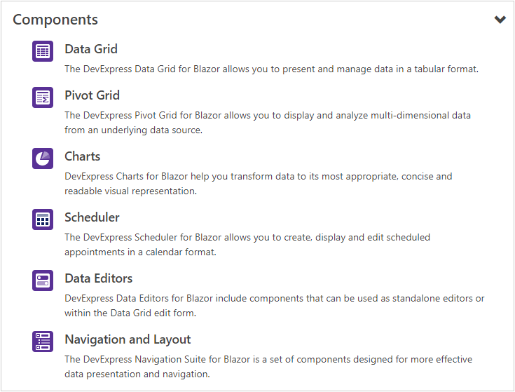
<DxTreeView @ref="@treeView"
            Data="@ComponentsData.ComponentSets"
            ChildrenExpression="@(dataItem => ((ComponentSet)dataItem).ComponentSets)">
    <NodeTemplate>
        @{
            var dataItem = (ComponentSet)context.DataItem;
        }
        @if (!context.IsLeaf) {
            <h4 class="my-0 p-2 d-flex align-items-center justify-content-between">
                <span class="mr-3">@dataItem.Title</span>
                <small class="@GetExpandButtonCssClass(dataItem)" style="top: 0px"></small>
            </h4>
        }
        else {
            <div class="media p-2">
                <img src="@dataItem.ImageUrl" class="bg-primary rounded mr-3" style="padding: 2px; width: 30px; height: 30px;" alt="@dataItem.Title" />
                <div class="media-body">
                    <h5 class="mt-0">@dataItem.Title</h5>
                    @dataItem.Description
                </div>
            </div>
        }
    </NodeTemplate>
</DxTreeView>

@code {
    DxTreeView treeView;

    string GetExpandButtonCssClass(ComponentSet nodeDataItem) {
        return String.Format("oi oi-chevron-{0}", treeView.GetNodeExpanded(n => n.DataItem == nodeDataItem) ? "bottom" : "right");
    }
}
The NodeTextTemplate property allows you to define a template for the text of all TreeView nodes.
In unbound mode, you can also use the DxTreeViewNode.TextTemplate and DxTreeViewNode.Template properties to apply templates to individual nodes.