CheckBoxContentAlignment Enum
Lists values that define alignment of a CheckBox’s text label and check mark relative to each other.
Namespace: DevExpress.Blazor
Assembly: DevExpress.Blazor.v20.2.dll
NuGet Package: DevExpress.Blazor
Declaration
public enum CheckBoxContentAlignmentMembers
| Name | Description |
|---|---|
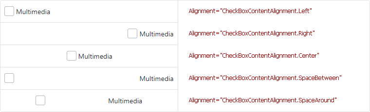
Default
|
The CheckBox content is aligned according to outer styles a user applies. |
Left
|
The CheckBox content is aligned to the left of the component’s root element. |
Right
|
The CheckBox content is aligned to the right of the component’s root element. |
Center
|
The CheckBox content is aligned to the center of component’s root element. |
SpaceBetween
|
The CheckBox content uses the |
SpaceAround
|
The CheckBox content uses |
Related API Members
The following properties accept/return CheckBoxContentAlignment values:
Remarks
Use the CheckBoxContentAlignment enumeration values to define alignment of a CheckBox‘s text label and check mark relative to each other.
<div>
    <DxCheckBox Checked="false"
                LabelPosition="LabelPosition.Right"
                Alignment="CheckBoxContentAlignment.Left">Multimedia</DxCheckBox>
</div>
Note
Checkbox alignment can work incorrectly when the CheckType property is set to CheckType.Switch and a text label is not specified.