DxMenu Class
A Menu component.
Namespace: DevExpress.Blazor
Assembly: DevExpress.Blazor.v20.2.dll
NuGet Package: DevExpress.Blazor
Declaration
public class DxMenu :
    DxControlComponent<DxMenu, MenuJSInteropProxy>,
    IMenuJSInteropProxyServer,
    IJSCallback,
    IModelWrapper<IMenuModel>
Remarks
<DxMenu> adds a menu to your Blazor application.
Add Menu to a Project
To add a <DxMenu> component to an application, follow the steps below:
- Create an application. If you use Microsoft project templates, configure the application as described in this topic: Microsoft Templates (Visual Studio).
- Add the
<DxMenu>…</DxMenu>markup to your application. - Configure the component (see the sections below).
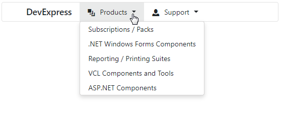
Items
You can specify menu items between the <DxMenu> and </DxMenu> tags or add them to the DxMenu.Items collection. Each item is a DxMenuItem class instance that can have a collection of child items (the DxMenuItem.Items property).
Use the ItemsPosition property to align items in the menu. To customize item content and appearance, use the Text, IconCssClass, CssClass properties.
<div class="card w-25">
    <DxMenu Title="DevExpress"
            ItemsPosition="MenuItemsPosition.Start">
        <Items>
            <DxMenuItem Text="Products" IconCssClass="oi oi-layers">
                <Items>
                    <DxMenuItem Text="Subscriptions / Packs" />
                    <DxMenuItem Text=".NET Windows Forms Components" />
                    <DxMenuItem Text="Reporting / Printing Suites" />
                    <DxMenuItem Text="VCL Components and Tools" />
                    <DxMenuItem Text="ASP.NET Components" />
                </Items>
            </DxMenuItem>
            <DxMenuItem Text="Support" IconCssClass="oi oi-person">
                <Items>
                    <DxMenuItem Text="Knowledge Base" />
                    <DxMenuItem Text="Documentation" />
                    <DxMenuItem Text="Support Center" />
                    <DxMenuItem Text="Newsgroups" />
                    <DxMenuItem Text="Best Practices" />
                </Items>
            </DxMenuItem>
        </Items>
    </DxMenu>
</div>
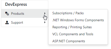
Orientation
The Menu’s default orientation is Horizontal (menu items are arranged in a row). Use the Orientation property to change the orientation.
<div>
    <DxMenu Title="DevExpress"
            Orientation="Orientation.Vertical"
            DisplayMode="MenuDisplayMode.Desktop">
        <Items>
            <DxMenuItem Text="Products" IconCssClass="oi oi-layers">
                <Items>
                    <DxMenuItem Text="Subscriptions / Packs" />
                    <DxMenuItem Text=".NET Windows Forms Components" />
                    <DxMenuItem Text="Reporting / Printing Suites" />
                    <DxMenuItem Text="VCL Components and Tools" />
                    <DxMenuItem Text="ASP.NET Components" />
                </Items>
            </DxMenuItem>
            <DxMenuItem Text="Support" IconCssClass="oi oi-person">
                <Items>
                    <DxMenuItem Text="Knowledge Base" />
                    <DxMenuItem Text="Documentation" />
                    <DxMenuItem Text="Support Center" />
                    <DxMenuItem Text="Newsgroups" />
                    <DxMenuItem Text="Best Practices" />
                </Items>
            </DxMenuItem>
        </Items>
    </DxMenu>
</div>
Display Modes
The Menu component supports different display modes (the DisplayMode property):
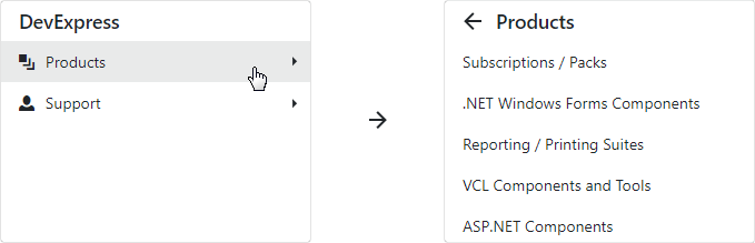
Auto- the menu is adapted to the device type.Desktop- the menu is shown as a panel with root items. The menu view also depends on the orientation. In the horizontal orientation, child items are available in drop-down menus. In the vertical orientation, submenus with child items are shown to the side of the menu container.Mobile- the menu has a compact view and depends on the orientation. In the horizontal orientation, it is a hamburger menu. In the vertical orientation, the menu looks like a desktop menu - a panel with root items, but submenus are shown in the main menu container and have the Back button.
The code below demonstrates how to specify display mode:
<DxMenu Title="DevExpress"
        Orientation="Orientation.Vertical"
        DisplayMode="MenuDisplayMode.Desktop">
    <Items>
        <DxMenuItem Text="Products" IconCssClass="oi oi-layers">
            <Items>
                <DxMenuItem Text="Subscriptions / Packs" />
                <DxMenuItem Text=".NET Windows Forms Components" />
                <DxMenuItem Text="Reporting / Printing Suites" />
                <DxMenuItem Text="VCL Components and Tools" />
                <DxMenuItem Text="ASP.NET Components" />
            </Items>
        </DxMenuItem>
        <DxMenuItem Text="Support" IconCssClass="oi oi-person">
            <Items>
                <DxMenuItem Text="Knowledge Base" />
                <DxMenuItem Text="Documentation" />
                <DxMenuItem Text="Support Center" />
                <DxMenuItem Text="Newsgroups" />
                <DxMenuItem Text="Best Practices" />
            </Items>
        </DxMenuItem>
    </Items>
</DxMenu>
Desktop Vertical Menu
Desktop Horizontal Menu
Mobile Horizontal Menu
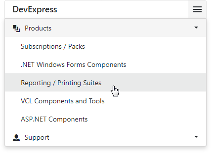
Mobile Vertical Menu
Adaptivity
The Menu component supports adaptive mode. The following properties specify how the menu responds when the width of the browser window changes and there is not enough space to display all the items:
- CollapseItemToIconMode - Specifies whether the menu hides item text and displays icons instead. You can also use the AdaptivePriority property to specify the order in which menu items are hidden.
- CollapseItemsToHamburgerMenu - Specifies whether menu items are collapsed into a hamburger menu. You can use the HamburgerButtonPosition property to specify the hamburger button’s position.
<DxMenu Title="DevExpress"
        CollapseItemToIconMode="MenuCollapseItemToIconMode.Sequentially"
        CollapseItemsToHamburgerMenu="true">
    <Items>
        <DxMenuItem Text="Products" IconCssClass="oi oi-layers" />
        <DxMenuItem Text="Support" IconCssClass="oi oi-person" />
        <DxMenuItem Text="Documentation" IconCssClass="oi oi-book" />
        <DxMenuItem Text="Demos" IconCssClass="oi oi-monitor" />
        <DxMenuItem Text="Blogs" IconCssClass="oi oi-bell" />
        <DxMenuItem Text="Search" IconCssClass="oi oi-magnifying-glass" />
    </Items>
</DxMenu>

Templates
The Menu component allows you to use templates to customize the layout and appearance of menu items and their parts.
You can specify a template for all items or for an individual item. Individual templates override common templates.
| What to Customize | Common Templates | Individual Templates |
|---|---|---|
| A whole item | DxMenu.ItemTemplate | DxMenuItem.Template |
| An item’s text | DxMenu.ItemTextTemplate | DxMenuItem.TextTemplate |
| An item’s submenu | DxMenu.SubMenuTemplate | DxMenuItem.SubMenuTemplate |
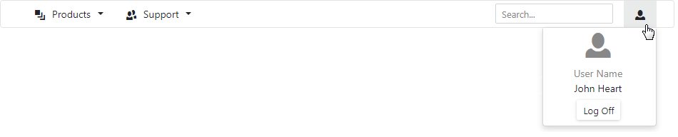
The following example demonstrates how to use templates to create the Search and User Profile menu items.
<div class="card">
    <DxMenu>
        <Items>
            <DxMenuItem Text="Products" IconCssClass="oi oi-layers">
                <Items>
                    <DxMenuItem Text="Subscriptions / Packs" />
                </Items>
            </DxMenuItem>
            <DxMenuItem Text="Support" IconCssClass="oi oi-people">
                <Items>
                    <DxMenuItem Text="Knowledge Base" />
                </Items>
            </DxMenuItem>
            <DxMenuItem Text="text" CssClass="ml-auto">
                <Template>
                    <div class="container">
                        <input type="text" class="form-control form-control-sm center" placeholder="Search...">
                    </div>
                </Template>
            </DxMenuItem>
            <DxMenuItem Text="User Profile">
                <TextTemplate>
                    <div class="oi oi-person" />
                </TextTemplate>
                <SubMenuTemplate>
                    <div class="w-100">
                        <div class="flex-column align-items-center justify-content-center">
                            <div class="logo-container d-flex align-items-center justify-content-center mt-2">
                                <div class="oi oi-person text-muted h1" />
                            </div>
                            <div class="user-name-container bm-3 mb-2">
                                <div class="user-name-title text-muted text-center">User Name</div>
                                <div class="user-name text-center">John Heart</div>
                            </div>
                            <div class="d-flex justify-content-center mb-2">
                                <DxButton Text="Log Off" RenderStyle="@ButtonRenderStyle.Secondary"></DxButton>
                            </div>
                        </div>
                    </div>
                </SubMenuTemplate>
            </DxMenuItem>
        </Items>
    </DxMenu>
</div>