DxGridLayout Class
A Grid Layout component.
Namespace: DevExpress.Blazor
Assembly: DevExpress.Blazor.v20.2.dll
NuGet Package: DevExpress.Blazor
Declaration
public class DxGridLayout :
    DxControlComponent<DxGridLayout, GridLayoutJSInteropProxy>,
    IGridLayoutJSInteropProxyServer,
    IJSCallback,
    IModelWrapper<IGridLayoutModel>
Remarks
<DxGridLayout> allows you to arrange UI elements on a page. The component is based on a CSS Grid Layout: layout items are organized into rows and columns.
If you need to organize layout items in a one-dimensional stack, use the DxStackLayout component.
Add a Grid Layout to a Project
Follow the steps below to add the Grid Layout component to an application:
- Use a DevExpress Project Template to create a new Blazor Server or Blazor WebAssembly application. If you use a Microsoft project template or already have a Blazor project, configure your project to incorporate DevExpress Blazor components.
- Add the
<DxGridLayout>…</DxGridLayout>markup to a Razor page. - Create rows and columns.
Arrange layout items in one of the following ways:
Create Rows and Columns
<DxGridLayout> defines rows and columns and then positions layout items within cells. A single item can span multiple rows or columns.
Follow the steps below to create rows and columns:
- Add
<Rows>...</Rows>and<Columns>...</Columns>to the component’s markup to define the Rows and Columns collections. - Add DxGridLayoutRow objects to the
Rowscollection. Use the Height property to specify the row height (auto, pixel, percentage, fr, etc.). Add DxGridLayoutColumn objects to the
Columnscollection. Use the Width property to specify the column width (auto, pixel, percentage, fr, etc.).Elements whose size is specified with the
frunit are arranged last, since they occupy the remaining space (this space is divided between these elements in proportion to the prefix number).Use RowSpacing and ColumnSpacing properties to specify the distance between rows and columns.
<DxGridLayout style="height:500px" ColumnSpacing="8px" RowSpacing="8px">
    <Rows>
        <DxGridLayoutRow Height="100px" /> @* the row's height equals 100 pixels *@
        <DxGridLayoutRow /> @* the row occupies the remaining space after two other rows are arranged *@
        <DxGridLayoutRow Height="auto"/> @* the row's height fits a content object. *@
    </Rows>
    <Columns>
        <DxGridLayoutColumn Width="2fr"/> @* the column occupies 2 parts of the remaining space
                                             after the column with a percentage value is arranged*@
        <DxGridLayoutColumn Width="60%" /> @* the column occupies 60% of the grid layout's width*@
        <DxGridLayoutColumn /> @* the Width property's default value is 1fr,
                                  the column occupies 1 part of the remaining space
                                  after the row with percentage value is arranged *@
    </Columns>
</DxGridLayout>
Create and Arrange Items
Define the Items collection to create layout items. Then arrange the items in one of the following ways:
The sections below demonstrate how to create the same grid layout in these two ways.
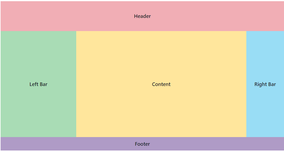
Use Row and Column Indexes
You can use row and column indexes to specify how to position layout items. This approach is similar to line-based placement in CSS grid. We recommend that you use this approach to create static layouts.
Follow the steps:
- Add
<Items>...</Items>to the component’s markup to define the Items collection. - Add DxGridLayoutItem objects to the collection. Use the Template property to specify item content.
- Use the Row and Column item properties to specify the row and column where the item should be located.
- Use the RowSpan and ColumnSpan properties to specify how many rows and columns the item occupies.
<DxGridLayout style="height:500px" ColumnSpacing="8px" RowSpacing="8px">
    <Rows>
        <DxGridLayoutRow Height="100px" />
        <DxGridLayoutRow  />
        <DxGridLayoutRow Height="auto" />
    </Rows>
    <Columns>
        <DxGridLayoutColumn Width="2fr" />
        <DxGridLayoutColumn Width="60%"/>
        <DxGridLayoutColumn />
    </Columns>
    <Items>
        <DxGridLayoutItem Row="0" Column="0" ColumnSpan="3">
            <Template>
                <div class="gridlayout-header gridlayout-item">
                    Header
                </div>
            </Template>
        </DxGridLayoutItem>
        <DxGridLayoutItem Row="1" Column="1">
            <Template>
                <div class="gridlayout-content gridlayout-item">
                    Content
                </div>
            </Template>
        </DxGridLayoutItem>
        <DxGridLayoutItem Row="1" Column="0">
            <Template>
                <div class="gridlayout-left-side-bar gridlayout-item">
                    Left Bar
                </div>
            </Template>
        </DxGridLayoutItem>
        <DxGridLayoutItem Row="1" Column="2">
            <Template>
                <div class="gridlayout-right-side-bar gridlayout-item">
                    Right Bar
                </div>
            </Template>
        </DxGridLayoutItem>
        <DxGridLayoutItem Row="2" Column="0" ColumnSpan="3">
            <Template>
                <div class="gridlayout-footer gridlayout-item">
                    Footer
                </div>
            </Template>
        </DxGridLayoutItem>
    </Items>
</DxGridLayout>
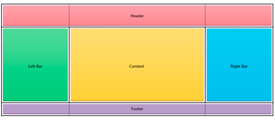
Use Named Areas
You can assign area names to layout items and then specify how these areas are placed in the grid rows. This approach is similar to grid template areas in CSS grid. We recommend that you use this approach to create responsive layouts (refer to Adaptivity).
Follow the steps:
- Add
<Items>...</Items>to the component’s markup to define the Items collection. - Add DxGridLayoutItem objects to the collection. Use the Template property to specify item content.
- Use the Area property to assign an area name to each layout item.
- Use the DxGridLayoutRow.Areas property to place the areas in the rows. If you need to leave a grid cell empty, use a period character (
.).
<DxGridLayout style="height:500px" ColumnSpacing="8px" RowSpacing="8px">
    <Rows>
        <DxGridLayoutRow Areas="header header header" Height="100px" />
        <DxGridLayoutRow Areas="left-bar content right-bar" />
        <DxGridLayoutRow Areas="footer footer footer" Height="auto" />
    </Rows>
    <Columns>
        <DxGridLayoutColumn Width="2fr" />
        <DxGridLayoutColumn Width="60%"/>
        <DxGridLayoutColumn />
    </Columns>
    <Items>
        <DxGridLayoutItem Area="header">
            <Template>
                <div class="gridlayout-header gridlayout-item">
                    Header
                </div>
            </Template>
        </DxGridLayoutItem>
        <DxGridLayoutItem Area="content">
            <Template>
                <div class="gridlayout-content gridlayout-item">
                    Content
                </div>
            </Template>
        </DxGridLayoutItem>
        <DxGridLayoutItem Area="left-bar">
            <Template>
                <div class="gridlayout-left-side-bar gridlayout-item">
                    Left Bar
                </div>
            </Template>
        </DxGridLayoutItem>
        <DxGridLayoutItem Area="right-bar">
            <Template>
                <div class="gridlayout-right-side-bar gridlayout-item">
                    Right Bar
                </div>
            </Template>
        </DxGridLayoutItem>
        <DxGridLayoutItem Area="footer">
            <Template>
                <div class="gridlayout-footer gridlayout-item">
                    Footer
                </div>
            </Template>
        </DxGridLayoutItem>
    </Items>
</DxGridLayout>
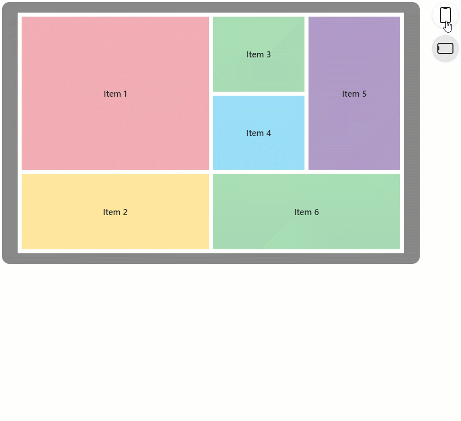
Adaptivity
You can use the DxLayoutBreakpoint component to adapt a grid layout to different screen sizes.
The code below does the following:
- Creates an
IsXSmallScreendata field. - Adds a
DxGridLayoutcomponent, uses named areas to arrange items, and adapts the layout for different screen sizes depending on theIsXSmallScreenfield value. - Adds a
DxLayoutBreakpointcomponent. The DeviceSize property specifies the device size when the breakpoint should be activated. The IsActive property is bound to theIsXSmallScreenfield. When the breakpoint is activated, theIsActiveproperty and the boundIsXSmallScreenfield equaltrue.
<DxLayoutBreakpoint DeviceSize="DeviceSize.XSmall" @bind-IsActive="@IsXSmallScreen" />

<DxGridLayout CssClass="h-100" ColumnSpacing="8px" RowSpacing="8px">
    <Rows>
        @if(isXSmallScreen) {
            <DxGridLayoutRow Areas="item1" />
            <DxGridLayoutRow Areas="item2" />
            <DxGridLayoutRow Areas="item3" />
            <DxGridLayoutRow Areas="item4" />
            <DxGridLayoutRow Areas="item5" />
            <DxGridLayoutRow Areas="item6" />
        } else {
            <DxGridLayoutRow Areas="item1 item3 item5" />
            <DxGridLayoutRow Areas="item1 item4 item5"/>
            <DxGridLayoutRow Areas="item2 item6 item6"/>
        }
    </Rows>
    <Columns>
        <DxGridLayoutColumn Width="2fr" />
        @if(!isXSmallScreen) {
            <DxGridLayoutColumn />
            <DxGridLayoutColumn />
        }
    </Columns>
    <Items>
        <DxGridLayoutItem Area="item1">
            <Template>
                <div class="gridlayout-header gridlayout-item">
                    Item 1
                </div>
            </Template>
        </DxGridLayoutItem>
        <DxGridLayoutItem Area="item2">
            <Template>
                <div class="gridlayout-content gridlayout-item">
                    Item 2
                </div>
            </Template>
        </DxGridLayoutItem>
        <DxGridLayoutItem Area="item3">
            <Template>
                <div class="gridlayout-left-side-bar gridlayout-item">
                    Item 3
                </div>
            </Template>
        </DxGridLayoutItem>
        <DxGridLayoutItem Area="item4">
            <Template>
                <div class="gridlayout-right-side-bar gridlayout-item">
                    Item 4
                </div>
            </Template>
        </DxGridLayoutItem>
        <DxGridLayoutItem Area="item5">
            <Template>
                <div class="gridlayout-footer gridlayout-item">
                    Item 5
                </div>
            </Template>
        </DxGridLayoutItem>
        <DxGridLayoutItem Area="item6">
            <Template>
                <div class="gridlayout-left-side-bar gridlayout-item">
                    Item 6
                </div>
            </Template>
        </DxGridLayoutItem>
    </Items>
</DxGridLayout>

@code {
    bool isXSmallScreen;
}