DxLayoutBreakpoint Class
A layout breakpoint.
Namespace: DevExpress.Blazor
Assembly: DevExpress.Blazor.v20.2.dll
NuGet Package: DevExpress.Blazor
Declaration
public class DxLayoutBreakpoint :
    DxComponentBase,
    IModelWrapper<ILayoutBreakpointModel>
Remarks
<DxLayoutBreakpoint> allows you to adapt a page layout to different screen sizes. For example, you can use breakpoints to create responsive DxGridLayout, DxStackLayout, or any other components.
Add a Layout Breakpoint to a Project
Follow the steps below to add the Layout Breakpoint component to an application:
- Use a DevExpress Project Template to create a new Blazor Server or Blazor WebAssembly application. If you use a Microsoft project template or already have a Blazor project, configure your project to incorporate DevExpress Blazor components.
- Add the
<DxLayoutBreakpoint />markup to a page. - Use the DeviceSize or MinWidth/MaxWidth property to specify the screen size when the breakpoint should be activated.
- Use the @bind attribute to bind the breakpoint’s IsActive property to a data field.
- Use this data field in components that should be adapted.
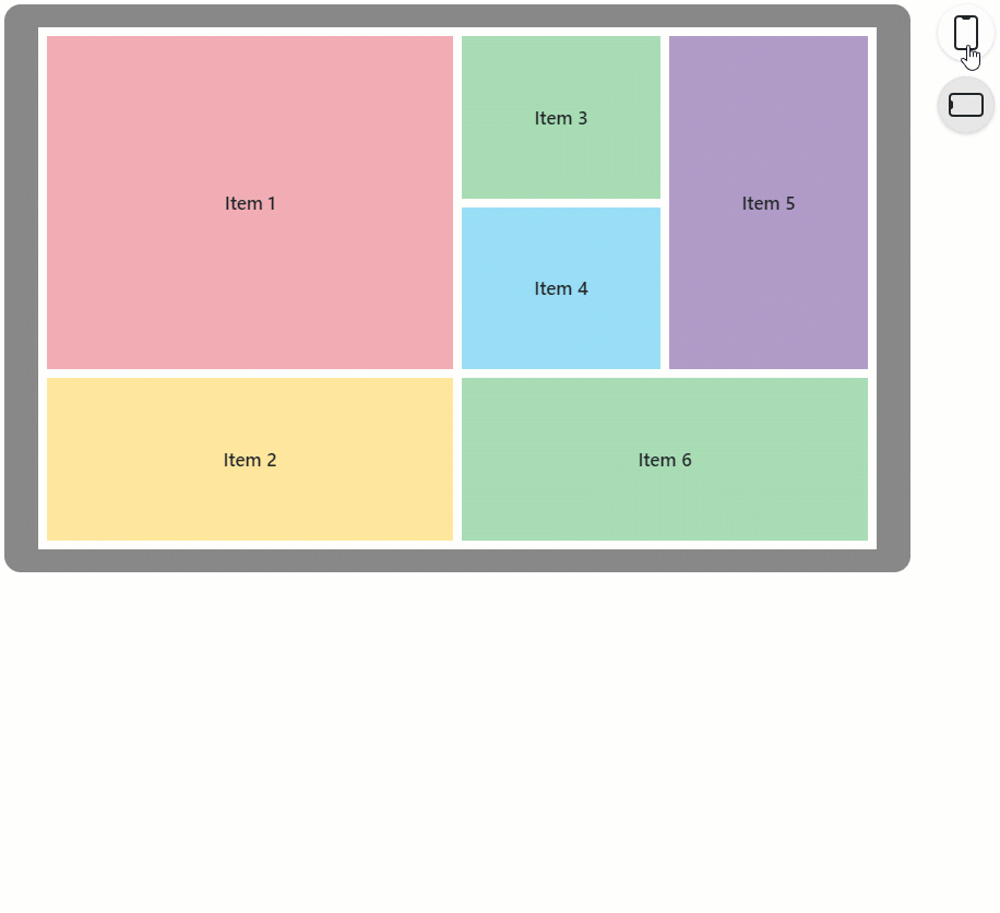
The following example demonstrates how to use a layout breakpoint to create an adaptive DxGridLayout:
<DxLayoutBreakpoint DeviceSize="DeviceSize.XSmall" @bind-IsActive="@IsXSmallScreen" />

<DxGridLayout CssClass="h-100" ColumnSpacing="8px" RowSpacing="8px">
    <Rows>
        @if(isXSmallScreen) {
            <DxGridLayoutRow Areas="item1" />
            <DxGridLayoutRow Areas="item2" />
            <DxGridLayoutRow Areas="item3" />
            <DxGridLayoutRow Areas="item4" />
            <DxGridLayoutRow Areas="item5" />
            <DxGridLayoutRow Areas="item6" />
        } else {
            <DxGridLayoutRow Areas="item1 item3 item5" />
            <DxGridLayoutRow Areas="item1 item4 item5"/>
            <DxGridLayoutRow Areas="item2 item6 item6"/>
        }
    </Rows>
    <Columns>
        <DxGridLayoutColumn Width="2fr" />
        @if(!isXSmallScreen) {
            <DxGridLayoutColumn />
            <DxGridLayoutColumn />
        }
    </Columns>
    <Items>
        <DxGridLayoutItem Area="item1">
            <Template>
                <div class="gridlayout-header gridlayout-item">
                    Item 1
                </div>
            </Template>
        </DxGridLayoutItem>
        <DxGridLayoutItem Area="item2">
            <Template>
                <div class="gridlayout-content gridlayout-item">
                    Item 2
                </div>
            </Template>
        </DxGridLayoutItem>
        <DxGridLayoutItem Area="item3">
            <Template>
                <div class="gridlayout-left-side-bar gridlayout-item">
                    Item 3
                </div>
            </Template>
        </DxGridLayoutItem>
        <DxGridLayoutItem Area="item4">
            <Template>
                <div class="gridlayout-right-side-bar gridlayout-item">
                    Item 4
                </div>
            </Template>
        </DxGridLayoutItem>
        <DxGridLayoutItem Area="item5">
            <Template>
                <div class="gridlayout-footer gridlayout-item">
                    Item 5
                </div>
            </Template>
        </DxGridLayoutItem>
        <DxGridLayoutItem Area="item6">
            <Template>
                <div class="gridlayout-left-side-bar gridlayout-item">
                    Item 6
                </div>
            </Template>
        </DxGridLayoutItem>
    </Items>
</DxGridLayout>

@code {
    bool isXSmallScreen;
}
Inheritance
Object
ComponentBase
DevExpress.Blazor.Base.DxAsyncDisposableComponent
DevExpress.Blazor.Base.DxDecoratedComponent
DxComponentBase
DxLayoutBreakpoint
See Also