DxPopup Class
A Popup component.
Namespace: DevExpress.Blazor
Assembly: DevExpress.Blazor.v20.2.dll
NuGet Package: DevExpress.Blazor
Declaration
public class DxPopup :
    DxComponentBase
Remarks
The DevExpress Popup for Blazor (<DxPopup>) is a pop-up window that overlays the current view. The component consists of a header with a Close button, the pop-up window’s content, and a footer.
Add a Popup to a Project
Follow the steps below to add the Popup component to an application:
- Use a DevExpress Project Template to create a new Blazor Server or Blazor WebAssembly application. If you use a Microsoft project template or already have a Blazor project, configure your project to incorporate DevExpress Blazor components.
- Add the
<DxPopup>…</DxPopup>markup to a Razor page. - Configure the component (see the sections below).
Show/Hide Popup
Use the Visible property to show or hide the pop-up window.
<div class="target-container" @onclick="@(() => PopupVisible = true)"></div>
<DxPopup HeaderText="Header"
         @bind-Visible="@PopupVisible">
    ...
</DxPopup>

@code {
    bool PopupVisible { get; set; } = false;
}
To respond to the property change, handle the VisibleChanged event.
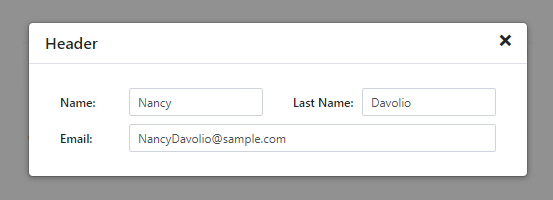
Content
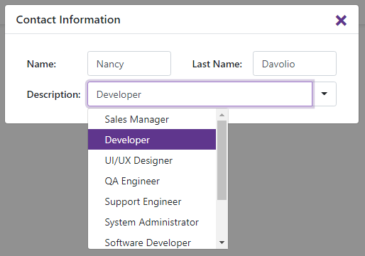
You can specify the pop-up window’s content directly between the <DxPopup> and </DxPopup> tags. When you define a header and/or footer template, use the Content property. The pop-up window’s content can include any UI fragment (for instance, text, an image, or another component).
The code below displays the DxFormLayout component within the pop-up window.
<DxPopup HeaderText="Contact information" ...>
    <DxFormLayout>
        <DxFormLayoutItem Caption="Name:" ColSpanMd="6">
            <Template>
                <DxTextBox Text="Nancy"></DxTextBox>
            </Template>
        </DxFormLayoutItem>
        <DxFormLayoutItem Caption="Last Name:" ColSpanMd="6">
            <Template>
                <DxTextBox Text="Davolio"></DxTextBox>
            </Template>
        </DxFormLayoutItem>
        <DxFormLayoutItem Caption="Email:" ColSpanMd="12">
            <Template>
                <DxTextBox Text="NancyDavolio@sample.com"></DxTextBox>
            </Template>
        </DxFormLayoutItem>
    </DxFormLayout>
</DxPopup>
Header
The HeaderText property specifies text displayed in the pop-up window’s header.
<DxPopup HeaderText="Header" ...>
    <p>...</p>
</DxPopup>
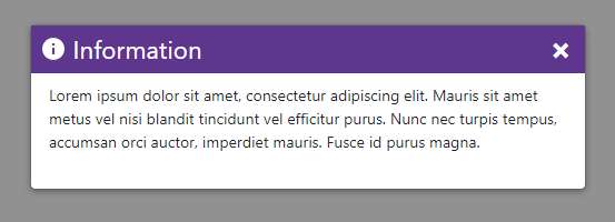
Use the HeaderTemplate property to customize the pop-up window’s header.
<DxPopup CssClass="custom-popup" ...>
    <HeaderTemplate>
        <div class="custom-header bg-primary text-white w-100">
            <span class="demo-icon-info bg-white"></span>
            Information
            <a class="close-button oi oi-x text-white" href="javascript:;" aria-hidden="true" role="button" aria-label="Close popup" @onclick="@(() => PopupVisible = false)"></a>
        </div>
    </HeaderTemplate>
    <Content>
        <p>Lorem ipsum dolor sit amet, consectetur adipiscing elit. Mauris sit amet metus vel nisi blandit tincidunt vel efficitur purus.
        Nunc nec turpis tempus, accumsan orci auctor, imperdiet mauris. Fusce id purus magna.</p>
    </Content>
</DxPopup>
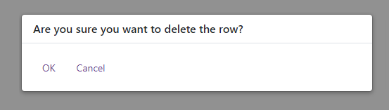
To handle the Close button click, use the CloseButtonClick event. To hide the Close button, set the ShowCloseButton property to false. The code snippet below demonstrates how to close the pop-up window when the Close button is hidden.
<div class="target-container" @onclick="@(() => PopupVisible = true)">Delete</div>
<DxPopup HeaderText="Are you sure you want to delete the row?"
         ShowCloseButton="false"
         @bind-Visible="@PopupVisible">
    <div>
        <button class="btn btn-link" type="button" @onclick="@OnDelete">OK</button>
        <button class="btn btn-link" type="button" @onclick="@(() => PopupVisible = false)">Cancel</button>
    </div>
</DxPopup>

@code {
    WeatherForecast[] forecasts;
    WeatherForecast DeletedForecast;

    bool PopupVisible = false;

    async void OnDelete() {
        if (DeletedForecast != null)
            forecasts = await ForecastService.Remove(DeletedForecast);
        PopupVisible = false;
    }
}
Set the ShowHeader property to false to hide the entire header.
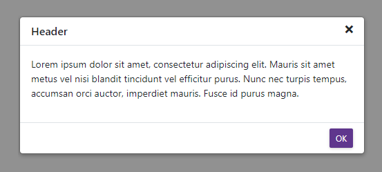
Footer
The Popup component does not display a predefined footer in the pop-up window. Use the FooterTemplate property to specify footer content.
<DxPopup HeaderText="Header"
        @bind-Visible="@PopupVisible">
    <Content>
        <p>Lorem ipsum dolor sit amet, consectetur adipiscing elit. Mauris sit amet metus vel nisi blandit tincidunt vel efficitur purus.
            Nunc nec turpis tempus, accumsan orci auctor, imperdiet mauris. Fusce id purus magna.</p>
    </Content>
    <FooterTemplate>
        <div class="modal-footer">
            <button class="btn btn-primary" @onclick="@(() => PopupVisible = false)">OK</button>
        </div>
    </FooterTemplate>
</DxPopup>

@code {
    bool PopupVisible { get; set; }
}
Scrolling
When a pop-up window contains an element whose content does not fit the window’s size entirely, this content is displayed over the window’s boundaries.
Set the Scrollable property to true to display all the content within the pop-up window’s boundaries and show scroll bars.
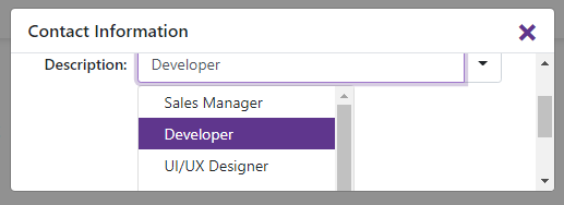
<DxPopup HeaderText="Contact Information" Scrollable="true">
      ...
</DxPopup>