DxSchedulerAppointmentLabelItem Class
A label used to categorize appointments in the Scheduler.
Namespace: DevExpress.Blazor
Assembly: DevExpress.Blazor.v20.2.dll
NuGet Package: DevExpress.Blazor
Declaration
public class DxSchedulerAppointmentLabelItem :
    DxSchedulerSourceObjectContainer
Related API Members
The following members return DxSchedulerAppointmentLabelItem objects:
Remarks
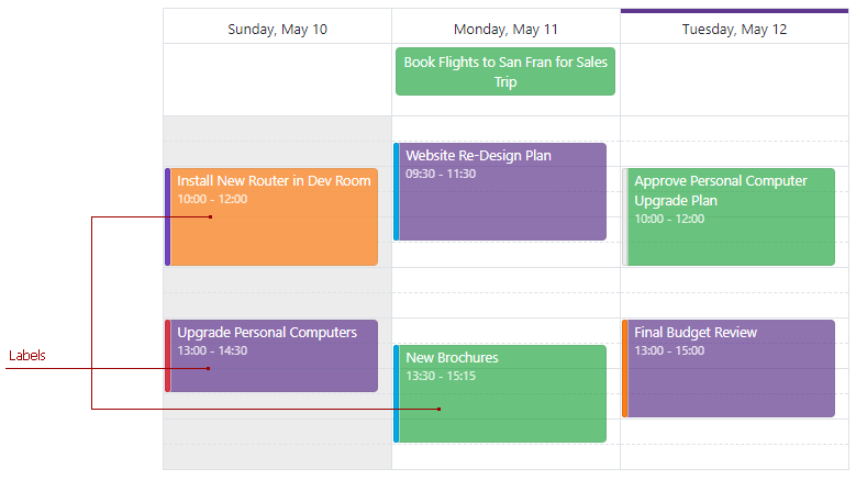
You can use color labels to categorize appointments. A label is displayed as an appointment’s background.
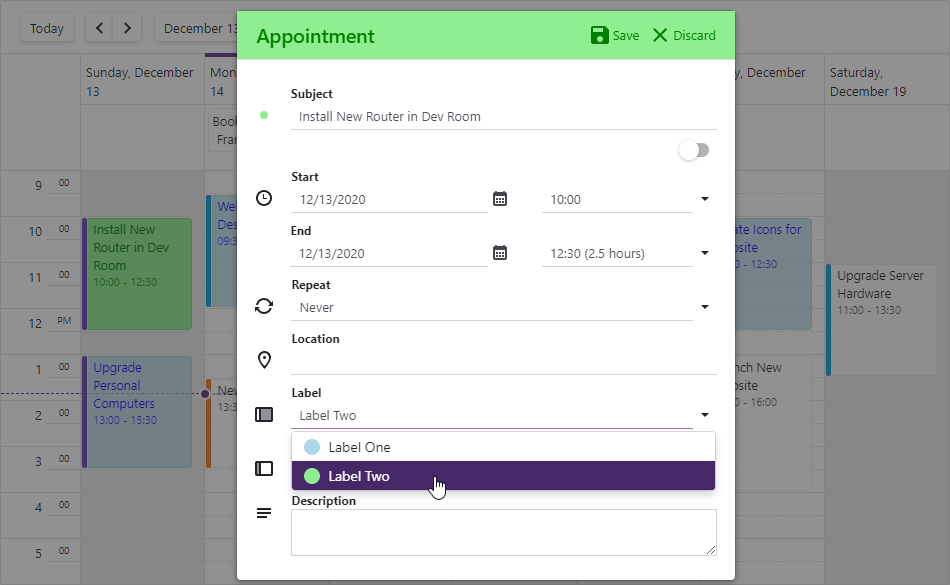
When users create or edit an appointment in the Appointment form, they can select the appointment’s label from the drop-down Label list.
The Caption property specifies the label’s text. The Color or BackgroundCssClass property defines the appearance of appointments to which the label is assigned. The TextCssClass specifies a CSS class applied to appointment text.
Note
When you use templates to customize appointment appearance, the Color, BackgroundCssClass, and TextCssClass property values are not applied to appointments. In the template, you can use the context.Label parameter to access these property values.
Built-In Labels
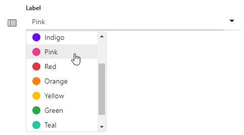
The Scheduler has a built-in collection of 11 color labels.
- Light (ID: 0)
- Blue (ID: 1)
- Purple (ID: 2)
- Indigo (ID: 3)
- Pink (ID: 4)
- Red (ID: 5)
- Orange (ID: 6)
- Yellow (ID: 7)
- Green (ID: 8)
- Teal (ID: 9)
- Cyan (ID: 10)
Custom Labels
Do the following to create a new collection with your own labels:
- Create a DxSchedulerDataStorage object with a simple constructor and specify appointment mappings. See the DxSchedulerAppointmentMappings class description for more information.
- Declare a class that stores label options (for instance, LabelObject).
- Create a collection of label source objects (LabelObject class instances) and define their options:
- Id - Specifies the label’s unique identifier.
- Caption - Specifies the caption of the appointment’s label.
- Color - Specifies the color of the appointment’s label.
- BackgroundCssClass - Specifies the CSS class applied to the appointment’s background (the background color, background image, border color, and so on). Note that the Color property value overrides the background color specified in the CSS class.
- TextCssClass - Specifies the CSS class applied to the appointment’s text.
- Assign the newly created collection to the storage’s AppointmentLabelsSource property.
- Create a DxSchedulerAppointmentLabelMappings instance and map the label’s source fields to the label’s properties.
- Optionally, you can also create custom fields for label items. Define custom fields in the label’s source object and add these fields to the CustomFieldMappings collection. For instance, the code below adds the MyCustomField field to the LabelObject and maps this field to the label’s MyCustomProperty.
- Assign the DxSchedulerAppointmentLabelMappings instance to the AppointmentLabelMappings property.
<DxScheduler StartDate="@DateTime.Today"
             DataStorage="@DataStorage">
    <DxSchedulerWeekView ShowWorkTimeOnly="true"></DxSchedulerWeekView>
</DxScheduler>

@code {
    public class LabelObject {
        public int Id { get; set; }
        public string LabelCaption { get; set; }
        public System.Drawing.Color LabelColor { get; set; }
        public string TextCssClass { get; set; }
        public string BackgroundCssClass { get; set; }
        public string MyCustomField { get; set; } // A custom field
    }
    DxSchedulerDataStorage DataStorage = new DxSchedulerDataStorage() {
        // Specify appointment mappings here.
        // ...
        AppointmentLabelsSource = new List<LabelObject>() {
            new LabelObject() {
                Id = 1,
                LabelCaption = "Label One",
                LabelColor = System.Drawing.Color.LightBlue,
                // Uncomment the line below and comment the line above to specify other background options.
                // BackgroundCssClass = "label1-background",
                TextCssClass = "label1-text",
                MyCustomField = "Custom text for Label One",
            },
            new LabelObject() {
                Id = 2,
                LabelCaption = "Label Two",
                LabelColor = System.Drawing.Color.LightGreen,
                // Uncomment the line below and comment the line above to specify other background options.
                // BackgroundCssClass = "label2-background",
                TextCssClass = "label2-text",
                MyCustomField = "Custom text for Label Two",
            },
        },
        AppointmentLabelMappings = new DxSchedulerAppointmentLabelMappings() {
            Id = "Id",
            Caption = "LabelCaption",
            Color = "LabelColor",
            // Uncomment the line below and comment the line above to specify other background options.
            //BackgroundCssClass = "BackgroundCssClass",
            TextCssClass = "TextCssClass",
            // Map the source object's custom field to the label's custom property.
            CustomFieldMappings = new List<DxSchedulerCustomFieldMapping> {
                new DxSchedulerCustomFieldMapping { Name = "MyCustomProperty", Mapping = "MyCustomField" }
            }
        }
    };
}

<style>
    .label1-background {
        background-color: lightblue;
        border-color: blue;
    }
    .label2-background {
        background-color: lightgreen;
        border-color: green;
    }
    .label1-text {
        color: blue;
    }
    .label2-text {
        color: green;
    }
</style>