DxContextMenu Class
A Context Menu component.
Namespace: DevExpress.Blazor
Assembly: DevExpress.Blazor.v20.2.dll
NuGet Package: DevExpress.Blazor
Declaration
public class DxContextMenu :
    DxComponent<ContextMenuComponentViewModel>,
    IDisposable
Remarks
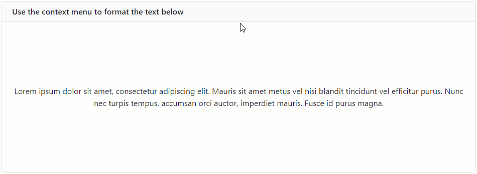
<DxContextMenu> adds a context menu to your Blazor application.
Add a Context Menu to a Project
Follow the steps below to add the Context Menu component to an application:
- Use a DevExpress Project Template to create a new Blazor Server or Blazor WebAssembly application. If you use a Microsoft project template or already have a Blazor project, configure your project to incorporate DevExpress Blazor components.
- Add the
<DxContextMenu>…</DxContextMenu>markup to a Razor page. Configure the component: add items, customize their appearance, handle clicks, etc.
You can use two methods to populate the control:
Add code that invokes the context menu when users right-click an HTML element.
Unbound Mode
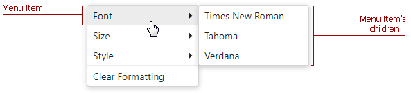
In this mode, you should add items to the Context Menu component markup. Use the DxContextMenuBase.Items property to specify a collection of root items. Each item is a DxContextMenuItem class instance that can have a collection of child items (the DxContextMenuItem.Items property).
<DxContextMenu>
    <Items>
        <DxContextMenuItem Text="Font">
            <Items>
                <DxContextMenuItem Text="Times New Roman"></DxContextMenuItem>
                <DxContextMenuItem Text="Tahoma"></DxContextMenuItem>
                <DxContextMenuItem Text="Verdana"></DxContextMenuItem>
            </Items>
        </DxContextMenuItem>
        <DxContextMenuItem Text="Size">
            <Items>
                <DxContextMenuItem Text="8pt"></DxContextMenuItem>
                <DxContextMenuItem Text="10pt"></DxContextMenuItem>
                <DxContextMenuItem Text="12pt"></DxContextMenuItem>
            </Items>
        </DxContextMenuItem>
        <DxContextMenuItem Text="Style">
            <Items>
                <DxContextMenuItem Text="Bold"></DxContextMenuItem>
                <DxContextMenuItem Text="Italic"></DxContextMenuItem>
                <DxContextMenuItem Text="Underline"></DxContextMenuItem>
            </Items>
        </DxContextMenuItem>
        <DxContextMenuItem Text="Clear Formatting" BeginGroup="true"></DxContextMenuItem>
    </Items>
</DxContextMenu>
Customize Items
To specify an item’s name, use the Name property.
The table below lists API members that allow you to customize item appearance.
| Member | Description |
|---|---|
| Text | Specifies a menu item’s text. |
| IconCssClass | Specifies the CSS class of a menu item’s icon. |
| IconUrl | Specifies the URL of a menu item’s icon. |
The following code demonstrates how to add items to a menu and specify their icons:
<DxContextMenu>
    <Items>
        <DxContextMenuItem Text="Home" IconCssClass="oi oi-home"></DxContextMenuItem>
        <DxContextMenuItem Text="Contacts" IconCssClass="oi oi-phone"></DxContextMenuItem>
        <DxContextMenuItem Text="Calendar" IconCssClass="oi-calendar"></DxContextMenuItem>
    </Items>
</DxContextMenu>
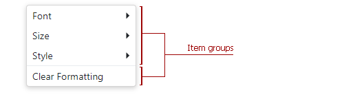
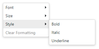
Group Items
You can split context menu items into groups. To specify the start of a new item group, use the BeginGroup property.
<DxContextMenu>
    <Items>
        <DxContextMenuItem Text="Font">
            <Items>
                ...
            </Items>
        </DxContextMenuItem>
        <DxContextMenuItem Text="Size">
            <Items>
                ...
            </Items>
        </DxContextMenuItem>
        <DxContextMenuItem Text="Style">
            <Items>
                ...
            </Items>
        </DxContextMenuItem>
        <DxContextMenuItem Text="Clear Formatting" BeginGroup="true"></DxContextMenuItem>
    </Items>
</DxContextMenu>
A horizontal line separates groups:
Handle Item Click
The following API members allow you to specify click handlers for context menu items:
| Member | Description |
|---|---|
| ItemClick | Specifies a common handler for all items. |
| Click | Specifies handlers for individual items. |
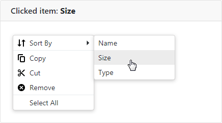
The code below demonstrates how to specify a common click handler for all menu items. When an item is clicked in the menu, the item’s text is displayed in the header.
<div class="card-header">
    @if (ClickedItem != null) {
        <span>Clicked item: <b>@ClickedItem</b></span>
    }
    else {
        <span>Clicked item: None</span>
    }
</div>

<DxContextMenu ItemClick="@OnItemClick">
    <Items>
        <DxContextMenuItem Text="Sort By" IconUrl="images/Sort_by.svg">
            <Items>
                <DxContextMenuItem Text="Name"></DxContextMenuItem>
                <DxContextMenuItem Text="Size"></DxContextMenuItem>
                <DxContextMenuItem Text="Type"></DxContextMenuItem>
            </Items>
        </DxContextMenuItem>
        ...
    </Items>
</DxContextMenu>

@code {
    string ClickedItem { get; set; }

    void OnItemClick(ContextMenuItemClickEventArgs args) {
        ClickedItem = args.ItemInfo.Text;
    }
}
Disable User Interaction
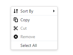
To disable a menu item, set its Enabled property to false. The code below disables the Cut and Remove menu items.
<DxContextMenu>
    <Items>
        <DxContextMenuItem Text="Sort By" IconUrl="images/Sort_by.svg">
            <Items>
                ...
            </Items>
        </DxContextMenuItem>
        <DxContextMenuItem Text="Copy" IconUrl="images/Copy.svg" BeginGroup="true"></DxContextMenuItem>
        <DxContextMenuItem Text="Cut" IconUrl="images/Cut.svg" Enabled="false"></DxContextMenuItem>
        <DxContextMenuItem Text="Remove" IconUrl="images/Clear.svg" Enabled="false"></DxContextMenuItem>
        <DxContextMenuItem Text="Select All" BeginGroup="true"></DxContextMenuItem>
    </Items>
</DxContextMenu>
Bound Mode
You can bind the Context Menu component to hierarchical data structures. To do this, use the following API members:
- Data - Specifies a data source that supplies menu items.
- ChildrenExpression - Specifies a lambda expression that returns a data item’s children.
Note
If you bind the Context Menu component with a nonempty Items collection to a data source, unbound data is lost. Bound data overwrites all the items added to the Items collection.
<DxContextMenu Data="@MenuItems"
               ChildrenExpression="(item => (item as TextFormattingMenuItem).Children)">
</DxContextMenu>

@code {
    List<TextFormattingMenuItem> menuItems;
    TextFormatting Formatting { get; set; } = new TextFormatting();

    public class TextFormatting {
        public string FontFamily { get; set; }
        public int FontSize { get; set; }
        public Dictionary<string, bool> Decoration { get; } = new Dictionary<string, bool>() {
            { "Bold", false },
            { "Italic" , false },
            { "Underline" , false }
        };
    }

    abstract class TextFormattingMenuItem {
        protected TextFormattingMenuItem(TextFormatting textFormatting, string text) {
            TextFormatting = textFormatting;
            Text = text;
        }

        public TextFormatting TextFormatting { get; }
        public string Text { get; }
        public List<TextFormattingMenuItem> Children { get; set; }
    }

    List<TextFormattingMenuItem> MenuItems {
        get {
            if (menuItems == null) {
                menuItems = new List<TextFormattingMenuItem>() {
                    new TextFormattingParentMenuItem(Formatting, "Font", new List<TextFormattingMenuItem>() {
                        new FontFamilyMenuItem(Formatting, "Times New Roman", "Times New Roman"),
                        new FontFamilyMenuItem(Formatting, "Tahoma", "Tahoma"),
                        new FontFamilyMenuItem(Formatting, "Verdana", "Verdana")
                    }),
                    new TextFormattingParentMenuItem(Formatting, "Size", new List<TextFormattingMenuItem>() {
                        new FontSizeMenuItem(Formatting, "8pt", 8),
                        new FontSizeMenuItem(Formatting, "10pt", 10),
                        new FontSizeMenuItem(Formatting, "12pt", 12)
                    }),
                    new TextFormattingParentMenuItem(Formatting, "Style", new List<TextFormattingMenuItem>() {
                        new TextDecorationMenuItem(Formatting, "Bold", "Bold"),
                        new TextDecorationMenuItem(Formatting, "Italic", "Italic"),
                        new TextDecorationMenuItem(Formatting, "Underline", "Underline")
                    }),
                    new ClearFormattingMenuItem(Formatting) { BeginGroup = true }
                };
            }
            return menuItems;
        }
    }
}
You can also bind the Context Menu component to Data Grid elements. Refer to the following example for more information.
Customize Items
To specify an item’s name, use the NameExpression property.
The table below lists API members that allow you to customize item appearance.
| Member | Description |
|---|---|
| TextExpression | Specifies an expression that returns a menu item’s text. |
| IconCssClassExpression | Specifies an expression that returns the CSS class of a menu item’s icon. |
| IconUrlExpression | Specifies an expression that returns the URL of a menu item’s icon. |
| VisibleExpression | Specifies an expression that returns a Boolean value. This value indicates whether an item is visible. |
Group Items
You can split context menu items into groups. A horizontal line separates groups:
To specify the start of a new item group, use the BeginGroupExpression property.
<DxContextMenu Data="@MenuItems"
               BeginGroupExpression="(item => (item as TextFormattingMenuItem).BeginGroup)">
</DxContextMenu>

@code {
    List<TextFormattingMenuItem> menuItems;
    TextFormatting Formatting { get; set; } = new TextFormatting();

    public class TextFormatting {
        ...
    }

    abstract class TextFormattingMenuItem {
        ...
        public bool BeginGroup { get; set; }
    }

    List<TextFormattingMenuItem> MenuItems {
        get {
            if (menuItems == null) {
                menuItems = new List<TextFormattingMenuItem>() {
                    new TextFormattingParentMenuItem(Formatting, "Font", new List<TextFormattingMenuItem>() {
                        ...
                    }),
                    new TextFormattingParentMenuItem(Formatting, "Size", new List<TextFormattingMenuItem>() {
                        ...
                    }),
                    new TextFormattingParentMenuItem(Formatting, "Style", new List<TextFormattingMenuItem>() {
                        ...
                    }),
                    new ClearFormattingMenuItem(Formatting) { BeginGroup = true }
                };
            }
            return menuItems;
        }
    }
}
Handle Item Click
The following API members allow you to specify click handlers for context menu items:
| Member | Description |
|---|---|
| ItemClick | Specifies a common handler applied to all items. |
| ClickExpression | Specifies different handlers for different menu items. |
<DxContextMenu Data="@MenuItems"
               ClickExpression="(item => (item as TextFormattingMenuItem).Click)">
</DxContextMenu>

@code {
    List<TextFormattingMenuItem> menuItems;

    abstract class TextFormattingMenuItem {
        protected TextFormattingMenuItem(TextFormatting textFormatting, string text) {
            TextFormatting = textFormatting;
            Text = text;
        }

        public TextFormatting TextFormatting { get; }
        public string Text { get; }
        public virtual void Click() { }
    }
}
Disable User Interaction
To ignore user interaction with individual menu items, use the EnabledExpression property. It allows you to specify a lambda expression that indicates whether an item is enabled/disabled.
The code below disables the Clear Formatting menu item.
<DxContextMenu Data="@MenuItems"
               EnabledExpression="(item => (item as TextFormattingMenuItem).Enabled)">
</DxContextMenu>

@code {
    List<TextFormattingMenuItem> menuItems;
    TextFormatting Formatting { get; set; } = new TextFormatting();

    public class TextFormatting {
        ...
    }

    abstract class TextFormattingMenuItem {
        ...
        public bool Enabled { get; set; }
    }

    List<TextFormattingMenuItem> MenuItems {
        get {
            if (menuItems == null) {
                menuItems = new List<TextFormattingMenuItem>() {
                    new TextFormattingParentMenuItem(Formatting, "Font", new List<TextFormattingMenuItem>() {
                        ...
                    }),
                    new TextFormattingParentMenuItem(Formatting, "Size", new List<TextFormattingMenuItem>() {
                        ...
                    }),
                    new TextFormattingParentMenuItem(Formatting, "Style", new List<TextFormattingMenuItem>() {
                        ...
                    }),
                    new ClearFormattingMenuItem(Formatting) { Enabled = false }
                };
            }
            return menuItems;
        }
    }
}
Show/Hide Context Menu
To display a context menu, handle an event (for example, contextMenu) and call the Show method. Refer to ASP.NET Core Blazor Event Handling for more information.
<div style="height: 200px;"
     @oncontextmenu="((e) => ContextMenu.Show(e))"
     @oncontextmenu:preventDefault>
    <span style="font-weight: 600">RIGHT-CLICK TO SHOW THE CONTEXT MENU</span>
</div>

<DxContextMenu @ref="@ContextMenu">
    <Items>
        ...
    </Items>
</DxContextMenu>
Note
You can also use the Show(Double, Double) method to display a context menu at the specified coordinates on a browser window (x,y).
The context menu is closed when a user clicks outside it or clicks a menu item that does not have child items.
You can also use the Hide() method to close the menu. The code below demonstrates how to close the menu when the SortBy root item is clicked. The example uses a handler for the ItemClick event.
<DxContextMenu @ref="@ContextMenu" ItemClick="@OnItemClick">
    <Items>
        <DxContextMenuItem Name="SortBy" Text="Sort By">
            <Items>
                <DxContextMenuItem Text="Name"></DxContextMenuItem>
                <DxContextMenuItem Text="Size"></DxContextMenuItem>
                <DxContextMenuItem Text="Type"></DxContextMenuItem>
            </Items>
        </DxContextMenuItem>
    </Items>
</DxContextMenu>

@code {
    DxContextMenu ContextMenu { get; set; }

    void OnItemClick(ContextMenuItemClickEventArgs args) {
        if(args.ItemInfo.Name == "SortBy") {
            SortItemsBy("Default");
            ContextMenu.Hide();
        }
        else
            SortItemsBy(args.ItemInfo.Name);
    }
}