DxToolbarItem Class
Defines an item of the Toolbar component.
Namespace: DevExpress.Blazor
Assembly: DevExpress.Blazor.v20.2.dll
NuGet Package: DevExpress.Blazor
Declaration
public class DxToolbarItem :
    DxToolbarItemBase
Remarks
The DxToolbarItem class implements the functionality of an individual item (button) in the Toolbar component.
The code below demonstrates how to add items to a toolbar and assign Iconic icons to them.
<DxToolbar>
    <DxToolbarItem Name="Button" Text="Button" Tooltip="Ordinary button" />
    <DxToolbarItem Name="Left"
                   BeginGroup="true"
                   IconCssClass="oi oi-align-left"
                   Tooltip="Align left" />
    <DxToolbarItem Name="Center"
                   IconCssClass="oi oi-align-center"
                   Tooltip="Align center" />
    <DxToolbarItem Name="Right"
                   IconCssClass="oi oi-align-right"
                   Tooltip="Align right" />
    <DxToolbarItem Name="Link"
                   Text="Toolbar documentation"
                   Alignment="ToolbarItemAlignment.Right"
                   BeginGroup="true"
                   NavigateUrl="https://docs.devexpress.com/Blazor/DevExpress.Blazor.DxToolbar"
                   Tooltip="Link to Toolbar documentation" />
</DxToolbar>

Item Appearance
Use the following API members to customize Toolbar item’s appearance:
Text - Specifies the processed toolbar item’s text.
IconCssClass - Specifies the CSS class of an item’s icon.
- CssClass - Specifies the name of the item’s CSS class.
- Tooltip - Specifies an item’s tooltip text.
- Alignment - Specifies the item’s position.
Item Groups
You can divide Toolbar items into groups. Item groups are separated by a space. To start a new item group, set the first group item’s BeginGroup property to true.
Note
The Toolbar aligns grouped items according to the group first item’s Alignment property value. Alignment property values of all other items in the group are not taken into account.
<div class="card-header p-2 bg-transparent">
    <DxToolbar>
        <DxToolbarItem Text="Item" />
        <DxToolbarItem Text="Link to the next demo"
                    NavigateUrl="https://demos.devexpress.com/blazor/Toolbar#DropDown" />
        <DxToolbarItem BeginGroup="true" IconCssClass="oi oi-align-left" />
        <DxToolbarItem IconCssClass="oi oi-align-center" />
        <DxToolbarItem IconCssClass="oi oi-align-right" />
        <DxToolbarItem IconCssClass="oi oi-cog"
                    Alignment="ToolbarItemAlignment.Right"
                    BeginGroup="true" />
        <DxToolbarItem Text="About" IconCssClass="oi oi-info" />
    </DxToolbar>
</div>

Item Types
Drop-Down Items
A toolbar item displays a drop-down list if you populate the DxToolbarItem.Items collection. The drop-down list can be displayed as a regular sub-menu, as a modal dialog, or as a modal bottom sheet. You can specify the type explicitly or let the component adapt to the device type. To specify the display mode, use the following properties:
- DxToolbarBase.DropDownDisplayMode - Applies to all menus in the toolbar.
- DxToolbarItemBase.DropDownDisplayMode - Applies to an individual item.
Note
The DropDownDisplayMode property is in effect only for root items.
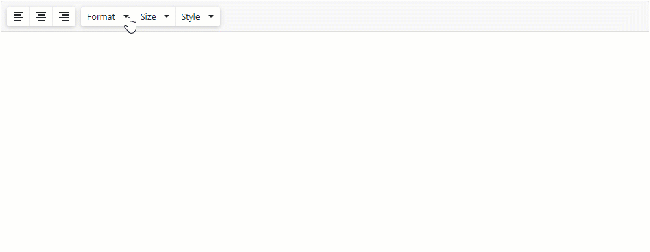
<DxToolbar DropDownDisplayMode="DropDownDisplayMode.DropDown">
    <Items>
        <DxToolbarItem GroupName="align" IconCssClass="tb-icon tb-icon-align-left" />
        <DxToolbarItem GroupName="align" IconCssClass="tb-icon tb-icon-align-center" />
        <DxToolbarItem GroupName="align" IconCssClass="tb-icon tb-icon-align-right" />
        <DxToolbarItem Text="Format" BeginGroup="true">
            <Items>
                <DxToolbarItem Text="Times New Roman" />
                <DxToolbarItem Text="Tahoma" />
                <DxToolbarItem Text="Verdana" />
            </Items>
        </DxToolbarItem>
        <DxToolbarItem Text="Size" DropDownDisplayMode="DropDownDisplayMode.ModalDialog">
            <Items>
                <DxToolbarItem Text="8pt" />
                <DxToolbarItem Text="10pt" />
                <DxToolbarItem Text="12pt" />
            </Items>
        </DxToolbarItem>
        <DxToolbarItem Text="Style" DropDownDisplayMode="DropDownDisplayMode.ModalBottomSheet">
            <Items>
                <DxToolbarItem IconCssClass="tb-icon tb-icon-bold" Text="Bold" />
                <DxToolbarItem IconCssClass="tb-icon tb-icon-italic" Text="Italic" />
                <DxToolbarItem IconCssClass="tb-icon tb-icon-underline" Text="Underline" />
            </Items>
        </DxToolbarItem>
    </Items>
</DxToolbar>
If you set the DxToolbarBase.DropDownDisplayMode or DxToolbarItemBase.DropDownDisplayMode property to ModalDialog/ModalBottomSheet, you can use the DropDownCaption property to specify the modal list’s caption.
<DxToolbar>
    <Items>
        <DxToolbarItem Text="Size"
                       DropDownDisplayMode="DropDownDisplayMode.ModalDialog"
                       DropDownCaption="Font Size">
            <Items>
                <DxToolbarItem Text="8pt" />
                <DxToolbarItem Text="10pt" />
                <DxToolbarItem Text="12pt" />
            </Items>
        </DxToolbarItem>
        ...
    </Items>
</DxToolbar>
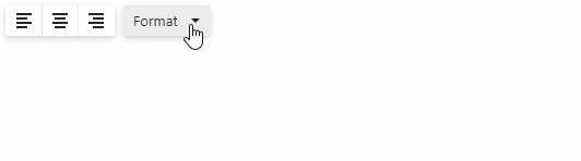
When a user clicks a menu item, the menu closes. If the item is checked button or has templated content, the menu does not close. To change this behavior, use the CloseMenuOnClick property.
The code below sets the CloseMenuOnClick property to false for the Times New Roman item. When a user selects this item, the Format menu does not close.
<DxToolbar>
    <Items>
        <DxToolbarItem GroupName="align" IconCssClass="tb-icon tb-icon-align-left" />
        <DxToolbarItem GroupName="align" IconCssClass="tb-icon tb-icon-align-center" />
        <DxToolbarItem GroupName="align" IconCssClass="tb-icon tb-icon-align-right" />
        <DxToolbarItem Text="Format" BeginGroup="true">
            <Items>
                <DxToolbarItem Text="Times New Roman" CloseMenuOnClick="false"/>
                <DxToolbarItem Text="Tahoma" />
                <DxToolbarItem Text="Verdana" />
            </Items>
        </DxToolbarItem>
    </Items>
</DxToolbar>
You can turn a parent item into a split button where the drop-down action is separate from the main click area. To enable this behavior, set the SplitDropDownButton property to true.
<DxToolbar DropDownDisplayMode="DropDownDisplayMode.DropDown">
    <Items>
        <DxToolbarItem GroupName="align" IconCssClass="tb-icon tb-icon-align-left" />
        <DxToolbarItem GroupName="align" IconCssClass="tb-icon tb-icon-align-center" />
        <DxToolbarItem GroupName="align" IconCssClass="tb-icon tb-icon-align-right" />
        <DxToolbarItem Text="Format" BeginGroup="true" SplitDropDownButton="true">
            <Items>
                <DxToolbarItem Text="Times New Roman" />
                <DxToolbarItem Text="Tahoma" />
                <DxToolbarItem Text="Verdana" />
            </Items>
        </DxToolbarItem>
    </Items>
</DxToolbar>

Checked and Radio Buttons
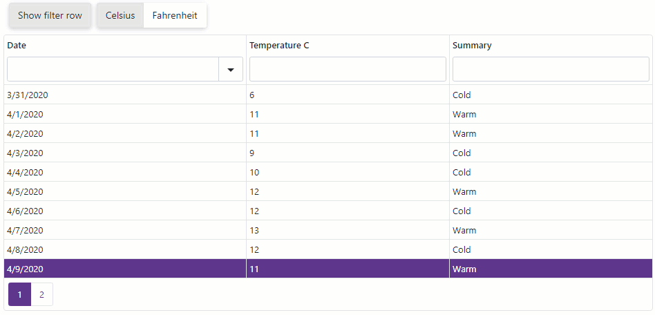
A group of radio buttons enables users to select one option from a group of options. To create a group of radio buttons within the Toolbar, use the same GroupName property value to arrange toolbar items into a group.
Similarly to radio buttons, you can define separate checked buttons that support checked and unchecked states. To create a checked button, set the GroupName property to a unique value. This changes the item’s checked state on every user click.
The example below adds one checked button (Show filter row) and a group of radio buttons (Celsius/Fahrenheit) to the Toolbar.
<DxToolbar>
    <DxToolbarItem @bind-Checked="@ShowFilterRow"
                   GroupName="ShowFilterRow"
                   Text="Show filter row">
    </DxToolbarItem>
    <DxToolbarItem BeginGroup="true"
                   @bind-Checked="@ShowCelsiusColumn"
                   GroupName="TemperatureFormat"
                   Text="Celsius">
    </DxToolbarItem>
    <DxToolbarItem @bind-Checked="@ShowFahrenheitColumn"
                   GroupName="TemperatureFormat" Text="Fahrenheit"></DxToolbarItem>
</DxToolbar>

<DxDataGrid DataAsync="@ForecastService.GetForecastAsync" ShowFilterRow="@ShowFilterRow">
    <DxDataGridDateEditColumn Field="@(nameof(WeatherForecast.Date))"></DxDataGridDateEditColumn>
    <DxDataGridColumn Field="@(nameof(WeatherForecast.TemperatureC))"
                      Visible="@ShowCelsiusColumn">
    </DxDataGridColumn>
    <DxDataGridColumn Field="@(nameof(WeatherForecast.TemperatureF))"
                      Visible="@ShowFahrenheitColumn"></DxDataGridColumn>
    <DxDataGridColumn Field="@(nameof(WeatherForecast.Summary))"></DxDataGridColumn>
</DxDataGrid>

@code {
    bool ShowFilterRow { get; set; } = true;
    bool ShowCelsiusColumn { get; set; } = true;
    bool ShowFahrenheitColumn { get; set; } = false;
}
Link Buttons
Use the item’s NavigateUrl property to specify a URL where the client web browser navigates whenever the current item is clicked.
<div class="card-header p-2 bg-transparent">
    <DxToolbar>
        <DxToolbarItem Text="Item" />
        <DxToolbarItem Text="Link to the next demo"
                    NavigateUrl="https://demos.devexpress.com/blazor/Toolbar#DropDown" />
        <DxToolbarItem BeginGroup="true" IconCssClass="oi oi-align-left" />
        <DxToolbarItem IconCssClass="oi oi-align-center" />
        <DxToolbarItem IconCssClass="oi oi-align-right" />
        <DxToolbarItem IconCssClass="oi oi-cog"
                    Alignment="ToolbarItemAlignment.Right"
                    BeginGroup="true" />
        <DxToolbarItem Text="About" IconCssClass="oi oi-info" />
    </DxToolbar>
</div>
Predefined Items
The Toolbar component also provides you with DxDataGridColumnChooserToolbarItem predefined item type. Use items of this type to display the Column Chooser button in the Data Grid‘s toolbar.
Item Templates
Use the item’s Template property to completely override an individual item’s content, including text, icon, child item, etc.
The example below demonstrates how to add the Search text box to the Toolbar component.
<DxToolbar ItemRenderStyleMode="ToolbarRenderStyleMode.Plain">
    <Items>
        <DxToolbarItem>
            <Template>
                <div class="dxbs-textbox">
                    <input type="text" class="form-control" placeholder="Search...">
                    <span class="dxbs-feedback">
                        <span class="d-flex pl-2 pr-2" role="button" style="color:gray">
                            <span class="tb-icon tb-icon-search"></span>
                        </span>
                    </span>
                </div>
            </Template>
        </DxToolbarItem>
        <DxToolbarItem IconCssClass="oi oi-cog" Tooltip="Settings" BeginGroup="true" />
    </Items>
</DxToolbar>

Handle an Item Click
Use the Click event to specify individual click handlers for Toolbar items. You can also use the ItemClick event to specify a common click handler that will be applied to all Toolbar items.
<p>The clicked item is @ClickedItem</p>

<DxToolbar ItemClick="@OnItemCommonClick">
    <DxToolbarItem Click="@OnInsertItemClick" Text="Insert"></DxToolbarItem>
    <DxToolbarItem Click="@OnEditItemClick" Text="Edit"></DxToolbarItem>
    <DxToolbarItem Click="@OnDeleteItemClick" Text="Delete"></DxToolbarItem>
</DxToolbar>

@code  {
    public string ClickedItem { get; set; } = "";

    void OnInsertItemClick(ToolbarItemClickEventArgs args) {
        ClickedItem = "Insert";
    }
    void OnEditItemClick(ToolbarItemClickEventArgs args) {
        ClickedItem = "Edit";
    }
    void OnDeleteItemClick(ToolbarItemClickEventArgs args) {
        ClickedItem = "Delete";
    }

    ElementReference alertReference;
    void OnItemCommonClick(ToolbarItemClickEventArgs e) {
        JSRuntime.InvokeAsync<string>("ShowAlert", alertReference, $"The Toolbar button has been clicked");
    }
}
Adaptivity
The Toolbar component supports adaptive mode. The following properties control how the toolbar responds when the container’s width changes:
- AdaptivityAutoCollapseItemsToIcons - If true, the text of all items that contain icons is hidden. You can also use the item’s AdaptivePriority and AdaptiveText properties to hide an item before other items and specify alternative item text for adaptive mode.
- AdaptivityAutoHideRootItems - If true, the toolbar combines root items one by one in the root submenu until the toolbar contains the minimum number of root items (specified by the AdaptivityMinRootItemCount property).
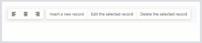
<DxToolbar>
    <DxToolbarItem Name="Left" BeginGroup="true" IconCssClass="oi oi-align-left" />
    <DxToolbarItem Name="Center" IconCssClass="oi oi-align-center" />
    <DxToolbarItem Name="Right" IconCssClass="oi oi-align-right" />
    <DxToolbarItem Text="Insert a new record" AdaptiveText="Insert" BeginGroup="true"></DxToolbarItem>
    <DxToolbarItem Text="Edit the selected record" AdaptiveText="Edit"></DxToolbarItem>
    <DxToolbarItem Text="Delete the selected record" AdaptiveText="Delete"></DxToolbarItem>
</DxToolbar>