ChartSeriesType Enum
Lists values that specify a chart series type.
Namespace: DevExpress.Blazor
Assembly: DevExpress.Blazor.v20.2.dll
NuGet Package: DevExpress.Blazor
Declaration
public enum ChartSeriesTypeMembers
| Name | Description |
|---|---|
Area
|
Displays data as a polyline that connects the series values. The area between the polyline and the argument axis is shaded with a color. |
Bar
|
Displays data as a collection of rectangular bars. |
Bubble
|
Displays data as individual bubbles of different sizes. |
FullStackedArea
|
Displays the percentage value of multiple area series for each argument. |
FullStackedBar
|
Displays the percentage value of multiple bar series for each argument. |
FullStackedLine
|
Displays the percentage value of multiple line series for each argument. |
FullStackedSpline
|
Displays the percentage value of multiple spline series for each argument. |
FullStackedSplineArea
|
Displays the percentage value of multiple spline area series for each argument. |
Line
|
Displays data as points joined by line segments. |
Scatter
|
Displays data as a collection of points. |
Spline
|
Displays data as points joined by a spline interpolation. |
SplineArea
|
Displays data as a spline interpolation of the series values. The area between the spline and the argument axis is shaded with a color. |
StackedArea
|
Displays data as a polyline that connects the series values. The area between the polyline and the argument axis (or a lower series) is shaded with a color. Different series do not overlap because their values are stacked. |
StackedBar
|
Displays data as a collection of rectangular bars. Values of different series are stacked in multiple-series bars. |
StackedLine
|
Displays data as points joined by line segments. Different series do not overlap because their values are stacked. |
StackedSpline
|
Displays data as points joined by a spline interpolation. Different series do not overlap because their values are stacked. |
StackedSplineArea
|
Displays data as a spline interpolation of the series values. The area between the spline and the argument axis (or a lower series) is shaded with a color. Different series do not overlap because their values are stacked. |
StepArea
|
Displays data as a polyline that connects the series values by horizontal and vertical line segments. The area between the polyline and the argument axis is shaded with a color. |
StepLine
|
Displays data as points joined by horizontal and vertical line segments, looking like steps. |
RangeBar
|
Displays value ranges that correspond to argument values. Chart data is represented as rectangles between the specified start and end value. |
RangeArea
|
Displays series as filled areas on a diagram, with two data points that define minimum and maximum limits. |
Stock
|
Displays data as vertical line with Low and High values and two marks displaying Open and Close values. |
Candlestick
|
Displays data as range bars with wicks on a chart, where Open and Close values form bar body, and Low and High values constitute upper and lower wicks. |
Pie
|
Visualizes chart data as pie slices. |
Donut
|
Displays the percentage values of different point arguments as pie slices, but with a hole in its center. |
Related API Members
The following properties accept/return ChartSeriesType values:
Remarks
The DxChart component provides the SeriesType property to specify a chart series type.
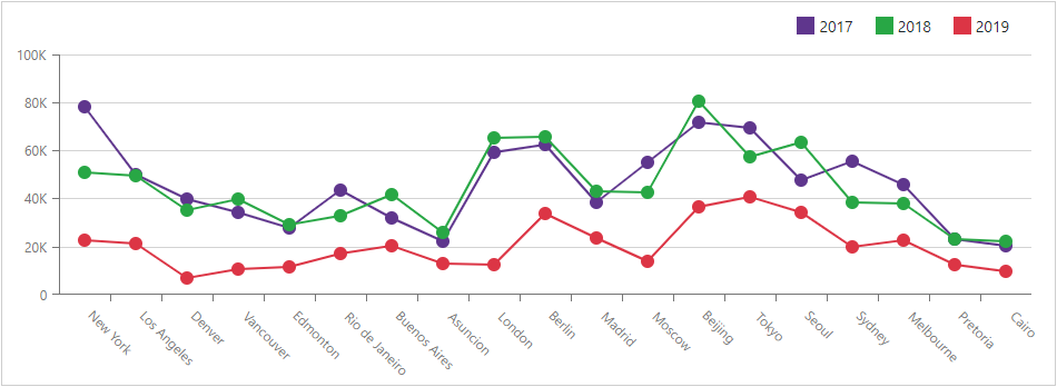
Line chart series visualize data trends over specified intervals. Stacked Line series (StackedLine) visualize multiple series and shows each series’ contribution to the total aggregate value for individual arguments.
<DxChart ...>
    <DxChartCommonSeries SeriesType="ChartSeriesType.StackedLine" ... />
</DxChart>
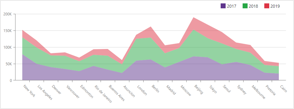
Use area series to emphasize a change in values. Stacked Area series (StackedArea) visualize multiple series and allow users to determine how a series constitutes the total aggregate value for individual arguments.
<DxChart ...>
    <DxChartCommonSeries  SeriesType="ChartSeriesType.StackedArea" ... />
</DxChart>
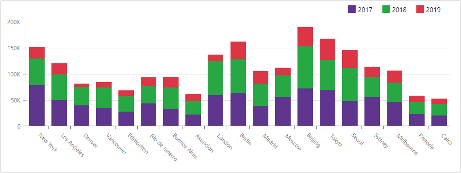
Bar series are used to display values in different discrete categories such as months, countries, age, etc. Stacked Bar series (StackedBar) are used when you need to display several series that represent values for discrete categories.
<DxChart ...>
    <DxChartCommonSeries  SeriesType="ChartSeriesType.StackedBar" ... />
</DxChart>
Bubble series (Bubble) allow you to visualize a data set with three dimensions: coordinates on the axes specify the first two dimensions; the size of the bubble the third.
<DxChart ...>
    <DxChartCommonSeries SeriesType="ChartSeriesType.Bubble" ... />
</DxChart>