DxTextBox Class
A Text Box component.
Namespace: DevExpress.Blazor
Assembly: DevExpress.Blazor.v20.2.dll
NuGet Package: DevExpress.Blazor
Declaration
public class DxTextBox :
    DxTextEditorBase
Remarks
The DevExpress Text Box for Blazor (<DxTextBox>) allows you to enter and edit a single line of text.

Add a Text Box to a Project
Follow the steps below to add the Text Box component to an application:
- Use a DevExpress Project Template to create a new Blazor Server or Blazor WebAssembly application. If you use a Microsoft project template or already have a Blazor project, configure your project to incorporate DevExpress Blazor components.
- Add the
<DxTextBox>…</DxTextBox>markup to a Razor page. - Configure the component (see the sections below).
Edit Value
Use the Text property to specify an editor value or to bind the displayed text to a data source object. You can use the @bind attribute to bind the Text property to a data field. Refer to the following topic for details: Two-Way Data Binding.
<DxTextBox Text="Some text"></DxTextBox>

<DxTextBox @bind-Text="@TextValue"></DxTextBox>

@code {
    string TextValue { get; set; } = "Some text";
}
The Text property value is updated when the editor loses focus (OnLostFocus mode). You can set the BindValueMode property to OnInput to update the Text property when a user changes the input value.
Handle a Text Change
If you do not use two-way data binding, handle the TextChanged event to respond to changes made in the editor. The code below enables the Update Text button once a user types in the Text Box editor.
<DxTextBox Text="Some text" TextChanged="@((newValue) => OnTextChanged(newValue))"></DxTextBox>
<DxButton Enabled="@IsEnabled">Update Text</DxButton>

@code {
    bool IsEnabled = true;

    void OnTextChanged(string newValue) {
        if (!string.IsNullOrEmpty(newValue)) {
            IsEnabled = false;
        } else IsEnabled = true;
    }
}
Password
Set the Password property to true to treat user input as a password and mask all characters. Users cannot copy or cut text from the editor in this mode.

<DxTextBox Password="true"> </DxTextBox>
Size Modes
Use the SizeMode property to specify a Text Box size. The code below applies different size modes to Text Box components.
<DxTextBox @bind-Text="@TextValue" SizeMode="SizeMode.Small"></DxTextBox>

<DxTextBox @bind-Text="@TextValue" SizeMode="SizeMode.Medium"></DxTextBox>

<DxTextBox @bind-Text="@TextValue" SizeMode="SizeMode.Large"></DxTextBox>

@code {
    string TextValue { get; set; } = "Some text";
}
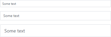
For more information, refer to the following topic: Size Modes.
Clear Button and Placeholder
Set the ClearButtonDisplayMode property to Auto to display the Clear button in the Text Box editor when it is not empty. Use the NullText property to display the prompt text (placeholder) in the editor when its value is null.

<DxTextBox @bind-Text="@TextValue"
           ClearButtonDisplayMode="DataEditorClearButtonDisplayMode.Auto"
           NullText="Type text..."></DxTextBox>

@code {
    string TextValue { get; set; } = "Some text";
}
Input Validation
You can add a standalone Text Box or the Form Layout component to the Blazor’s standard EditForm. This form validates user input based on data annotation attributes defined in a model and indicates errors.
<EditForm Model="@starship" Context="EditFormContext">
    <DataAnnotationsValidator />
    <DxFormLayout >
        <DxFormLayoutItem Caption="Identifier:" ColSpanMd="6" >
            <Template >
                <DxTextBox @bind-Text="@starship.Identifier" />
            </Template >
        </DxFormLayoutItem >
        @*...*@
    </DxFormLayout>
</EditForm>

@code {
    private Starship starship=new Starship();
}
For more information, refer to the following help topic: Validate Input.
Read-Only State
<DxTextBox> supports a read-only state. Set the ReadOnly property to true to activate this option.
<DxTextBox ReadOnly="true"> </DxTextBox>
HTML Attributes and Events
You can use HTML attributes and events to configure the Text Box.
<DxTextBox Text="Some text"
           id="text"
           name="text"
           autocomplete="on"
           maxlength="10"
           @onselect="MyFunction">
</DxTextBox>

@code {
    void MyFunction(){
        //...
    }
}