Column Settings in Blazor Grid
- 8 minutes to read
This topic lists options used to configure Grid columns in Blazor applications.
Column Visibility
Toggle the Visible property value to change column visibility.
<DxGrid Data="@Data">
    <Columns>
        <DxGridDataColumn FieldName="Date" DisplayFormat="D" />
        <DxGridDataColumn FieldName="TemperatureC" />
        <DxGridDataColumn FieldName="TemperatureF" Visible="false" />
        <DxGridDataColumn FieldName="Forecast" />
        <DxGridDataColumn FieldName="CloudCover" />
    </Columns>
</DxGrid>
Users can show or hide columns in the UI using the following elements:
- Built-in Grid context menu. Use the HideColumn property to add or remove the corresponding context menu item.
- Column chooser. Disable a column’s ShowInColumnChooser property to remove this column from the column chooser.
Column Caption
DxGrid generates user-friendly captions for all data columns. Caption text is based on the bound data field name. Use the Caption property to change the generated caption.
@inject WeatherForecastService ForecastService

<DxGrid Data="@Data">
    <Columns>
        <DxGridDataColumn FieldName="Date" DisplayFormat="D" />
        <DxGridDataColumn FieldName="TemperatureC" Caption="@("Temp. (\x2103)")" Width="120px" />
        <DxGridDataColumn FieldName="TemperatureF" Caption="@("Temp. (\x2109)")" Width="120px" />
        <DxGridDataColumn FieldName="Forecast" />
        <DxGridDataColumn FieldName="CloudCover" />
    </Columns>
</DxGrid>

@code {
    object Data { get; set; }

    protected override void OnInitialized() {
        Data = ForecastService.GetForecast();
    }
}

Column Width
DxGrid uses the fixed table layout algorithm to render HTML, and column widths never depend on the column content - the component does not adjust column width based on column content automatically. Refer to the following topic for additional information about Grid layout specifics: Layout Specifics.
You can use the following column properties to specify the Grid column layout:
Note that a non-empty band ignores these properties. The band width is the total width of nested column widths.
Fit Columns to Content
Call the AutoFitColumnWidths() method to adjust column widths to their content. The following example calls the AutoFitColumnWidths method to calculate initial optimal column widths:
<DxGrid Data="Products"
        @ref="MyGrid"
        EditMode="GridEditMode.EditRow"
        TextWrapEnabled="false">
    <Columns>
        <DxGridCommandColumn MinWidth="135" />
        <DxGridDataColumn FieldName="ProductName" Width="20%" />
        <DxGridDataColumn FieldName="CategoryId" Caption="Category Name">
            <EditSettings>
                <DxComboBoxSettings Data="Categories" ValueFieldName="CategoryId" TextFieldName="CategoryName" />
            </EditSettings>
        </DxGridDataColumn>
        <DxGridDataColumn FieldName="Category.Description" Caption="Description" />
        <DxGridDataColumn FieldName="UnitPrice" DisplayFormat="c">
            <EditSettings>
                <DxSpinEditSettings MinValue="0M" Mask="n3" />
            </EditSettings>
        </DxGridDataColumn>
        <DxGridDataColumn FieldName="UnitsInStock" Width="50px" />
        <DxGridDataColumn FieldName="QuantityPerUnit" Width="50px" />
        <DxGridDataColumn FieldName="Discontinued" Width="50px" />
    </Columns>
</DxGrid>

@code {
    List<Product> Products { get; set; }
    IGrid MyGrid { get; set; }

    protected override void OnAfterRender(bool firstRender) {
         if(firstRender) {
             MyGrid.AutoFitColumnWidths();
         }
    }
}
Users can call the AutoFitColumnWidths() method in the UI via the context menu. Use the AutoFitAll option to add or remove the corresponding item from the context menu.
Resize Columns
Use the ColumnResizeMode property to allow users to resize columns. The following modes are available:
- Disabled
- A user cannot resize columns.
- NextColumn
- When a user resizes a column, the width of the column to the right changes (considering the MinWidth value), but the Grid’s total width does not change. Users cannot change the width of the rightmost column.
- ColumnsContainer
- When a user resizes a column, all other columns retain their widths, but the width of the container that stores all Grid columns changes.
In NextColumn/ColumnsContainer modes, the following resize operations are available to users:
- Drag a column header’s right border.
- Double-click a column’s right border to apply the optimal width based on column content.
Fixed (Anchored) Columns
If the combined column width exceeds the component size, DxGrid displays a horizontal scrollbar. Set a column’s FixedPosition property to Left/Right to freeze the column at the component left/right edge. A frozen (anchored) column always stays within view, regardless of the horizontal scroll position.
Users can display/hide fixed columns using the column chooser. Fixed columns also support resize and reorder operations with the following limitations:
- Users cannot move regular columns to a fixed column zone and vice versa.
- A column before the first right-fixed column is not resizable.
- In
NextColumnresize mode, users cannot change the width of a zone at the expense of another zone. That is, users cannot drag borders that separate zones.
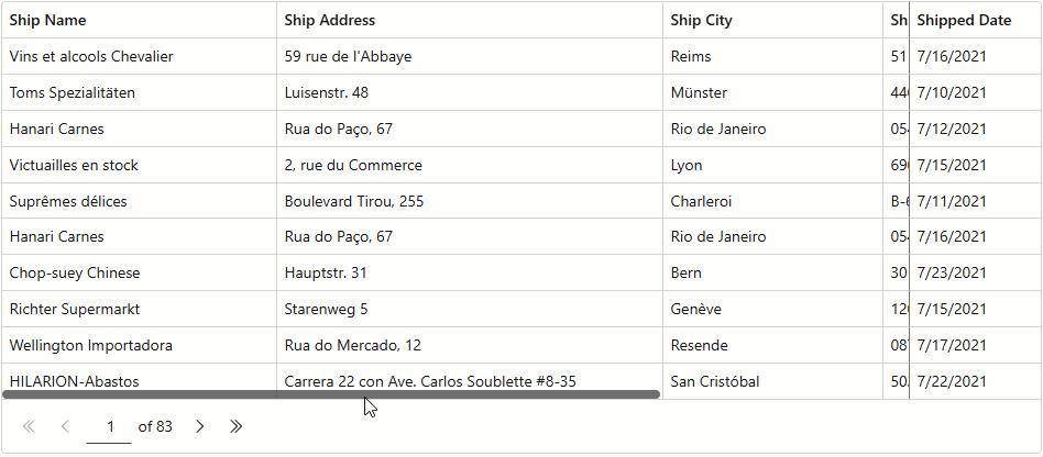
The following code snippet anchors (fixes) Ship Name and Shipped Date columns to the component left and right edges:
<DxGrid Data="Data" >
    <Columns>
        <DxGridDataColumn FieldName="ShipName" FixedPosition="GridColumnFixedPosition.Left" Width="250px" />
        <DxGridDataColumn FieldName="ShipAddress" Width="350px" />
        <DxGridDataColumn FieldName="ShipCity" Width="200px" />
        <DxGridDataColumn FieldName="ShipPostalCode" Width="150px" />
        <DxGridDataColumn FieldName="ShipCountry" Width="200px" />
        <DxGridDataColumn FieldName="Freight" Width="100px" />
        <DxGridDataColumn FieldName="OrderDate" DisplayFormat="d" Width="120px" />
        <DxGridDataColumn FieldName="ShippedDate" FixedPosition="GridColumnFixedPosition.Right" Width="120px" />
    </Columns>
</DxGrid>
Column Order
The Grid layout can include multiple column zones. The display order of zones is as follows:
In a zone, the DxGrid displays columns based on their visible indexes in the following order:
Columns with non-negative visible indexes. The leftmost column has the smallest index value.
Columns with unset and negative visible indexes. Columns appear in the same order as in Grid markup.
Users can reorder columns by dragging headers within the column header panel or in the column chooser. Set the DxGrid.AllowColumnReorder or DxGridColumn.AllowReorder property to false to prevent users from reordering columns.
Text Customization
When a value does not fit into a cell as a single line, the cell displays multiple lines of text. Set the TextWrapEnabled property to false to disable word wrap (trim extra words). Instead of trimmed characters, the DxGrid component displays an ellipsis. Users can hover over the cell to display complete cell text in a tooltip.

You can also specify text format in column cells and headers. Refer to the following topic for additional information: Display Text in Blazor Grid.
Text Alignment
Use one of the following properties to align text in data cells or column captions:

Export Settings
The Grid exports data of every data column unless its ExportEnabled property is set to false. If a column’s Visible property value is false, that column is exported as a hidden column (has a zero width).
You can use the Column.IsHidden property in the CustomizeColumn action to show and hide columns in the resulting document:
await Grid.ExportToXlsxAsync("ExportResult", new GridXlExportOptions() {
    CustomizeColumn = CustomizeColumn,
});
void CustomizeColumn(GridExportCustomizeColumnEventArgs e) {
    e.Column.IsHidden = false;
}
To specify the column width in an exported document, use the ExportWidth property:
<DxGrid @ref="Grid" Data="@Data" >
    <Columns>
        <DxGridDataColumn FieldName="ContactName" ExportWidth="300"/>
        <DxGridDataColumn FieldName="ContactTitle" ExportWidth="150"/>
        <DxGridDataColumn FieldName="CompanyName" />
        <DxGridDataColumn FieldName="Country" />
    </Columns>
</DxGrid>
Save and Restore Column Settings
The Grid allows you to save its layout between application work sessions. Saved information includes the following column settings:
- Group index
- Sort index
- Sort direction
- Position
- Visibility
- Width
Refer to the following topic for additional information: GridPersistentLayout.
Task-Based Examples
Display Text Instead of Checkboxes in a Column with Boolean Values
The Grid displays check boxes instead of column cell values if a column is bound to the Boolean or Nullable Boolean type.
Set the ShowCheckBoxInDisplayMode property to false to show text strings instead of check boxes in display mode. To customize these strings, specify the following properties:
<DxGrid Data="products" PageSize="5">
    <Columns>
        <DxGridDataColumn FieldName="ProductName" />
        <DxGridDataColumn FieldName="UnitPrice" />
        <DxGridDataColumn FieldName="UnitsInOrder" />
        <DxGridDataColumn FieldName="Discontinued">
            <EditSettings>
                <DxCheckBoxSettings ShowCheckBoxInDisplayMode="false"
                                    CheckedDisplayText="Yes"
                                    IndeterminateDisplayText="Unknown"
                                    UncheckedDisplayText="No" />
            </EditSettings>
        </DxGridDataColumn>
    </Columns>
</DxGrid>

@code {
    private Product[]? products;
    protected override async Task OnInitializedAsync() {
        products = await ProductData.GetData();
    }
}
