TreeList.ViewStyle Property
Gets or sets whether the control renders its data in a default Tree List style (cell borders, column headers and indicator panel are visible by default) or Tree View style (no cell borders, column headers and indicator panel).
Namespace: DevExpress.XtraTreeList
Assembly: DevExpress.XtraTreeList.v26.1.dll
Declaration
[DefaultValue(TreeListViewStyle.Default)]
[DXCategory("Appearance")]
[XtraSerializableProperty]
public TreeListViewStyle ViewStyle { get; set; }Property Value
| Type | Default | Description |
|---|---|---|
| DevExpress.XtraTreeList.TreeListViewStyle | Default | A value that specifies the control’s visual style. |
Remarks
The ViewStyle property allows you to choose between the TreeView and TreeList visual styles.
TreeView style | TreeList style |
|---|---|
|
|
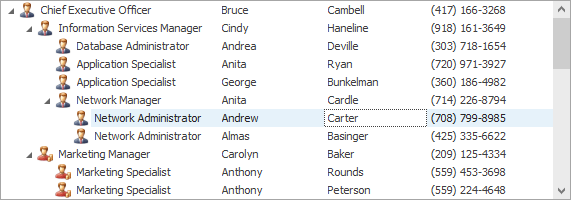
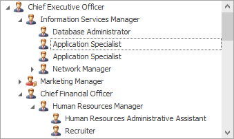
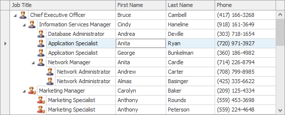
When the ViewStyle property is set to Default, the actual view style is dependent on the TreeList.TreeViewColumn and TreeList.TreeViewFieldName properties. If the TreeList.TreeViewColumn property refers to a valid column, or the TreeList.TreeViewFieldName property is set to a non-empty string (in bound mode), the actual view style is TreeListViewStyle.TreeView. Otherwise, the actual view style is TreeListViewStyle.MultiColumnTreeList.
See TreeView Style to learn more.