RibbonPageGroup.SmallGlyph Property
Gets or sets the glyph of the drop-down button displayed in the collapsed group. This property is in effect for the TabletOffice and OfficeSlim ribbon styles. This is a dependency property.
Namespace: DevExpress.Xpf.Ribbon
Assembly: DevExpress.Xpf.Ribbon.v26.1.dll
Declaration
Property Value
| Type | Description |
|---|---|
| ImageSource | An ImageSource object that represents an image displayed in the drop-down button of the collapsed group. |
Remarks
The RibbonControl automatically adjusts the layout of groups in the currently opened page when the application window is resized. If the window is being narrowed, the RibbonControl progressively collapses the groups starting from the rightmost groups. The links of the collapsed groups are hidden in the drop-down menus, which can be invoked by the drop-down buttons automatically displayed in the collapsed groups. The captions of these drop-down buttons are specified by the group captions. You can also display small glyphs in the drop-down buttons. For this purpose, use the SmallGlyph property of the corresponding groups.
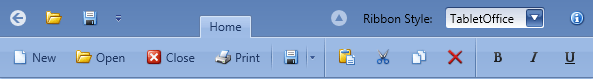
The following image shows the RibbonControl displayed in the TabletOffice style. The window width is sufficient to display all available links, so the groups are not collapsed.
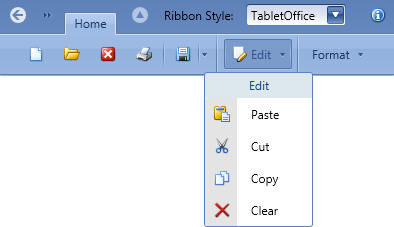
The figure below depicts the same RibbonControl, where the application window is narrowed. The two rightmost groups, captioned Edit and Format, are collapsed and display the drop-down buttons. The SmallGlyph property of the Edit group is specified, so its drop-down button displays the small glyph, while the Format group does not.
The SmallGlyph property is in effect for the TabletOffice and OfficeSlim ribbon styles, which are designed for compact content representation. For the Office2007 and Office2010 ribbon styles, use the RibbonPageGroup.Glyph property of the corresponding groups to specify glyphs to be displayed in the collapsed state.
Control images can be automatically substituted for other images based on the app context (the system DPI setting, the application UI culture, paint theme and touch mode availability). See the following topic to learn more: Automatically Choosing Images Based on App Context.