Time Ruler
- 2 minutes to read
You can add multiple Time Rulers to a view and let users navigate appointments in multiple time zones. These UI elements available in the Day View, Work Week View, and Week View views.
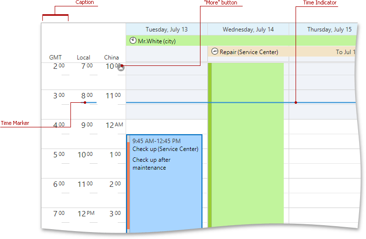
The image below illustrates a Scheduler control’s Day View with time rulers.

The Time Ruler includes the following elements:
- TimeRuler.Caption
- Displays a time zone or a geographical region.
- Time Marker
- Indicates the current time. Use the TimeRuler.TimeMarkerVisibility property to specify the visibility for a particular time ruler, or the DayViewBase.VisibleTime property to specify the visibility for all time rulers if the TimeRuler.TimeMarkerVisibility property set to
null. - Minutes
- Minute portion in time ruler labels. Use the TimeRuler.ShowMinutes property to control visibility.
- Time Designator
- Displays a time label for the first visible row. Use the TimeRuler.AlwaysShowTimeDesignator property to control visibility.
- Time Indicator
- Indicates the current time across the entire view. Use the DayViewBase.TimeIndicatorVisibility and TimelineView.TimeIndicatorVisibility properties to specify time indicator options, including its visibility.
- “More” Buttons
- Indicate that additional appointments are available on the displayed dates, but they don’t fit into the current visible range. Users can click these buttons to scroll the schedule and bring those appointments into the view.
To set up a time ruler, use the Scheduling.TimeRuler class.