Chart Clients for the Range Control
- 6 minutes to read
This document lists the chart client types and explains how to use them in a Range control.
Chart Clients are used to visualize numeric or date-time data within the range control’s viewport. Clients interact with the Range control via the IRangeControlClient interface.
Chart Range Control Clients are divided into two groups:
Common Information
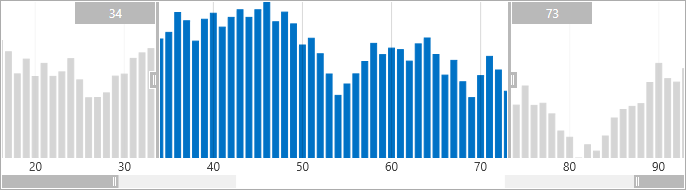
The Client uses one of the following views to represent data when data is bound to a Client directly and when data is provided from the Chart’s series:
| View Type | Image | Description |
|---|---|---|
| RangeControlClientAreaView |  |
An area chart. |
| RangeControlClientBarView |  |
A bar chart. |
| RangeControlClientLineView |  |
A line chart. |
Note
Chart clients show an Area view by default.
The following dependency properties configure Chart Range Control Client appearance:
| Property | Description |
|---|---|
| ChartRangeControlClientBase.ShowGridLines | Gets or sets a value indicating whether the grid lines should be visible in the chart range control client. This is a dependency property. |
| ChartRangeControlClientBase.ShowArgumentLabels | Gets or sets a value that specifies whether to show a data point’s argument label in the chart range control client. This is a dependency property. |
| ChartRangeControlClientBase.GridLinesBrush | Gets or sets chart client grid lines’ color. This is a dependency property. |
| ChartRangeControlClientBase.ArgumentLabelTemplate | Gets or sets the argument label template. This is a dependency property. |
Standalone Chart Range Control Clients
A Standalone Chart Range Control Client uses its ItemsSource property to draw a chart in the Range Control. The following standalone chart clients are available:
NumericChartRangeControlClient - displays numeric data in the Range control’s background.
The Numeric Chart client visualizes numeric data types: integer, double, decimal and float.
DateTimeChartRangeControlClient – displays date-time data within the Range control’s viewport.

TimeSpanChartRangeControlClient - displays time-span data within the Range control’s viewport.

See the Range Control section for more information.
To add a chart client (numeric chart client or date-time chart client) to the Range control, do one of the following:
- Drag the NumericChartRangeControlClient (DateTimeChartRangeControlClient or TimeSpanChartRangeControlClient) from the DX.26.1: Common Controls toolbox tab to a form with a Range control.
Click the Range control’s smart tag, and in its actions list, select the NumericChartRangeControlClient (DateTimeChartRangeControlClient or TimeSpanChartRangeControlClient) in the Client combo box.

After adding the numeric chart client, your XAML should appear as follows:
<Window
        xmlns="http://schemas.microsoft.com/winfx/2006/xaml/presentation"
        xmlns:x="http://schemas.microsoft.com/winfx/2006/xaml"
        xmlns:Custom="http://schemas.devexpress.com/winfx/2008/xaml/charts/rangecontrolclient"
        xmlns:dxe="http://schemas.devexpress.com/winfx/2008/xaml/editors"
        xmlns:System="clr-namespace:System;assembly=mscorlib" x:Class="NumericRangeControlClient.MainWindow"
        Title="MainWindow" Height="350" Width="525">
    <Grid>
        <dxe:RangeControl>
            <dxe:RangeControl.Client>
                <Custom:NumericChartRangeControlClient/>
            </dxe:RangeControl.Client>
        </dxe:RangeControl>
    </Grid>
</Window>
The RangeControl.Client property is automatically set to NumericChartRangeControlClient (or DateTimeChartRangeControlClient).
To display data in chart clients, you need to bind the client to a data source using the following properties:
| Member | Description |
|---|---|
| ChartRangeControlClient.ItemsSource | Gets or sets the chart client’s data source. |
| ChartRangeControlClient.ArgumentDataMember | Gets or sets the name of the data field that contains the chart client’s point arguments. |
| ChartRangeControlClient.ValueDataMember | Gets or sets the name of the data field that contains the chart client’s point values. |
Note
When you bind a numeric chart range control client to simple type objects (short, integer, long, double, decimal, float types, etc.), for example, to an array of simple objects, you do not need to use ChartRangeControlClient.ArgumentDataMember and ChartRangeControlClient.ValueDataMember properties. In this case, the numeric chart client automatically treats simple type objects’ values as chart values. As a result, the data values are shown in the same order in which elements are added to the array.
Specify the ChartRangeControlClient.ArgumentDataMember property if you need to display numeric points sorted by arguments in the ascending order, for example, from the collection.
To assign a view type to a numeric chart client or date-time chart client, set its ChartRangeControlClient.View property to the RangeControlClientView descendant representing the current chart view.
See the following examples to learn more about how to use the chart client for the range control:
- How to: Bind a Numeric Chart Range Control Client to an Array of Simple Type Objects
- How to: Bind a Numeric Chart Range Control Client to a List of Custom Objects
- How to: Bind a Date-Time Chart Range Control Client to a List of Custom Objects
Chart Range Control Client bound to a Chart Control
The Chart Bound Range Control Client displays data from chart series in a Range Control and allows scrolling and zooming a chart. The Range control can visualize only the primary axes data of the bound chart.

The following code demonstrates how to configure the Chart Bound Range Control Client’s behavior:
<dxe:RangeControl AllowZoom="False">
    <dxcr:ChartBoundRangeControlClient Chart="{Binding ElementName=chart}" ThumbLabelFormatString="{}{0:dd MMM yyyy}">
        <dxcr:ScaleOptions LabelFormat="{}{0:MMM yyyy}">
            <dxcr:ScaleOptions.GridBehavior>
                <dxcr:ManualGridBehavior Alignment="Month" Spacing="20"/>
            </dxcr:ScaleOptions.GridBehavior>
            <dxcr:ScaleOptions.SnapBehavior>
                <dxcr:AutoSnapBehavior/>
            </dxcr:ScaleOptions.SnapBehavior>
        </dxcr:ScaleOptions>
    </dxcr:ChartBoundRangeControlClient>
</dxe:RangeControl>
The code above uses the following classes and members:
| Symbols | Description |
|---|---|
| ChartBoundRangeControlClient | The Chart Range Control Client that obtains data to visualize from the bound Chart Control. |
| ChartBoundRangeControlClient.ScaleOptions | Gets or sets the scale options that configure grid appearance. This is a dependency property. |
| ScaleOptions | The Chart bound Range Control scale options storage. |
| ScaleOptions.LabelFormat | Gets or sets the string used to format chart client label values. This is a dependency property. |
| ScaleOptions.GridBehavior | Gets or sets the behavior that specifies how the Chart bound Range Control Client forms its grid. This is a dependency property. |
| ScaleOptions.SnapBehavior | Gets or sets the behavior that specifies how the Chart bound Range Control Client snaps its range bounds. This is a dependency property. |
The Chart Bound Client can use one of the following Grid Behaviors:
| Behavior | Sample Image | Description |
|---|---|---|
| AutoGridBehavior |  |
Identifies the Chart bound Range Control Client Grid Behavior, in which the Client automatically calculates its grid spacing, grid offset and grid alignment (for the date-time scale) values. |
| ChartGridBehavior |  |
Identifies the Chart bound Range Control Client Grid Behavior which obtains the Client’s grid spacing and grid offset and, grid alignment (for the date-time scale) values from the bound chart. |
| ManualGridBehavior | 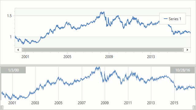 |
Identifies the Chart bound Range Control Client Grid Behavior which forms Client’s grid using ManualGridBehavior.Offset, ManualGridBehavior.Spacing and ManualGridBehavior.Alignment (for the date-time scale) values. |
The following predefined Snap Behaviors specifies how the Range control’s selected range is aligned:
| Behavior | Sample Image | Description |
|---|---|---|
| AutoSnapBehavior |  |
Identifies the Chart bound Range Control Client’s Snap Behavior, in which the selected range snaps to the Client’s grid. |
| ChartSnapBehavior |  |
The Chart Snap Behavior specifies that the Range control’s selected range is aligned by the bound chart’s measurement. |
| ManualSnapBehavior | 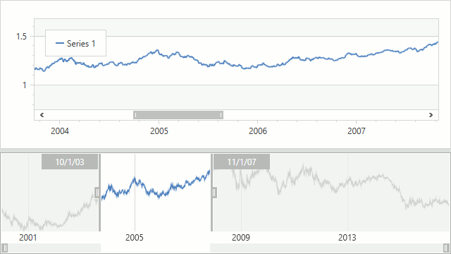 |
Chart bound Range Control Client Snap Behavior, in which the selected range is aligned using parameters that the behavior specifies manually via the ManualSnapBehavior.Offset, ManualSnapBehavior.Spacing, ManualSnapBehavior.Alignment (for date-time scale) properties. |
To configure how a Range Control Client displays the bound Chart’s series, use the following code:
<dxc:StockSeries2D DisplayName="EURUSD" DataSource="{Binding EurUsdRates}"
                   ArgumentDataMember="TimeStamp" ValueDataMember="Rate">
     <dxc:StockSeries2D.RangeControlOptions>
        <dxcr:RangeControlOptions ValueLevel="Close">
            <dxcr:RangeControlOptions.View>
                <dxcr:RangeControlClientLineView ShowMarkers="False"/>
            </dxcr:RangeControlOptions.View>
        </dxcr:RangeControlOptions>
     </dxc:StockSeries2D.RangeControlOptions>
</dxc:StockSeries2D>
The following classes and members allow to configure the appearance of a series within the Range Control:
| Symbols | Description |
|---|---|
| XYSeries2D.RangeControlOptions | Gets or sets options that specify how the Range control visualizes the series data. |
| RangeControlOptions | The storage of settings that specify series appearance in the Range Control. |
| RangeControlOptions.Visible | Gets or sets the value indicating whether the Range Control visualized the series data. This is a dependency property. |
| RangeControlOptions.View | Gets or sets the view that configures the series’ appearance within the Range Control. This is a dependency property. |