How to: Customize Appointment Appearance
- 3 minutes to read
The following example provides a step-by-step instruction on how to customize the appointment appearance using a data template.
Create an Appointment Template
Create a new DataTemplate object in the resources section.
This code describes a custom template used to display appointment information in the AppointmentControl. The template is applied explicitly in the Day View by assigning its
x:Keyto the DayViewBase.AppointmentContentTemplate property.<DataTemplate x:Key="appointmentContentTemplate"> <dxschv:AppointmentContentPanel> <dxschv:AppointmentContentPanel.Background> <LinearGradientBrush StartPoint="0,0" EndPoint="0, 1"> <GradientStop Color="White" Offset="0" /> <GradientStop Color="Transparent" Offset="0.5" /> </LinearGradientBrush> </dxschv:AppointmentContentPanel.Background> <dxschv:AppointmentContentPanel.IntervalSubject> <dxschv:AppointmentIntervalSubjectPresenter/> </dxschv:AppointmentContentPanel.IntervalSubject> <dxschv:AppointmentContentPanel.Location> <dxschv:AppointmentLocationPresenter FontWeight="Normal" Foreground="Blue" /> </dxschv:AppointmentContentPanel.Location> <dxschv:AppointmentContentPanel.Description> <StackPanel> <dxschv:FastTextBlock Text="{Binding Appointment.CustomFields[Note]}" FontWeight="Normal" Foreground="Red"/> <dxschv:AppointmentDescriptionPresenter FontWeight="Normal" Margin="0,1,0,0" WordWrap="True"/> </StackPanel> </dxschv:AppointmentContentPanel.Description> <dxschv:AppointmentContentPanel.Images> <dxschv:AppointmentImagesPanel/> </dxschv:AppointmentContentPanel.Images> </dxschv:AppointmentContentPanel> </DataTemplate>Add the following namespace declaration to use the sample template:
xmlns:dxschv="http://schemas.devexpress.com/winfx/2008/xaml/scheduling/visual"This template displays a custom image on a certain condition. If the FirstVisit custom property of an appointment is true, the
 icon appears.
Create an ConditionToImageSourceConverter class implementing the IValueConverter interface to display an image depending on an appointment custom field value, as shown in the code below:
public class ConditionToImageSourceConverter : IValueConverter { public object Convert(object value, Type targetType, object parameter, CultureInfo culture) { if (value != null) { if ((bool)value) return DXImageHelper.GetImageSource(@"Office2013\Actions\Show_16x16.png"); } return null; } public object ConvertBack(object value, Type targetType, object parameter, CultureInfo culture) { return value; } }Create a markup extension to the ConditionToImageSourceConverter class to provide the value for the Binding.Converter property:
Create a new Style object in the resources section. The following code shows a sample style:
<Style x:Key="appointmentStyle" TargetType="dxschv:AppointmentControl">
    <Setter Property="ShowInterval" Value="True"/>
    <Setter Property="ShowDescription" Value="True"/>
    <Setter Property="ImageBoxTemplate" Value="{StaticResource myImageBox}"/>
</Style>
In XAML, use the
AppointmentContentTemplateandAppointmentStyleproperties of a desired View to apply the created template and style to appointments. The code snippet below shows how to apply the template and style to a DayView:<dxsch:DayView AppointmentContentTemplate="{StaticResource appointmentContentTemplate}" AppointmentStyle="{StaticResource appointmentStyle}" ShowAllDayArea="False" ShowWorkTimeOnly="True" DayCount="3"/> <dxsch:WorkWeekView AppointmentContentTemplate="{StaticResource appointmentContentTemplate}" ShowWorkTimeOnly="True" />
View the Result
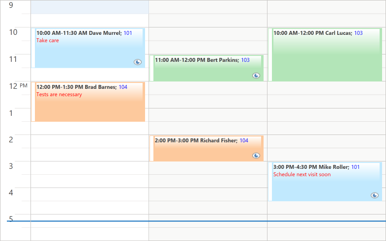
As a result, appointments appear as shown on the image below: