Tile Layout Control
- 3 minutes to read
The TileLayoutControl allows you to change the look of your WPF applications using Windows UI design principles. It provides a tile-based interface with support for built-in animation, touch, and drag-and-drop. The interface in turn allows you to deliver an outstanding user experience.

The Tile Control’s primary building blocks are Tiles - informative boxes that are, due to their size, capable of presenting much more information than simple icons. Note that tiles are not just static boxes, but they also support animation. For each tile, you can provide multiple frames that will be displayed one after another, emulating an animation effect.
You can provide a specific functionality for any title that a user can invoke by clicking the tile. The Tile Layout Control fully supports touch screens, so a user can drag-and-drop, activate tiles, and scroll the Tile Control using his/her fingers in addition to the mouse.
Note
Controls added dynamically to a Tile Layout Control should be registered using the RegisterName method to save/restore their layout correctly.
Tiles
Tiles (Tile objects) are available in four predefined sizes:
- Small - A medium square tile of 150x150 pixels.
- Large - A wide tile of 310x150 pixels.
- Extra Small - A small square tile of 70x70 pixels.
- Extra Large - An extra large square tile of 310x310 pixels.
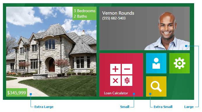
Specify the Tile.Size property to set tile size. This property affects the number of tiles contained in each column and row according to the image above.
Note
The TileLayoutControl arranges tiles only based on their Tile.Size values. The Width and Height properties of tile items do not affect the order of items.
Like FlowLayoutControl, the TileLayoutControl wraps its tiles. Set the BreakFlowToFit property to false to disable this functionality.
A tile can stretch to fit the TileLayoutControl‘s available space. Set the Tile.IsMaximized property to true to enable this feature.
A tile consists of the following elements.
Header
The header is specified by the tile’s Header property. Its location within the tile is specified by Padding, Tile.HorizontalHeaderAlignment and Tile.VerticalHeaderAlignment properties. To hide the header, set the Header property to an empty string.
Content
A tile’s content is specified by the Content property. You can provide varying content that is changed automatically at a specified time interval using the Tile.ContentSource property. The content change interval is specified by the Tile.ContentChangeInterval property.
You can also define a template that displays tile content using the ContentTemplate property.
Border
The border thickness is specified by the BorderThickness property. Its appearance is specified by the BorderBrush property.
To associate an action with a tile, define a command using the Tile.Command property or handle the Tile.Click event. The TileLayoutControl also provides the TileLayoutControl.TileClick event, allowing you to perform the required tile actions in one place.
Tile Groups
Tiles are arranged down and then across the Tile Layout Control. You can combine tiles into groups using the FlowLayoutControl.IsFlowBreak attached property. A tile marked with this property will start a new group. You can also provide a header for a group by specifying the TileLayoutControl.GroupHeader attached property for the tile. The following image shows a Tile Layout Control with two tile groups (Home and Statistics):
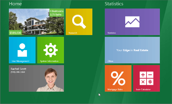
The FlowLayoutControl.LayerSpace property specifies the distance between groups.
You can use the FlowLayoutControl.Orientation property to specify how to arrange tiles (in columns or rows).
Drag and Drop Tiles
Users can move tiles to a new position. To disable this behavior, set the FlowLayoutControl.AllowItemMoving property to false.
After a user changes a tile position, the TileLayoutControl raises the FlowLayoutControl.ItemPositionChanged event.