TdxPanel Class
A resizable general-purpose panel.
Declaration
TdxPanel = class(
    TdxCustomPanel
)
Remarks
TdxPanel is a general-purpose panel with customizable frame appearance and support for border drag operations at runtime. You can use the TdxPanel control to create resizable areas on a form without double borders and dedicated splitter controls.
Use the Frame property to configure frame appearance settings. To allow users to drag panel borders, set the Frame.Drag.Enabled property to True:
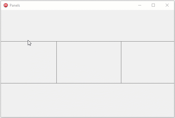
You can place a control on such a panel without gaps or double borders to create lightweight application layouts.

Main API Members
The list below outlines key members of the TdxPanel class. These members allow you to configure panel appearance and behavior.
Appearance and Behavior Settings
- Color | ParentColor
- Specify the panel fill color.
- Frame
- Provides access to border appearance and behavior settings.
- LookAndFeel
- Allows you to override global appearance settings for the panel.
User Interaction Options
- Automation
Provides access to UI Automation and accessibility-related settings.
Tip
Use Automation.Name, Automation.Description, and other API members to specify information visible to third-party assistive tools as UIA node properties.
- Hint
- Specifies a hint for the panel.
- OnDragBorder
- Allows you to track panel border movements and respond to them.
- TabStop
- Specifies if users can focus the panel.