Third-Party SVG Icon Adaptation for DevExpress Skins and Palettes
- 3 minutes to read
DevExpress controls can change their SVG icon colors based on the current skin and palette to maintain UI element contrast. All vector icons shipped with the DevExpress Icon Library change their colors according to skins and palettes used and active palette interaction settings.
To use third-party icons in the same way as DevExpress icons, define and use SVG colors with the following CSS style names: Red, Green, Blue, Yellow, Black, Purple, and White. For more information, see Draw SVG Icons.
Use SVG Icon Builder
Download and install our standalone SVG Icon Builder application.
Run SVG Icon Builder and click LIBRARY SETTING.
Select the required source folder for custom icons[1] and click the ADD FOLDER button.
Click the Adjust button to scan all icons in the source folder and automatically adjust their size and color settings according to DevExpress guidelines. You can preview pending changes and manually change incorrectly converted colors.
To save pending changes in the .iconbuilder folder automatically created in the source folder, click the CONVERT button.
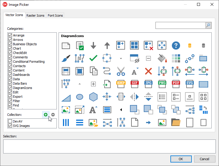
Add Adapted Custom Icons to Icon Library
You can use adapted third-party icons from the created .iconbuilder folder as a custom collection in the Icon Library. Click the Add a custom collection button in the Image Picker dialog, select the target folder in a shell dialog, and click the Select button.
Refer to the following topic for more information: Manage Custom Icon Collections.
SVG Glyph and Palette Interaction Settings
This topic section lists all settings that allow you to enable or disable skin palette interaction for all or individual UI element glyphs.
Global Palette Interaction Settings
The following class properties allow you to disable or enable palette interaction for SVG glyphs application-wide:
- TdxVisualRefinements.UseDisabledSkinPaletteForSVG
- Specifies if UI elements apply the active vector skin palette to disabled state glyphs at the application level.
- TdxVisualRefinements.UseEnabledSkinPaletteForSVG
- Specifies if UI elements apply the active vector skin palette to enabled state glyphs at the application level.
Glyph and Image List Settings
Many UI elements allow you to load individual glyphs or assign glyphs stored in a TcxImageList component. You can use the following properties to explicitly enable or disable palette interaction for individual UI element glyphs or image lists:
- TdxGPImage.UseDisabledSkinPaletteForSVG
- Specifies if the active vector skin palette affects the stored SVG glyph for the disabled UI element state.
- TdxGPImage.UseEnabledSkinPaletteForSVG
- Specifies if the active vector skin palette affects the stored SVG glyph for the enabled UI element state.
- TcxCustomImageList.UseDisabledSkinPaletteForSVG
- Specifies if the active vector skin palette affects stored SVG glyphs for the disabled UI element state.
- TcxCustomImageList.UseEnabledSkinPaletteForSVG
- Specifies if the active vector skin palette affects stored SVG glyphs for the enabled UI element state.
-
We use Google Material Design icons as an example.