Tree View Control
- 10 minutes to read
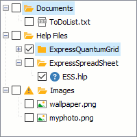
The Tree View control allows a user to display data in nodes with customizable captions, images, checkboxes, and hints. The control supports look & feel settings common to all DevExpress VCL controls. These settings allow you to keep the application’s appearance consistent for all UI elements.
Manage the Tree Structure
The Tree View control allows you to display information in a tree structure.
Manage the Tree Structure in Code
The Tree View control, tree node container and nodes allow you to manage the tree structure at runtime.
Add Nodes
The following table describes the methods you can call to add nodes in the tree structure:
Action | The Node Container’s Methods | A Node’s Methods |
|---|---|---|
Prepend a node at the same nesting level as the target node | AddFirst, AddObjectFirst, and AddNode | |
Insert a node immediately before the target node | Insert, InsertObject, InsertNode, and AddNode | |
Append a node at the same nesting level as the target node | ||
Prepend a child node | AddChildFirst and AddNode | |
Append a child node | AddChild, AddChildObject, and AddNode |
The following code appends a new child node to the top node in the Tree View control:
var
  AFirstNode: TdxTreeViewNode;
begin
  if dxTreeViewControl1.AbsoluteCount > 0 then
  begin
    AFirstNode := dxTreeViewControl1.Items[0];
    AFirstNode.AddChild('New Child Node');
  end;
end;
Delete Nodes
The following table describes the methods you can call to delete nodes from the control:
Action | The Node Container’s Methods | A Node’s Methods |
|---|---|---|
Delete all nodes from the tree structure | – | |
Delete a specific node and all its children | ||
Delete a node’s children | – | Clear and DeleteChildren |
The following code deletes the top node and all its children from the Tree View control:
var
  AFirstNode: TdxTreeViewNode;
begin
  if dxTreeViewControl1.AbsoluteCount > 0 then
  begin
    AFirstNode := dxTreeViewControl1.Items[0];
    AFirstNode.Delete;
  end;
end;
Sort Nodes
The control includes the following procedures that allow you to sort nodes:
The control’s AlphaSort and CustomSort procedures
The node container’s AlphaSort and CustomSort procedures
A node’s AlphaSort and CustomSort procedures
The following code sorts the top node’s children by their captions:
var
  AFirstNode: TdxTreeViewNode;
begin
  if dxTreeViewControl1.Items.Count > 0 then
  begin
    AFirstNode := dxTreeViewControl1.Items[0];
    AFirstNode.AlphaSort;
  end;
end;
Save and Load Nodes
The following table describes the Tree View methods you can call to save the control:
Methods | Description |
|---|---|
Save node captions and positions in the control to a file or stream. | |
Load node captions and positions from a file or stream. | |
Save the Tree View’s state to a file or stream. | |
Load a previously saved Tree View state from a file or stream. |
The following code saves the Tree View’s state to the Example.txt file in the application’s folder:
dxTreeViewControl1.SaveDataToFile('Example.txt');
Manage the Tree Structure at Design Time
You can create, customize, and delete nodes in the TreeView Items Editor dialog. Double-click the control to invoke the dialog.
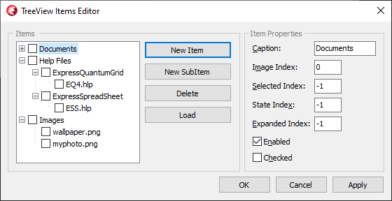
Use the following buttons to customize the Tree View’s layout and structure:
Button | Description |
|---|---|
New Item | Appends a new node at the same nesting level as the focused node in the preview box on the left. |
New Subitem | Appends a new child node to the focused node. |
Delete | Removes the focused node and all its children. |
Load | Invokes the Open dialog that allows you to select a file to load a tree structure. Note that the TreeView Items Editor supports only files that are compatible with the control’s LoadFromFile procedures. |
Edit Node Captions
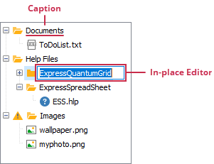
Each node in the control can show a caption.
Edit Node Captions in Code
Each node in the control has the Caption property that specifies the node’s caption. You can assign a string to this property of a node to change the node’s caption.
Call a node’s EditCaption or EndEdit method to open or close the node’s in-place caption editor. The control’s OnEdited and OnCancelEdit events allow you to perform actions when a user closes an in-place caption editor.
The following OnEdited event handler discards changes made in an in-place editor if a user assigns an empty string to a node caption:
procedure TForm1.dxTreeViewControl1Edited(Sender: TdxCustomTreeView;
  ANode: TdxTreeViewNode; var AText: string);
begin
  if AText = '' then
    AText := ANode.Caption;
end;
You can assign False to the control’s OptionsBehavior.CaptionEditing property to forbid a user from opening an in-place caption editor. To prohibit a user from opening an in-place editor for specific nodes, handle the control’s OnEditing event instead.
Edit Node Captions at Design Time
Type text into the Caption edit box in the TreeView Items Editor. You can click the focused node in the preview box or press F2 to invoke the node’s in-place caption editor.
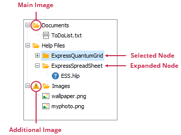
Display Node Images
The control can display two images in each node. To display node images, use the control’s Images and StateImages properties to specify source image lists.
Set Images in Code
The following node properties allow you to specify node images in code:
Property | Description |
|---|---|
Specifies an index of the node’s main image. | |
Specifies an image index for the node in the expanded state. | |
Specifies an image index for the node in the selected state. | |
Specifies an index of the image used as the main image’s overlay mask. | |
Allows you to display an additional image to the left of the node’s main image. |
You can handle the control’s OnCustomDraw and OnCustomDrawNode events to display more images in nodes.
Set Images at Design Time
The TreeView Items Editor has edit boxes that allow you to specify node images at design time.
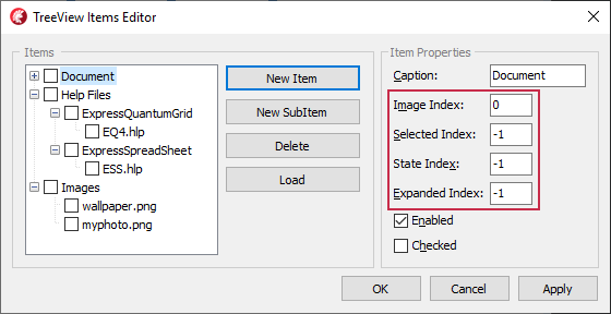
The following table describes these edit boxes:
Edit Box | Description |
|---|---|
Image Index | Specifies an index of the node’s main image. You can type -1 in this box to display the node without a main image. |
Selected Index | Specifies an image index for the node in selected state. You can type -1 in this box to display no dedicated node image in selected state. Note that the Tree View control omits a value in this box if the control’s OptionView.UseImageIndexForSelected property is set to False. |
State Index | Allows you to display an additional image to the left of the node’s main image. You can type -1 in this box to display the node without an additional image. |
Expanded Index | Specifies an image index for the node in expanded state. You can write -1 in this box to display no dedicated node image in the expanded state. Note that the Tree View control omits a value in this box if the control’s OptionView.UseImageIndexForExpanded property is set to False. |
Expand and Collapse Nodes
A user can click a node expand button to expand or collapse the corresponding node.
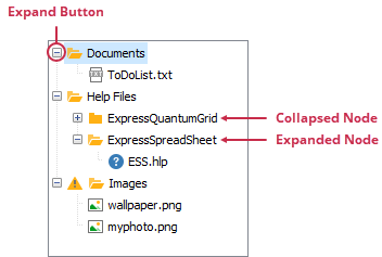
The control has the OnExpanded and OnCollapsed events that allow you to perform specific actions when a user expands or collapses a node. To prohibit a user from expanding and collapsing nodes, handle the control’s OnExpanding and OnCollapsing events.
The following table describes the properties and methods you can use to expand and collapse nodes in code:
API | Description |
|---|---|
The control’s FullExpand and FullCollapse procedures | Expand and collapse all nodes in the control. |
The control’s ExpandTo procedure | Allows you to expand all ancestor nodes of the specified node. |
Allow you to expand and collapse the specified node and its children at all nesting levels. | |
A node’s Expanded property | Specifies if the node is expanded. |
The following code expands all nodes in the control:
dxTreeViewControl1.FullExpand;
Select Nodes
A user can click a node to select it.
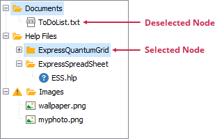
The Tree View control allows a user to select only one node out-of-the-box. Use the control’s OptionsSelection.MultiSelect and OptionsSelection.MultiSelectStyle properties to allow a user to select multiple nodes. To prohibit a user from selecting specific nodes, handle the control’s OnCanSelectNode event. You can handle the Tree View control’s OnSelectionChanged event to perform specific actions when a user selects or deselects a node.
The following table describes the properties and methods you can use to expand and collapse nodes in code:
API | Description |
|---|---|
The control’s ClearSelection procedure | Deselects all nodes in the control. |
Select and deselect specific nodes in the control. | |
A node’s Selected property | Specifies if the node is selected. |
The following code deselects all nodes in the control:
dxTreeViewControl1.ClearSelection;
Check Nodes
Set the control’s OptionsView.ShowCheckBoxes property to True to display node checkboxes in the Tree View control.
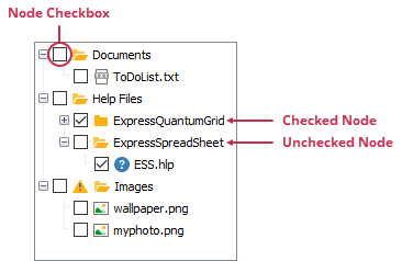
You can set a node’s HideCheckBox property to False to hide the node’s checkbox. To check or uncheck a node, use the node’s Checked and CheckState properties. A user can click a node checkbox to check or uncheck the node. To prohibit a user from changing a node’s checkbox state, set the node’s Enabled property to False. You can handle the control’s OnNodeStateChanged event to perform specific actions when a user checks or unchecks a node.
The following code checks all nodes in the control that have child nodes:
var
  ANode: TdxTreeViewNode;
begin
  dxTreeViewControl1.BeginUpdate;
  for ANode in dxTreeViewControl1.Items do
    ANode.Checked := ANode.Count > 0;
  dxTreeViewControl1.EndUpdate;
end;