UI Adorner Manager
- 2 minutes to read
The adorner UI manager is a non-visual component designed to display up to two additional adorner layers on top of the target form, allowing you to mark and emphasize UI elements in your application in different ways.
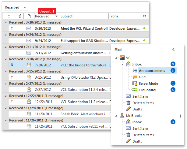
The first adorner layer is designed to display custom marks, also called badges, anchored to specific elements of your UI. A badge can be a simple opaque colored shape, optionally including a custom text hint or message, or show an icon or image accompanied by a precisely positioned text string.

The UI adorner manager provides access to the badge adorner layer and its individual badges via the Badges property. Use the Badges.Active property to hide or display the layer.
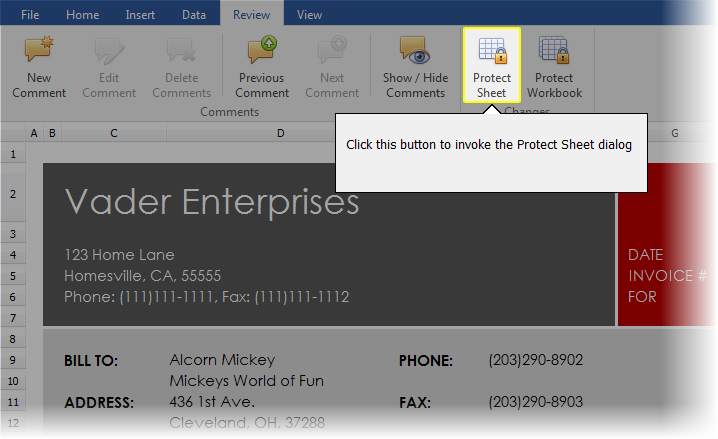
The second adorner layer displayed on top of all others, highlights specific UI elements or regions by darkening the rest of the application form. End-users can navigate between individual outlined regions that are called guides. The guides are particularly useful for making a quick introduction to a new feature in your application. The currently selected guide highlights its target UI element by removing the darkening effect from it:

The UI adorner manager provides access to the guide adorner layer and individual guides via the Guides property. Use the Guides.Active property to show or hide the layer. End-users can deactivate the guide layer by pressing the keystroke specified by the Guides.DeactivateKey property (the Esc key by default).
Additionally, each clicked guide can optionally display a popup callout containing hints and instructions. To provide a control or form as the displayed popup callout’s content, handle the corresponding guide UI adorner’s OnGetCalloutPopupControl event.
