TdxColorPicker Class
A color picker component.
Declaration
TdxColorPicker = class(
    TdxCustomColorPicker
)
Remarks
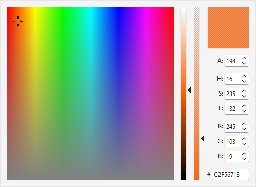
TdxColorPicker is an advanced color selection component.
Color Value Type
The TdxColorPicker component is designed to work with TdxAlphaColor values instead of TColor to support transparency.
You can use the TdxAlphaColors record declared in the dxCoreGraphics unit to obtain compatible predefined colors or create custom TdxAlphaColor values. In addition, you can call the dxMakeAlphaColor function or other global methods declared in the same unit.
Color Picker UI Elements
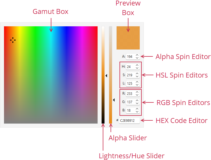
- Gamut Box
- A click within this box selects the corresponding color.
- Lightness/Hue | Alpha
- These vertical sliders allow users to adjust lightness/hue and alpha gradually and are associated with corresponding spin editors (H (Hue), S (Saturation), L (Lightness), and A (Alpha)).
- Preview Box
- Displays the selected color.
- Alpha
- This spin editor allows users to adjust color opacity from
0to255. - H | S | L
- HSL (Hue, Saturation, and Lightness) spin editors allow users to adjust color hue, saturation, and lightness from
0to255. Hue and Lightness editors are associated with the Lightness/Hue slider. - R | G | B
- RGB (Red, Green, and Blue) spin editors allow users to adjust red, green, and blue color channel values from
0to255. - HEX Code Editor
- Allows users to specify the required color as a hexadecimal value.
UI Automation/Accessibility Support
The color picker is mapped to a node in UI Automation tree when the global UI Automation flag (dxUIAutomationEnabled) is enabled.
UI Automation Settings
Use Automation.Name and Automation.Description properties to specify the component name and add optional information that are then used to clarify editor purpose for users who rely on third-party assistive tools (such as Microsoft Narrator).
Refer to the TdxAutomationElementSettings class description for detailed information on all available options.
Main API Members
The list below outlines key members of the TdxColorPicker class.
Appearance Settings
- BorderStyle
- Specifies if the component border is visible.
- LookAndFeel
- Allows you to override global skin and palette settings at the component level.
- OptionsView
- Provides access to color picker UI visibility and appearance settings.
Content-Related APIs
- Automation
- Provides access to UI Automation and accessibility-related settings.
- Color
- Specifies the selected TdxAlphaColor value.
- OnColorChanged
- Allows you to execute custom code in response to Color property value changes.
- Hint
- Allows you to assign a hint message to the color picker component.
General-Purpose API Members
- AutoSize
- Specifies if color picker dimensions are calculated automatically.
- FullRefresh
- Redraws color picker content on demand.
- Width | Height
- Allow you to increase color picker dimensions when the AutoSize property is disabled.