Design-Time Features
- 7 minutes to read
With the ExpressGauge control, you can imitate both simple measuring instruments and complex multi-functional dashboards in your application without complicated programming. You can create advanced dashboard layouts with only the provided design-time tools, without writing a single line of code.
The Gauge Control allows you to create, position, arrange and customize its visual components by using drag-and-drop operations, on-form context menus, the Object Inspector, and multiple helper tools listed in the following subtopics:
Gauge Control, Scale, Range, and Label Selectors;
Selected Object Boundaries;
Scale Drag-and-Drop Operations;
Components Editor;
On-Form Context Menus.
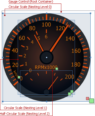
Gauge Control, Scale, Range, and Label Selectors
The ExpressGauge control provides design-time selectors for all objects that can be created, positioned and modified within it, including the TdxGaugeControl component itself. Design-time object selectors are rectangles with green diagonal stripes near the bottom-right corner of the object’s bounding box. Once an object (whether it is a scale, range bar, custom label, or an instance of the Gauge Control) is selected, these green stripes turn red:

At design time the ExpressGauge control can display three types of selectors corresponding to three types of objects:
 An instance of the Gauge control itself (the root node of the scales hierarchy) displays the large selector;
 All types of scales (including nested scales and containers) display the medium selector;
 Optional scale elements (extra scale decorations, such as range bars and custom labels) display the small selector.
Selectors are designed to simplify focusing individual objects at design time, especially when creating complex hybrid dashboards in your application:

Even if a scale is centered in the Gauge Control‘s area of the same size, you can select either of these objects. Click the overlapping selectors if you need to select the control, or click anywhere else within the scale’s area to select the scale:

Selected Object Boundaries
The Gauge Control displays a blue rectangle bounding the layout of the currently selected object (whether it is a scale or an optional scale decoration element) within the control’s boundaries. For The ExpressGauge control displays eight sizing handles on the object’s bounding box and marks its center with a small circle for each selected object that has sizing parameters (any scales):

The scale’s OptionsLayout absolute or relative sizing settings determine the bounding box’s dimensions.

The scale’s actual area is stretched to the specified boundaries if the OptionsLayout.Stretch option applies to a particular scale type and set to True:

Otherwise, a scale simply fits into the bounding box while keeping its style-determined height-to-width ratio:

The scale’s bounding rectangle corresponds to the scale area used as a container for nested scales that can be created within it. The ExpressGauge control automatically displays the blue dashed boundaries for all scale objects anchored within the currently selected scale:

Note that the bounding boxes for optional scale decoration elements are not displayed when their parent object (scale) is selected. The custom captions’ boundaries and range bars are shown only when these elements are selected:

Refer to the Scale Layout topic for more information on scale sizing and positioning settings.
Scale Drag-and-Drop Operations
At design time you can manipulate the scales created within the Gauge Control component in the same manner as other controls placed on an application form:
Move a scale by dragging it within an area of the TdxGaugeControl component’s area;
Drag the currently selected scale‘s bounding box by using one of the eight sizing handles;
Copy a scale with its current style, OptionsView, OptionsLayout, and OptionsAnimate settings, including all custom captions and range bars by performing a drag-and-drop operation while holding down the Ctrl key. If you release the Ctrl key before dropping a scale, it simply moves to the mouse pointer’s current position.
Components Editor
The Components Editor is a design time tool that helps you manage all visual and helper components created in an instance of the Gauge Control. The editor’s window displays all control contents (including scales, containers, range bars, and custom captions) as a tree-like hierarchical structure with collapsible nodes. Each component is marked with an icon corresponding to its type. The Components Editor displays its ExpressGauge control instance as the root node:

The Components Editor allows you to:
Select any visual or helper object created within the Gauge Control;
Anchor a scale to a different parent object (i.e., another scale or the root node), rearranging the scales hierarchy;
Invoke the selected object’s context menu;
Delete any selected object except the root node (that is, an ExpressGauge control instance to which the Components Editor window belongs) by pressing the Delete button;
Change the currently selected scale’s Z-Order using the Scale Context Menu;
Create nested scales, range bars, and custom labels within the currently selected scale using the Scale Context Menu.
You can either double-click anywhere within the Gauge Control area or click the Edit Scales… item in the on-form context menu of an instance of the ExpressGauge control to invoke the Components Editor.
If you need more information on:
Visual and helper components – refer to the Gauge Control Components topic;
The hierarchy of scales, helper, and decorative components within the Gauge Control – refer to the Scales Hierarchy topic.
Refer to the Scales Hierarchy topic for information on the hierarchical structure of components within the Gauge Control.
On-Form Context Menus
The ExpressGauge control provides a set of on-form context menus available at design time you can use to can add, delete, rearrange and customize various components of the control, such as scales, containers, range bars, etc.
The full list of Gauge Control‘s context menus includes:
Main Control Context Menu;
Add Scale Context Menu;
Scale Context Menu;
Components Editor Context Menus.
Main Control Context Menu
In addition to the standard list of control’s on-form context menu items, main context menu of the Gauge Control contains three control-specific menu items that allow you to:
Invoke the Components Editor (the Edit Scales… menu item);
Create a container scale (the Add Container menu item);
Display the nested Add Scale Context Menu that lists all scales available in the ExpressGauge control (the Add Scale menu item).

Right-click within the ExpressGauge control’s empty area (that is, not occupied by any components created in it) to invoke the main control context menu.
Add Scale Context Menu
The Gauge Control provides both the common and data-aware versions of circular, wide circular, three-fourth circular, half-circular, quarter-circular, linear, and digital scales, all of which can be created using the Add Scale context menu:

In order to invoke the on-form Add Scale context menu, right-click within either the TdxGaugeControl component or the Scales Editor area:

To create an unbound or data-aware scale of the required type within the ExpressGauge control, click its respective menu item at the Add Scale context menu. All newly created scales have the default style, size, position, and value display settings and need to be customized individually. The Add Scale context menu anchors the created scale to the currently selected object (including any other previously created scale or an instance of the Gauge Control), allowing you to create nested scales:
Scale Context Menu
The Scale context menu allows you to:
Change the scale’s Z-Order within the ExpressGauge control;
Restore the scale appearance settings to the default values determined by the selected style;
Create a nested scale of any type;
Add a custom label and/or range bar to the scale;
Delete the scale with its optional decorative objects.

Right-click on a scale either on the form or in the tree displayed by the Components Editor to invoke the scale context menu.
Refer to the How to Work with Scale Range Bars topic for additional information on range bar management at both design time and runtime.
Components Editor Context Menus
The Components Editor provides the shortened variant of the Gauge Control‘s main on-form context menu that allows you to create a new container or visual scale at the root node of the scales hierarchy.

Another context menu available from the Components Editor is the Scale Context Menu that you can invoke by right-clicking on a scale within the hierarchy displayed within the editor window.