How to Work with Scale Range Bars
- 7 minutes to read
Colored scale range bars (or ranges for short) are used to mark certain intervals on quantitative scales regardless of their shape. Ranges can be placed on the background layer in both linear and arc (including wide circular) scales, appearing as linear and arc colored bars, respectively.

For instance, you can use these markings to signify the ranges of recommended and/or unsafe values displayed by scales in your application.
A scale created in an instance of the Gauge Control can have any number of ranges with any parameters. You can use tools provided by the ExpressGauge control for range management at design time to add, remove, or customize scale range bars. You can also use the runtime scale management option to extend your application’s functionality. For instance, you can create or destroy individual ranges within a scale or change their appearance parameters, such as size, position and color, programmatically.
Refer to one of the following subtopics explaining how to work with ranges:
How to Create Range Bars at Design Time;
How to Create Range Bars at Runtime;
How to Delete Range Bars at Design Time;
How to Delete Range Bars at Runtime;
How to Set Up Range Properties.
How to Create Range Bars at Design Time
The ExpressGauge control provides two methods of adding a range to the selected scale – either by using design time tools or programmatically. All newly created ranges have default settings and thus require additional customization, described in the How to Set Up Range Properties subtopic.
You need to invoke the scale context menu and click the Add Range menu item to create a new range at design time:

The currently invisible range is added to the focused scale as a result. All customizable properties of the range bar appear in the Object Inspector:

How to Create Range Bars at Runtime
You can use the ranges collection’s Add function to add a new range within the scale in response to some event occurring in your application. This method creates the range with parameters identical to those of the newly created range at design time.
To address the created range object properly, you need to cast the Add function result to the TdxGaugeCircularScaleRange or TdxGaugeLinearScaleRange type, depending on the particular scale type you are working with. Refer to the following code example:
var
  ARange: TdxGaugeCircularScaleRange;  // Use this variable to address the range's properties properly
//...
  ARange := TdxGaugeCircularScaleRange(dxGaugeControl1CircularScale1.Ranges.Add);
For more information on the range customization, refer to the How to Set Up Range Properties subtopic.
How to Delete Range Bars at Design Time
You need to select one or more ranges either on the form or in the Components Editor window and press the Delete button to remove ranges from the selected scale at design time. Alternatively, you can select the single Delete menu item in the range bar context menu:

How to Delete Range Bars at Runtime
You can use the ranges collection’s Delete procedure to remove a range from the scale in response to some event occurring in your application. This method deletes the range with the specified index within the collection. Use the collection’s Count property to monitor the current number of ranges within the scale.
The following code example demonstrates how to remove the last range created within a scale:
var
  ARangeCount: Integer;  // The total number of ranges within the scale
//...
  ARangeCount := dxGaugeControl1CircularScale1.Ranges.Count;
  if(ARangeCount > 0) then
    dxGaugeControl1CircularScale1.Ranges.Delete(ARangeCount - 1);
How to Set Up Range Properties
Once the range is created, you can set up its color, size, and positioning within the scale. A range bar’s actual shape, dimensions and position depend on its scale type. Regardless of the scale type, you can customize the following groups of properties in the range’s Object Inspector:

Range Mark Settings | Implemented in Ranges as |
|---|---|
The common range appearance settings. | |
The common component settings. | |
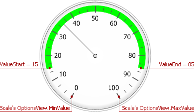
The range’s length (limited by the top and bottom values). | The ValueStart and ValueEnd properties, whose values must be within the range restricted by the scale‘s OptionsView.MinValue and OptionsView.MaxValue property values. The LinkedWithScaleValue property determines whether the range bar size is affected by the position of a scale value indicator. |
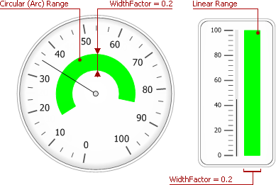
The range’s width. | The WidthFactor property specifies the relative width of the range. |
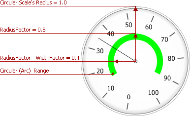
The range’s position within a scale. | The position of the arc and linear ranges within their scales is determined by the RadiusFactor and CenterPositionFactor property values, respectively. |
Setting Up the Range’s Appearance
The Visible and Color properties represent the range’s appearance settings. You can use the Visible property to hide and show a range at runtime without the need to destroy and re-create it.
Note that you can assign only solid (non-transparent) colors to ranges by customizing the Color property via the Object Inspector. Assign the required TdxAlphaColor value at runtime instead if you need to make ranges transparent. To accomplish this goal, you may need the dxColorToAlphaColor, or dxMakeAlphaColor method declared in the dxCoreGraphics unit. Refer to the following code example that creates the semi-transparent arc range within the circular scale:
var
  ARange: TdxGaugeCircularScaleRange;
// Creating the arc range within a circular scale
  ARange := TdxGaugeCircularScaleRange(dxGaugeControl1CircularScale1.Ranges.Add);
//...
  ARange.Color := dxColorToAlphaColor(clRed, 127);
Setting Up the Range’s Size
The range of values a colored range bar marks on a scale and its current width factor determine its size.
The maximum length of both the arc and linear range bars cannot exceed the scale‘s range of displayed values, determined by its OptionsView.MinValue and OptionsView.MaxValue properties. The range’s ValueStart property value can be either less or greater than the ValueEnd property value. The range bar’s length and position remain the same if you swap these values.
Additionally, you can attach either the range bar’s starting or ending point to the current position of the scale value indicator by using the range’s LinkedWithScaleValue property:
The range’s ending point moves with the scale’s needle or level bar if this property is set to rlsvValueEnd.
The range’s starting point moves with the scale’s needle or level bar if this property is set to rlsvValueStart.
The rlsvNone value corresponds to the default mode when the range bar’s size is not affected by the scale value indicator.
The colored range bar’s absolute width is calculated as the result of multiplying the WidthFactor property value by either the linear scale’s width or the arc scale’s radius:
The total width of the arc range is subtracted from its outer radius (position) to determine the arc range’s inner radius:
Use the range’s ValueStart, ValueEnd and WidthFactor properties via the Object Inspector to set up the range bar’s length and width at design time to change the range bar’s size in response to any event occurring in your application.
Setting up the Range’s Position
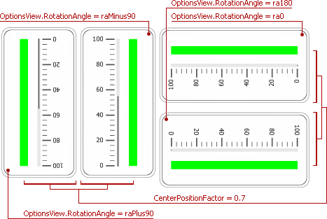
The range’s position within the scale is determined either by the CenterPositionFactor or RadiusFactor property values for linear or arc scales, respectively.
For linear ranges, the distance from the scale’s left edge to the range bar’s center line is the product of multiplying the scale’s width by the CenterPositionFactor property value.
The RadiusFactor and WidthFactor properties determine the range’s thickness and position for arc scales. The range arc’s outer radius and width are the products of multiplying the scale radius by the RadiusFactor and WidthFactor property values, respectively. The range’s inner radius is calculated by subtracting its width from the outer radius.
To set up the range bar’s position at design time, use either its RadiusFactor or CenterPositionFactor property via the Object Inspector, depending on the scale type. Assign a new value to one of these properties at runtime to change the range bar’s position in response to any event occurring in your application.