Tile Controls
- 4 minutes to read
The ExpressTileControl Suite includes two visual components inspired by the Microsoft Windows 8 UI that help you easily integrate live tiles into your applications: the Tile Control and Tile Bar Control. Commonly called Tile Controls, they are built with tiles – interactive informative boxes – arranged in a specific manner. Each of the controls is designed to implement different application navigation models:
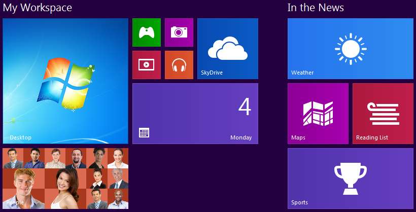
The Tile Control represents the application’s main page and its tiles are arranged to conform to the Windows 8 UI:
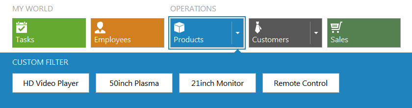
The Tile Bar Control represents the application’s main horizontal or vertical scrollable tile-based menu:
Tiles
Despite their size, tiles are capable of presenting much more information than just static images and/or text (up to four text blocks). For each tile, you can provide any number of frames that will be displayed one after another, similar to slides, with various animation effects.

In addition, you can turn your tiles into elegant contact lists or photo galleries, allowing them to display images with a mosaic effect similar to that found in the Windows Phone People Hub.

Detail Pages
Although the Tile Control and Tile Bar Control correspond to different application navigation models, both controls allow you to add custom functionality to your tiles available to end-users by clicking or tapping tiles (also called tile activation). You can visualize tile activation results and show relevant information within detail pages displayed within the same (Tile Bar Control) or different pages (Tile Control) in your application. For more information on content pages associated with individual tile items, refer to the Tile Detail Pages topic.

Accessibility
Both tile controls fully support touch screens, so end-users can drag and drop tiles, activate them, and scroll the control with their fingers, as well as with the mouse and/or arrow keys.
To get acquainted with the Tile Control and see its capabilities in action, run the RealtorWorld, FrameAnimationDemo, or DesktopDemo shipped with the ExpressTileControl Suite. The Tile Bar Control’s features are demonstrated in the HybridDemo.
Visual Elements
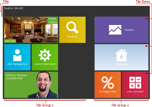
Tiles (also called tile items) are logically combined into groups and each group can contain as many items as required. You can switch between predefined sizes for each individual tile. Tiles typically act as buttons capable of displaying static or dynamic content, including text and graphics, on their surface. You can optionally display group titles to provide more information.
Refer to the Tile Groups and Items and Tile Control Title topics to learn about groups, items, and the title.
Design-Time Experience
Both the Tile Control and Tile Bar Control support on-form object access – you can click a control, group or item to display its properties in the Object Inspector. Drag-and-drop operations and content scrolling are also supported at design time.
Group, tile item, and control context menus always provide the most commonly used group and tile management commands, facilitating fluent layout customization.

In addition, you can double-click a tile item to add an empty implementation of its OnClick event handler into the code.
The Tile Control and Tile Bar Control are implemented as the TdxTileControl and TdxTileBar components, respectively. The table below lists the TdxTileControl and TdxTileBar members that affect the Tile Control and Tile Bar Control characteristics.
Characteristic | Description |
|---|---|
Contents | The Items and Groups collections and the Title option set. You can manage items and groups via the CreateItem, CreateGroup, DeleteItem, and RemoveGroup method calls. |
Appearance | The LookAndFeel, Style, and Transparent properties. |
Behavior | The OptionsBehavior option set. Use the Controller.FocusedItem and Controller.HottrackedItem properties to focus or highlight specific tiles. Handle the OnItemFocusChange and OnItemFocusChanging events to respond to focusing tile items and prohibit certain tile items from being focused. In addition, you can handle the OnItemDragBegin, OnItemDragOver, and OnItemDragEnd events for granular control over drag-and-drop operations with individual tile items. |
Animation | The Controller.StopItemContentAnimation and Controller.StartItemContentAnimation methods allow you to temporarily suspend animation of item frames and mosaics. The OptionsItemAnimate property. |
Layout | The OptionsView option set. To save and restore layout information, call the StoreToIniFile, StoreToRegistry, StoreToStream, RestoreFromIniFile, RestoreFromRegistry, and RestoreFromStream methods. To customize layout persistence settings, handle the OnGetStoredProperties, OnGetStoredPropertyValue, OnSetStoredPropertyValue, and OnInitStoredObject events. For in-depth customization, you can call the OnGetStoredProperties, OnGetStoredPropertyValue, and OnSetStoredPropertyValue events of individual groups and items. |
HitTest Information | The ActiveHitTest property. |