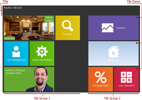
Tile Groups and Items
- 6 minutes to read
Tile groups and items are the Tile Control‘s primary elements. The Tile Control consists of groups, which contain one or more items. These groups and items are arranged according to the Tile Control’s OptionsView.GroupLayout setting.
You can control how groups and items visually detach from each other and from the Tile Control edges, using a comprehensive set of properties.
Group Captions
You can optionally provide captions for tile groups, in order to help end-users identify tile groups and their content. Group captions always reside above the group content and span one line.

With the Tile Control’s OptionsBehavior.GroupRenaming property, you can allow end-users to customize group captions at runtime in a manner similar to that found in Windows 8.
Tile Sizes
The Tile Control supports four tile sizes:
Small. A small item is about half the size of a regular item.
Regular. A regular item is OptionsView.ItemWidth pixels wide by OptionsView.ItemHeight pixels high. These properties are specified at the Tile Control’s level and are common to all tile items.
Large (2x as wide as a regular tile).
Extra-large (a large item that occupies two rows).

To select the tile size, use a tile item’s Size property. You can vertically enlarge any item, making it easier for end-users to view and interact with it, via its RowCount property.
Tile and Group Interactions
Normally, tile items act as buttons. They can be hot-tracked, focused, and activated either by mouse clicks or via the keyboard (using the arrow and Enter keys). Activating a tile fires its OnClick and OnActivateDetail events, which you can handle to perform custom actions and/or initialize the detail control associated with the tile.
Tile items can be moved within and between tile groups using drag and drop provided that the Tile Control’s OptionsBehavior.ItemMoving property is set to True. A new group is created automatically if a tile item is dropped between existing groups. Similarly, you can allow entire groups to be re-arranged within the Control via the Tile Control’s OptionsBehavior.GroupMoving property. A group can be moved by clicking/tapping within the empty area of this group. All of these arrangement capabilities are available at design and runtime.
Tile Selection with Check Marks
The Tile Control supports selecting multiple tiles using right-clicks or swipe down gestures. Each selected tile is emphasized with a frame and a check mark displayed in the tile’s top-right corner. That is why these tiles are also called checked.
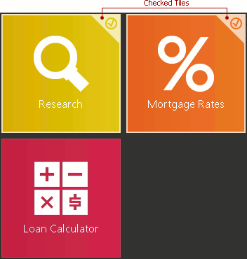
Right-clicking or swiping down a tile toggles its checked state and accordingly updates the current selection. You can handle the Tile Control’s OnItemBeforeCheck event to prohibit certain tiles from being checked. In addition, you can completely disable tile checking via the Tile Control’s OptionsBehavior.ItemCheckMode option.
If at least one tile is checked (selected), the Tile Control automatically displays action bars. You can implement the context-sensitive behavior for them by responding to selection changes and dynamically switching the visibility of action bar items that are specific to the current selection, via the Tile Control’s OnItemCheck event.
Clicking any action bar or its action button, activating a tile, or starting a drag-and-drop operation automatically clears the selection (unless a tile being dragged is currently selected). End-users can instantly clear the selection by pressing the Esc key.
Tile items and groups are implemented by the TdxTileControlItem and TdxTileControlGroup components. The table below lists component members that affect main tile element characteristics.
Characteristic | Description |
|---|---|
Visibility | The Visible property of a tile item or group. To scroll a particular item or group into view, call its MakeVisible property. In addition, you can set an item’s GroupIndex property to -1 to unlink it from a group. Unlinked tile items are not shown in tile controls. |
Contents | You can manage items in a tile group via the Items property, and the Add, DeleteItem, DeleteItems, RemoveItem, and RemoveItems methods of the group. At design time, tile groups and items can be created using either the Tile Control’s Items and Groups collection editors or the context menu. Removing a group does not remove its items – you can still access them via the Items collection. Use the following set of item properties to customize item contents – text, graphics, and animated frames: ActiveFrame, ActiveFrameIndex, Frames, Glyph, Text1, Text2, Text3, and Text4. Use a tile group’s Caption.Text property to specify the group caption. Use the tile item’s DetailOptions.DetailControl and/or PopupOptions.PopupControl properties to associate the tile with a detail page and/or popup control, respectively. |
Appearance | Use the following set of item properties to customize the item content appearance: Glyph, ParentStyle, Style, Text1, Text2, Text3, and Text4. Use a tile group’s Caption.Color and Caption.Font properties to customize the group caption’s appearance. Use the tile’s PopupOptions.BorderHeight, PopupOptions.BorderWidth, PopupOptions.BorderColor, and PopupOptions.Color properties to customize the appearance of the associated popup control. Use the Tile Control’s Style property set to customize appearance settings that are common to all tile items. |
Behavior | Tile Activation A tile item’s DetailOptions.DetailControl property. Call a tile item’s Click, ActivateDetail and DeactivateDetail methods to programmatically control tile activation. Handle a tile item’s OnClick, OnActivateDetail, and OnDeactivateDetail events to respond to tile activation. Popup Control Activation Handle the tile bar control’s OnPopupActivate and OnPopupDeactivate events to respond to displaying or hiding the popup control. To prevent the popup control from displaying or hiding, handle the OnPopupActivating or OnPopupDeactivating events, respectively. Tile Selection A tile item’s Checked property. Note You can prohibit end-user interaction (including tile activation and tile selection) with certain items and/or entire groups via their Enabled property. |
Animation | A tile item’s AnimationInterval, AnimationMode, and OptionsAnimate properties. A tile frame’s OptionsAnimate property. Handle a tile item’s OnActiveFrameChanged event to respond to frame changes. |
Layout | The GroupIndex, Size, and RowCount properties and the Move method of a tile item. The Index property and the MoveItem method of a tile group. The OnGetStoredProperties, OnGetStoredPropertyValue, and OnSetStoredPropertyValue events of individual groups and items allow you to customize the manner in which layout information is saved and restored. Use a tile group’s Caption.Alignment property to specify how the caption text is aligned within the caption area. |