Tile Control Title
- 2 minutes to read
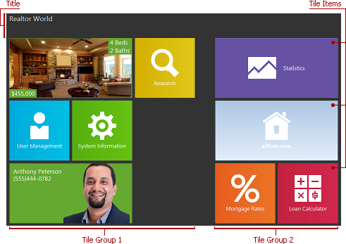
The title is always displayed at the top of the Tile Control, above tiles and detail page contents. The title provides common information within the Tile Control.
The title can display a text and/or glyph. In detail pages, the title also hosts tab captions and the Back button that provide navigation between detail pages and the main page. Tab captions reside between the title’s text and glyph, in one row. The title height is automatically adjusted to completely display its content vertically.

The TdxTileControlTitle class implements title settings. The table below lists class members that affect the main characteristics of the title.
align=”center” colspan=”2” ! | ||
|---|---|---|
Characteristic | Description | |
Visibility | The main page displays the title only if its text and/or glyph are specified via the Text and Glyph properties. Detail pages display the title regardless of these property settings in order to host the Back button and tab captions. | |
colspan=”2” | | ||
Contents | Use the Text and/or Glyph properties to specify the text and/or glyph for the title. | |
colspan=”2” | | ||
Appearance | Use the Color property to specify the title’s background color. To specify the font settings that are common to the title’s text and captions of detail page tabs, use the Font property. Use the TabsActiveTextColor, TabsFontSize, TabsTextColor, and TabsHotTextColor properties to customize the appearance of tab captions. | |
colspan=”2” | | ||
Layout | Use the IndentHorz and IndentVert properties to adjust the glyph’s horizontal and vertical offsets inside the title area. | |
colspan=”2” | | ||