Tile Control
- 3 minutes to read
The ExpressTile Control (Tile Control for short) is a visual component inspired by the Microsoft Windows 8 UI that helps you easily integrate live tiles into your applications. The Tile Control is built with tiles – informative boxes – arranged in a specific manner to conform to the Windows 8 UI.

Detail Pages
With the Tile Control, you can add any custom functionality for your tiles and let end-users invoke it with clicks or taps (also called tile activation). You can visualize tile activation results and show relevant information within additional pages called detail pages. Refer to the Tile Detail Pages topic for more information about these pages.

Visual Elements
Tiles (also called tile items) are logically combined into groups and each group can contain as many items as required. You can have small, regular, large, and extra-large size tiles. Tiles typically act as buttons capable of displaying text and graphics on their surface. You can optionally display the title to provide common information within the entire Tile Control.
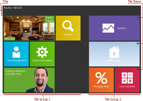
Refer to the Tile Groups and Items and Tile Control Title topics to learn about groups, items, and the title.
Group Layout
Two group layouts are supported: horizontal and vertical. In a horizontal layout, tiles that belong to one group can be arranged in multiple columns.
In a vertical layout, tiles in a group are always arranged in one column.
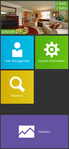
You can switch between these group layouts via the Tile Control’s OptionsView.GroupLayout property.
Action Bars
Action bars allow you to extend the Tile Control with an additional context-specific functionality, similar to context menus in toolbar/menu systems. You can customize the appearance and behavior of action bars as required. Refer to the Tile Action Bars topic for more information about action bars.
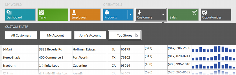
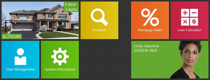
Use Cases
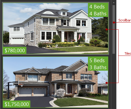
The Tile Control was specifically designed to help you create Windows 8 style UIs. However, you can easily extend its scope with adjustments to the appearance and behavior settings. For example, you can adjust them to mimic the look & feel of an advanced version of a list box capable of displaying items with multiple text blocks, background images, and optional content animation. To see an example of this use case in action, run the RealtorWorld demo shipped with the ExpressTileControl Suite and activate the Houses or Agents detail page. To underpin the list box’s design on these detail pages, all drag-and-drop operations with tiles are disabled using the Tile Control’s OptionsBehavior.GroupMoving and OptionsBehavior.ItemMoving properties.
Moreover, you can use the Tile Control as a popup control associated with the Tile Bar Control’s tile item. To see an example of this use case in action, run the HybridDemo shipped with the ExpressTileControl Suite and click the tile’s dropdown button: