DxFormLayout Class
A Form Layout component.
Namespace: DevExpress.Blazor
Assembly: DevExpress.Blazor.v21.1.dll
NuGet Package: DevExpress.Blazor
Declaration
public class DxFormLayout :
    DxComponentBase,
    INestedSettingsOwner,
    IFormLayoutLevel,
    IFormLayoutBase,
    IFormLayoutItemOwner,
    ISizeModeAccessor,
    IRequireSelfCascading,
    IServiceProviderAccessor
Remarks
The DevExpress Form Layout for Blazor (<DxFormLayout>) consists of data editors and allows you to create responsive edit forms that are automatically arranged.
Add a Form Layout to a Project
Follow the steps below to add the Form Layout component to an application:
- Use a DevExpress Project Template to create a new Blazor Server or Blazor WebAssembly application. If you use a Microsoft project template or already have a Blazor project, configure your project to incorporate DevExpress Blazor components.
- Add the
<DxFormLayout>…</DxFormLayout>markup to a Razor page. - Add layout items
<DxFormLayoutItem>…</DxFormLayoutItem>into the component’s markup. - Configure the component (see the sections below).
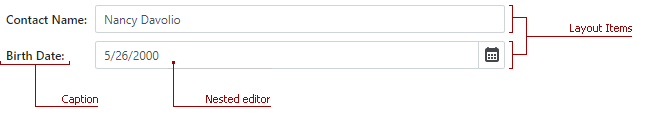
Layout Items
<DxFormLayout> consists of multiple layout items (DxFormLayoutItem) - containers that arrange nested Blazor components. An item can include a caption displayed against the corresponding component. To specify the item’s nested component, use the item’s Template property.
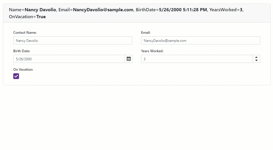
<DxFormLayout>
    <DxFormLayoutItem Caption="Contact Name:" ColSpanMd="6">
        <DxTextBox @bind-Text="@Name" />
    </DxFormLayoutItem>
    <DxFormLayoutItem Caption="Birth Date:" ColSpanMd="6">
        <DxDateEdit @bind-Date="@BirthDate" />
    </DxFormLayoutItem>
</DxFormLayout>
Note
Item templates should not include layout hierarchy objects (groups, items). Otherwise, an exception occurs.
The Bootstrap grid system renders the <DxFormLayout>. You can specify the number of virtual columns each layout item occupies. This number is an integer between 1 and 12 that can be specified for five different screen resolutions:
- ColSpanXl - Extra large screens (1200px or wider).
- ColSpanLg - Large screens (992px or wider).
- ColSpanMd - Medium screens (768px or wider).
- ColSpanSm - Small screens (576px or wider).
- ColSpanXs - Extra small screens (less than 576px).
<DxFormLayout>
    <DxFormLayoutItem Caption="Name" ColSpanLg="4" ColSpanMd="6" ColSpanSm="12">
        <DxTextBox @bind-Text="@Name"></DxTextBox>
    </DxFormLayoutItem>
</DxFormLayout>
All layout items are rendered as .col elements within a single .row container. An item moves to the next row if there are not enough virtual columns within the current row. To explicitly indicate that the item should be placed into a new row, use an item’s BeginRow property.
<DxFormLayout Data="@DataSource">
    <DxFormLayoutItem Caption="Postal/ZIP Code" BeginRow="true" />
</DxFormLayout>
The table below lists the main layout item settings.
Member | Description |
|---|---|
Specifies the caption position. | |
Specifies a data source field assigned to the current layout item. | |
Specifies whether the current layout item is visible in the Form Layout. | |
Specifies how caption paddings are calculated in the Form Layout component. | |
Specifies the name of a CSS class applied to a layout item. | |
Specifies the name of the CSS class applied to the layout item’s caption. | |
Specifies whether the Form Layout item activates read-only mode for a nested auto-generated editor. | |
Specifies whether the Form Layout item’s auto-generated editor is enabled. |
Bind to Data
<DxFormLayout> allows you to display and edit data from the data source fields. You do not have to bind each layout item to a data source and specify proper label captions that correspond to field names. This is done automatically. Bind the control to a data source via the Data property and specify which fields are to be displayed. To set up a correspondence between a data source field and a layout item, use the item’s Field property. Once a user changes a layout item’s value, post all changes to a data source. To do so, handle the ItemUpdating event.
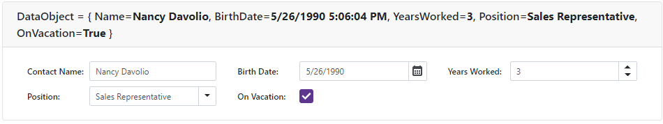
<DxFormLayout Data="@editFormData"
              ItemUpdating="@((pair) => OnItemUpdating(pair.Key, pair.Value))">
    <DxFormLayoutItem Field="@nameof(FormDataItem.Name)" Caption="Contact Name:" />
    <DxFormLayoutItem Field="@nameof(FormDataItem.BirthDate)" Caption="Birth Date:" />
    <DxFormLayoutItem Field="@nameof(FormDataItem.YearsWorked)" Caption="Years Worked:" />
    <DxFormLayoutItem Field="@nameof(FormDataItem.Position)" Caption="Position:" >
        <DxComboBox Data="@(new List<string>() { "Sales Representative", "Designer" })"
                    Value="@(((string)((ValueEditContext)context).Value))"
                    ValueChanged="@((string value) => ((ValueEditContext)context).OnChanged(value))">
        </DxComboBox>
    </DxFormLayoutItem>
    <DxFormLayoutItem Field="@nameof(FormDataItem.OnVacation)" Caption="On Vacation:" ColSpanMd="6" />
</DxFormLayout>
Once a layout item is bound to a data source field, <DxFormLayout> tries to determine the corresponding data field’s type. If the component can determine the type, it displays the corresponding editor within the layout item.
Field Data Type | Editor |
|---|---|
Boolean | |
Date | |
Numeric | |
String | |
Other |
To display a custom editor within a bound layout item, use the item’s Template property.
Groups
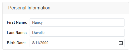
A layout group (DxFormLayoutGroup) is a built-in container that allows you to combine layout items and other layout groups into titled panels. You can use the ColSpanXX properties (see the section above) to specify the width of layout groups.
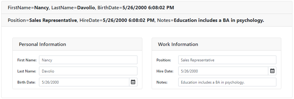
<DxFormLayout>
    <DxFormLayoutGroup Caption="Personal Information" ColSpanMd="6">
        <DxFormLayoutItem Caption="First Name:" ColSpanMd="12">
            <DxTextBox @bind-Text="@FirstName" />
        </DxFormLayoutItem>
        <DxFormLayoutItem Caption="Last Name:" ColSpanMd="12">
            <DxTextBox @bind-Text="@LastName" />
        </DxFormLayoutItem>
        <DxFormLayoutItem Caption="Birth Date:" ColSpanMd="12">
            <DxDateEdit @bind-Date="@BirthDate" />
        </DxFormLayoutItem>
    </DxFormLayoutGroup>
    // ...
</DxFormLayout>
Use the CaptionCssClass property to customize a group caption. The following code snippet applies a custom CSS class to the input’s text:
<style>
    .my-style {
        text-decoration: underline;
    }
</style>

<DxFormLayout>
    <DxFormLayoutGroup Caption="Personal Information" ColSpanMd="6" CaptionCssClass="my-style">
        <DxFormLayoutItem Caption="First Name:" ColSpanMd="12">
            <DxTextBox @bind-Text="@FirstName" />
        </DxFormLayoutItem>
        // ...
    </DxFormLayoutGroup>
</DxFormLayout>
Tabs
A layout tab (DxFormLayoutTabPage) is a built-in tabbed container for layout items and groups. All the Layout Form’s tabs are stored in the DxFormLayoutTabPages collection. To specify the active tab, use the zero-based ActiveTabIndex property.
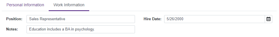
<DxFormLayout>
    <DxFormLayoutTabPages ActiveTabIndex="1">
        // ...
        <DxFormLayoutTabPage Caption="Work Information">
            <DxFormLayoutItem Caption="Position:" ColSpanMd="6">
                <DxTextBox @bind-Text="@Position" />
            </DxFormLayoutItem>
            <DxFormLayoutItem Caption="Hire Date:" ColSpanMd="6">
                <DxDateEdit @bind-Date="@HireDate" />
            </DxFormLayoutItem>
            <DxFormLayoutItem Caption="Notes:" ColSpanMd="6">
                <DxTextBox @bind-Text="@Notes" />
            </DxFormLayoutItem>
        </DxFormLayoutTabPage>
    </DxFormLayoutTabPages>
</DxFormLayout>
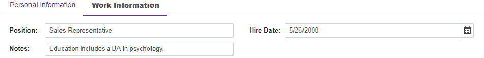
Use the CaptionCssClass to specify the CSS class name applied to a tab’s caption. In the following example, the CSS rule changes the font weight:
<style>
    .my-style {
        font-weight: 900;
    }
</style>

<DxFormLayout>
    <DxFormLayoutTabPages ActiveTabIndex="1">
        // ...
        <DxFormLayoutTabPage Caption="Work Information" CaptionCssClass="my-style">
            <DxFormLayoutItem Caption="Position:" ColSpanMd="6">
                <DxTextBox @bind-Text="@Position" />
            </DxFormLayoutItem>
            // ...
        </DxFormLayoutTabPage>
    </DxFormLayoutTabPages>
</DxFormLayout>
Input Validation
You can add the Form Layout component to the Blazor’s standard EditForm. This form validates user input based on data annotation attributes defined in a model and indicates errors.
For more information, refer to the following help topic: Validate Input.
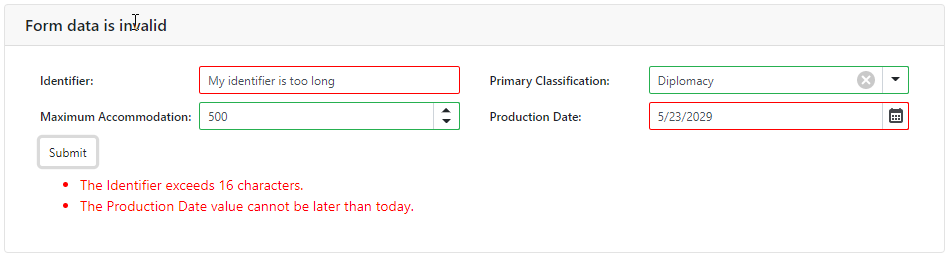
<EditForm Model="@starship" Context="EditFormContext">
    <DataAnnotationsValidator />
    <DxFormLayout>
        <DxFormLayoutItem Caption="Identifier:" ColSpanMd="6" >
            <DxTextBox @bind-Text="@starship.Identifier" />
        </DxFormLayoutItem >
        @*...*@
    </DxFormLayout>
</EditForm>

@code {
    private Starship starship=new Starship();
}