DxFormLayoutGroup Class
Specifies a container for layout items and other layout groups.
Namespace: DevExpress.Blazor
Assembly: DevExpress.Blazor.v21.1.dll
NuGet Package: DevExpress.Blazor
Declaration
public class DxFormLayoutGroup :
    FormLayoutGroupBase
Remarks
Use the DxFormLayoutGroup class to organize layout items (DxFormLayoutItem) and other layout groups. You can use ColSpanXX properties to specify a group width.
See Also: Bootstrap documentation
Create a Group
The following example illustrates how to create groups of layout items in the Form Layout:
<DxFormLayout>
    <DxFormLayoutGroup Caption="Personal Information">
        <DxFormLayoutItem Caption="First Name:" ColSpanMd="6">
            ...
        </DxFormLayoutItem>
    </DxFormLayoutGroup>

    <DxFormLayoutGroup Caption="Work Information">
        <DxFormLayoutItem Caption="Position:" ColSpanMd="6">
            ...
        </DxFormLayoutItem>
    </DxFormLayoutGroup>
</DxFormLayout>
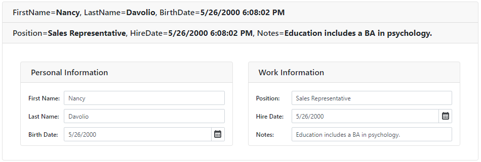
Use the CssClass property to customize the group’s appearence.
Specify a Caption
To specify a group caption, use the Caption property:

Use the CaptionPosition property to place the caption above an item (Vertical) or at its left (Horizontal).
Customize a Group Header
You can specify the template for a group header. To do this, add the HeaderTemplate component to the group’s markup and wrap group items in the Items component:
<DxFormLayout>
    <DxFormLayoutGroup ColSpanMd="6">
        <HeaderTemplate>
            <div class="float-left">
                Work Information
            </div>
            <div class="float-right">
                <DxCheckBox CheckedChanged="@((bool t) => UnemployedChanged(t))" LabelPosition="LabelPosition.Left" Checked="@Unemployed">Unemployed</DxCheckBox>
            </div>
        </HeaderTemplate>
        <Items>
            <DxFormLayoutItem Caption="Position:" ColSpanMd="12">
                <DxTextBox @bind-Text="@Position" Enabled="!Unemployed" />
            </DxFormLayoutItem>
            // ...
        </Items>
    </DxFormLayoutGroup>
</DxFormLayout>

@code {
  bool Unemployed { get; set; }
  string? Position { get; set; } = "Sales Representative";
  // ...
  void UnemployedChanged(bool value)
  {
      // ...
      Position = value ? null : Position;
      Unemployed = value;
  }
}
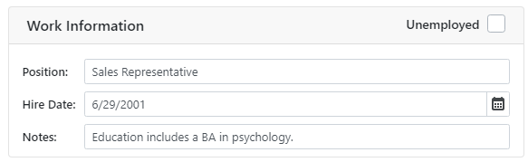
You can apply CSS classes to a group header. To do this, use the HeaderCssClass.
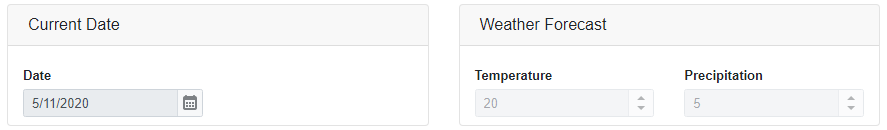
Enabled and Read-Only Modes
You can disable the group or mark it as read-only.
<DxFormLayout Data="forecast">
    <DxFormLayoutGroup Caption="Current Date" ColSpanMd="6" ReadOnly="true">
        <DxFormLayoutItem Caption="Date" Field="@nameof(WeatherForecast.Date)" ReadOnly="true" />
    </DxFormLayoutGroup>
    <DxFormLayoutGroup Caption="Weather Forecast" ColSpanMd="6" Enabled="false">
        <DxFormLayoutItem Caption="Temperature" Field="@nameof(WeatherForecast.TemperatureC)" Enabled="false" />
        <DxFormLayoutItem Caption="Precipitation" Field="@nameof(WeatherForecast.Precipitation)" />
    </DxFormLayoutGroup>
</DxFormLayout>