DxScheduler Class
A calendar and scheduler component.
Namespace: DevExpress.Blazor
Assembly: DevExpress.Blazor.v21.1.dll
NuGet Package: DevExpress.Blazor
Declaration
public class DxScheduler :
    DxComponentBase<SchedulerJSInteropProxy>,
    ISchedulerJSInteropProxyServer,
    IJSCallback,
    ISchedulerViewOwner,
    ISizeModeAccessor,
    IRequireSelfCascading
Remarks
<DxScheduler> allows users to view and manage scheduled appointments.
Add a Scheduler to a Project
Follow the steps below to add the Scheduler component to an application:
- Use a DevExpress Project Template to create a new Blazor Server or Blazor WebAssembly application. If you use a Microsoft project template or already have a Blazor project, configure your project to incorporate DevExpress Blazor components.
- Add the
<DxScheduler>…</DxScheduler>markup to a Razor page. - Bind the Scheduler to data.
- Add views to the Scheduler.
- Specify other Scheduler options (see the sections below).
Bind to Data
Follow the steps below to bind the Scheduler component to data:
- Create a DxSchedulerDataStorage object. Use the constructor without parameters.
- Use the DxSchedulerDataStorage.AppointmentsSource property to fill the storage with a collection of data objects.
- Create a DxSchedulerAppointmentMappings object and map data source fields to appointment properties.
- Assign the newly created object to the DxSchedulerDataStorage.AppointmentMappings property.
- Assign the data source to the Scheduler’s DataStorage property.
 <DxScheduler StartDate="@DateTime.Today" DataStorage="@DataStorage">
    <DxSchedulerWeekView ShowWorkTimeOnly="true"></DxSchedulerWeekView>
</DxScheduler>

@code {
    DxSchedulerDataStorage DataStorage = new DxSchedulerDataStorage() {
        AppointmentsSource = AppointmentCollection.GetAppointments(),
        AppointmentMappings = new DxSchedulerAppointmentMappings() {
            Type = "AppointmentType",
            Start = "StartDate",
            End = "EndDate",
            Subject = "Caption",
            AllDay = "AllDay",
            Location = "Location",
            Description = "Description",
            LabelId = "Label",
            StatusId = "Status",
            RecurrenceInfo = "Recurrence"
        }
    };
}
If you need to load appointments for a specific time period, refer to the following GitHub example: How to load appointments for visible interval only (lazy loading).
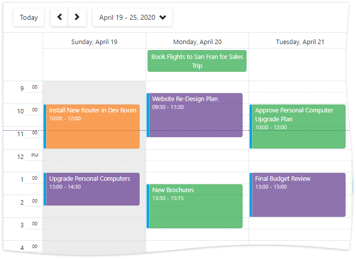
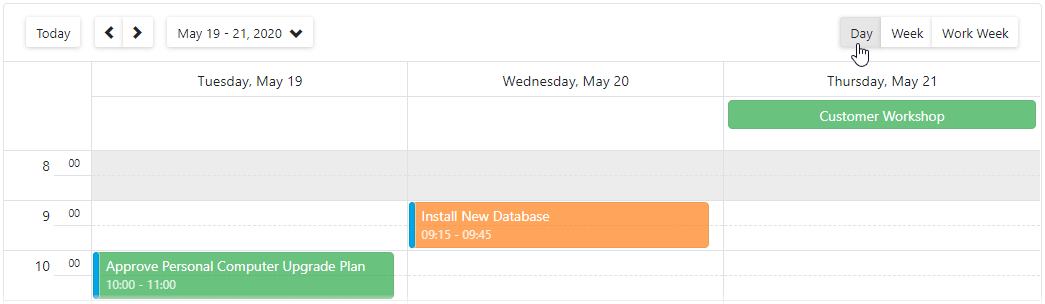
Views
<DxScheduler> can contain the following views:
- DxSchedulerDayView - displays one or multiple days.
- DxSchedulerWeekView - displays one week at a time.
- DxSchedulerWorkWeekView - displays one work week at a time.
- DxSchedulerMonthView - displays one or multiple months.
- DxSchedulerTimelineView - displays appointments as horizontal bars along timescales.
You should add one or more views to the Scheduler component markup.
<DxScheduler Id="scheduler"
             StartDate="@(DateTime.Today.AddDays(-1))"
             DataStorage="@DataStorage">
    <DxSchedulerDayView ShowWorkTimeOnly="false"
                        DayCount="3"
                        TimeIndicatorVisibility="SchedulerTimeIndicatorVisibility.TodayView"
                        TimeScale="@(new TimeSpan(0,15,0))"
                        WorkTime="@(new DxSchedulerTimeSpanRange(TimeSpan.FromHours(9),
                         TimeSpan.FromHours(18)))"
                        VisibleTime="@(new DxSchedulerTimeSpanRange(TimeSpan.FromHours(8),
                         TimeSpan.FromHours(19)))">
    </DxSchedulerDayView>
    <DxSchedulerWeekView></DxSchedulerWeekView>
    <DxSchedulerWorkWeekView></DxSchedulerWorkWeekView>
    <DxSchedulerMonthView></DxSchedulerMonthView>
    <DxSchedulerTimelineView Duration="@(TimeSpan.FromHours(36))" CellMinWidth="100">
        <Scales>
            <DxSchedulerTimeScale Unit="@SchedulerTimeScaleUnit.Day" UnitCount="1"></DxSchedulerTimeScale>
            <DxSchedulerTimeScale Unit="@SchedulerTimeScaleUnit.Hour" UnitCount="6"></DxSchedulerTimeScale>
        </Scales>
    </DxSchedulerTimelineView>
</DxScheduler>
When you define multiple views, the Scheduler displays a view selector that allows users to switch between views. The Scheduler initially shows the first defined view. You can also use the DxSchedulerBase.ActiveViewType property to specify the active view. To track view changes, handle the ActiveViewTypeChanged event.
When you create a custom appointment form (use the AppointmentFormLayout or the AppointmentCompactFormLayout property), you should use the Views property to add views.
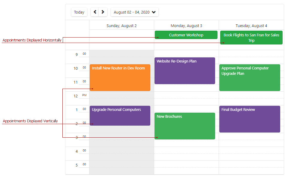
Appointment Types
<DxScheduler> supports different appointment types:
One-Time Appointment - an appointment with a start and end date.
All-Day Appointment - an appointment that occupies an entire day or multiple days. It is displayed in the all-day panel.
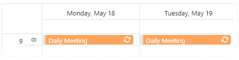
Recurring Appointment - an appointment that repeats on a schedule. It is marked with the “recurrent” icon:
 .
.
Manage Appointments
Users can create, edit, select, and delete appointments in the UI. You can also perform these operations in code:
Select appointments: SelectedAppointment
Event: SelectedAppointmentChanged
Create appointments: CreateAppointmentItem()
Events: AppointmentInserted | AppointmentInserting
Get and edit appointments: GetAppointmentItemById(Object)
Events: AppointmentUpdated | AppointmentUpdating
Remove appointments: RemoveAppointment(DxSchedulerAppointmentItem)
Events: AppointmentRemoved | AppointmentRemoving
Labels
Users can use color labels to categorize appointments. A label is displayed as an appointment’s background color.
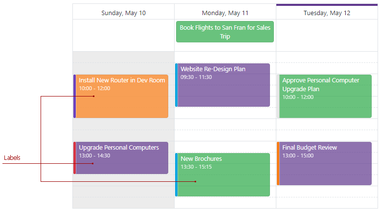
When users create or edit an appointment in the Appointment form, they can select the appointment’s label from the drop-down Label list.
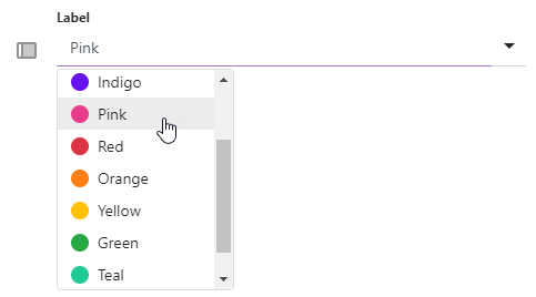
The Scheduler has a built-in collection of 11 color labels. To customize this collection, use the DxSchedulerAppointmentLabelItem (for user labels) or DxSchedulerAppointmentLabelMappings (for mapped labels).
Status Items
Users can mark appointments with availability status. An appointment displays its status as a colored strip on the left edge.
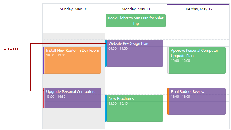
When users create or edit an appointment in the Appointment form, they can select the appointment’s status from the drop-down Status list.
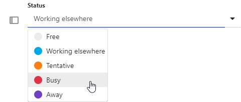
The Scheduler has a built-in status collection:
- Free
- Working elsewhere
- Tentative
- Busy
- Away
To customize this collection, use the DxSchedulerAppointmentStatusItem (for user statuses) or DxSchedulerAppointmentStatusMappings (for mapped statuses).
Resources
You can assign resources to Scheduler appointments to group appointments by category. For instance, if employees are resources, the Scheduler component allows users to browse appointments related to each employee.
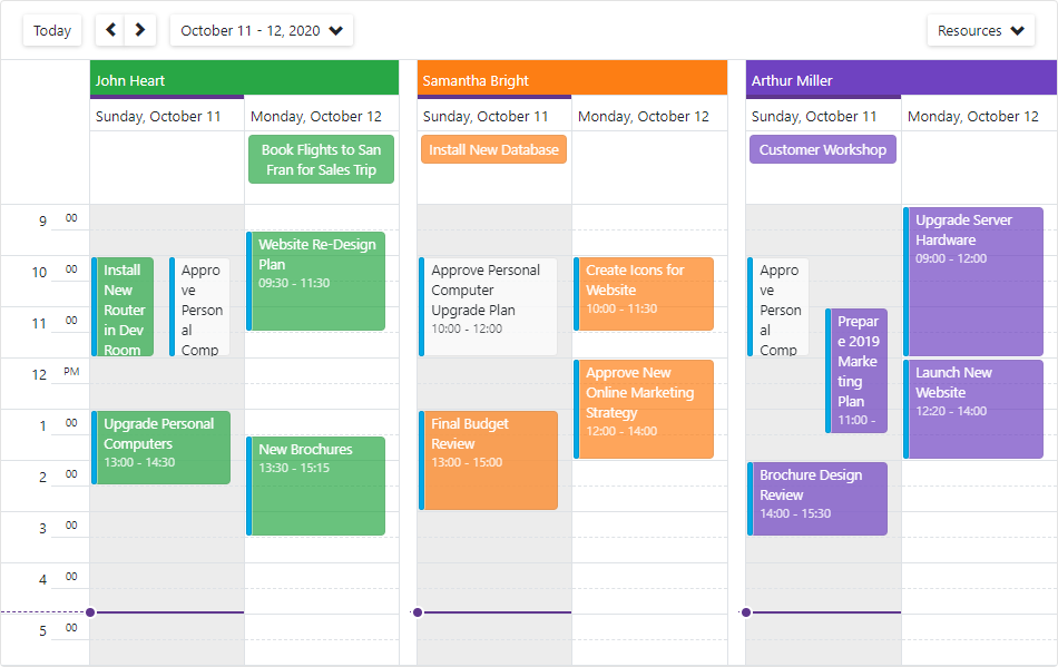
Follow the steps below to add and assign resources to Scheduler appointments:
- Create a DxSchedulerDataStorage object with a simple constructor and specify appointment mappings. See the DxSchedulerAppointmentMappings class description for more information.
- Declare a class that stores resource options (for instance, ResourceObject).
- Create a collection of resource source objects (ResourceObject class instances) and define their options:
- Id - Specifies the resource’s unique identifier.
- Caption - Specifies the resource’s caption.
- Color - Specifies the resource’s color. To apply this color to all appointments that correspond to the resource, remove appointment labels.
- BackgroundCssClass - Specifies the CSS class applied to the resource’s background (the background color, background image, border color, and so on). Note that the Color property value overrides the background color specified in the CSS class.
- TextCssClass - Specifies the CSS class applied to the text of appointments that correspond to the resource.
- Assign the resource collection to the storage’s ResourcesSource property. The Scheduler generates a resource item (DxSchedulerResourceItem) for each item in this collection.
- Create a DxSchedulerResourceMappings object and map the resource’s source fields to the resource’s properties.
- Assign this object to the storage’s ResourceMappings property.
- Group appointments by resource (optional). To do this, set the Scheduler’s GroupType property to
SchedulerGroupType.Resource.
<DxScheduler StartDate="@DateTime.Today"
             DataStorage="@DataStorage"
             GroupType="SchedulerGroupType.Resource"
             ResourceColorInHeaderVisible="true"
             CssClass="mw-1100">
    <DxSchedulerDayView DayCount="2" ShowWorkTimeOnly="true"></DxSchedulerDayView>
</DxScheduler>

@code {
    DxSchedulerDataStorage DataStorage = new DxSchedulerDataStorage() {
        AppointmentsSource = ResourceAppointmentCollection.GetAppointments(),
        AppointmentMappings = new DxSchedulerAppointmentMappings() {
            Type = "AppointmentType",
            Start = "StartDate",
            End = "EndDate",
            Subject = "Caption",
            AllDay = "AllDay",
            Location = "Location",
            Description = "Description",
            LabelId = "Label",
            StatusId = "Status",
            RecurrenceInfo = "Recurrence",
            ResourceId = "ResourceId"
        },
        ResourcesSource = new List<ResourceObject>() {
                new ResourceObject() { Id=0 , Name="John Heart", TextCss="text-white",
                                       BackgroundCss="green-background",
                                       /*Color = System.Drawing.Color.Green*/ },
                new ResourceObject() { Id=1 , Name="Samantha Bright", TextCss="text-white",
                                       BackgroundCss="orange-background",
                                       /*Color = System.Drawing.Color.Orange*/ },
                new ResourceObject() { Id=2 , Name="Arthur Miller", TextCss="text-white",
                                       BackgroundCss="purple-background",
                                       /*Color = System.Drawing.Color.Purple*/ },
        },
        ResourceMappings = new DxSchedulerResourceMappings() {
            Id = "Id",
            Caption = "Name",
            Color = "Color",
            BackgroundCssClass = "BackgroundCss",
            TextCssClass = "TextCss"
        }
    };

    public class ResourceObject {
        public int Id { get; set; }
        public string Name { get; set; }
        public System.Drawing.Color Color { get; set; }
        public string TextCss { get; set; }
        public string BackgroundCss { get; set; }
    }
}

<style>
    .green-background {
        background-color: #13B955;
    }
    .orange-background {
        background-color: #fd7e14;
    }
    .purple-background {
        background-color: #593196;
    }
    .text-white {
        color: white;
    }
</style>
The table below lists other related API members:
Member | Description |
|---|---|
Creates a new resource item. | |
Returns a resource item with the specified identifier from the Scheduler’s data storage. | |
Specifies whether a resource color is applied to the corresponding group’s header. | |
Specifies whether the Scheduler displays the Resource Navigator. | |
Specifies the data source that stores visible resource objects. |
Appointment Templates
<DxScheduler> allows you to use templates to customize appointment appearance:
- HorizontalAppointmentTemplate - applied to all-day appointments that occupy an entire day or multiple days (displayed horizontally in the all-day panel).
- VerticalAppointmentTemplate - applied to other appointments (displayed vertically).
To define appointment content and appearance, use HTML markup within the <HorizontalAppointmentTemplate> and <VerticalAppointmentTemplate> tags.
When you build a template, you can use the template’s context parameter to access appointment data. This parameter returns a DxSchedulerAppointmentView object.
<DxScheduler StartDate="@DateTime.Today" DataStorage="@DataStorage">
    <DxSchedulerDayView ShowWorkTimeOnly="true" DayCount="3">
        <HorizontalAppointmentTemplate>
            <div class="card p-1 @context.Label.BackgroundCssClass">@context.Appointment.Subject</div>
        </HorizontalAppointmentTemplate>
        <VerticalAppointmentTemplate>
            <div class="card @context.Label.BackgroundCssClass" style="height: 100%; padding: 0.2em 0.5em; opacity: 0.9;">
                @context.Appointment.Subject
            </div>
        </VerticalAppointmentTemplate>
    </DxSchedulerDayView>
</DxScheduler>
Custom Fields
Scheduler items (DxSchedulerAppointmentItem, DxSchedulerAppointmentLabelItem, DxSchedulerAppointmentStatusItem) contain predefined sets of properties. When you bind a Scheduler to data, you map these properties to data source fields (see the AppointmentMappings, AppointmentLabelMappings, and AppointmentStatusMappings properties).
You can add custom properties to Scheduler items:
- Define custom fields in source objects.
- Add created fields to the CustomFieldMappings collection.
You can use custom properties in appointment templates to change appointment appearance. To obtain property values, use the CustomFields property. For example, the code below demonstrates how to:
- Add the
Acceptedcustom field to an appointment’s source object. - Map the field to the
IsAcceptedappointment property. - Use the property value in the VerticalAppointmentTemplate and HorizontalAppointmentTemplate (
@context.CustomFields[...])).
<DxScheduler StartDate="@DateTime.Today"
             DataStorage="@DataStorage"
             ActiveViewType="SchedulerViewType.WorkWeek"
             AppointmentFormShowing="OnAppointmentFormShowing"
             ValidateEditForm="true"
             CssClass="mw-1100">
    <Views>
        <DxSchedulerWorkWeekView VisibleTime="@(new DxSchedulerTimeSpanRange(TimeSpan.FromHours(8),
                                 TimeSpan.FromHours(19)))">
            <HorizontalAppointmentTemplate>
                <div class="demo-sc-apt @((bool)context.CustomFields["IsAccepted"] ?
                            "demo-sc-accepted " : "")" style="width: 100%;">
                    <div class="card demo-apt-bg dx-purple-color" style="width: 100%;"></div>
                    <div class="card shadow-sm p-1 demo-sc-apt-content text-white" style="width:100%;">
                        @context.Appointment.Subject
                    </div>
                </div>
            </HorizontalAppointmentTemplate>
            <VerticalAppointmentTemplate>
                <div class="shadow-sm demo-sc-apt @((bool)context.CustomFields["IsAccepted"] ?
                            "demo-sc-accepted" : "")">
                    <div class="card demo-apt-bg dx-purple-color"></div>
                    <div class="card demo-sc-apt-content text-white">
                        <div class="card demo-sc-status-container">
                            <div class="card demo-apt-status dx-purple-color"></div>
                        </div>
                        <div class="demo-apt-subject">
                            @context.Appointment.Subject
                        </div>
                    </div>
                </div>
            </VerticalAppointmentTemplate>
        </DxSchedulerWorkWeekView>
    </Views>
</DxScheduler>

@code {
    DxSchedulerDataStorage DataStorage = new DxSchedulerDataStorage() {
        AppointmentsSource = AppointmentCollection.GetAppointments(),
        AppointmentMappings = new DxSchedulerAppointmentMappings() {
            Type = "AppointmentType",
            Start = "StartDate",
            End = "EndDate",
            Subject = "Caption",
            AllDay = "AllDay",
            Location = "Location",
            Description = "Description",
            CustomFieldMappings = new List<DxSchedulerCustomFieldMapping> {
                new DxSchedulerCustomFieldMapping { Name = "IsAccepted", Mapping = "Accepted" }
            }
        }
    };
The code below demonstrates how to add a custom field to LabelObject and map this field to the appointment label’s custom property:
@code {
    public class LabelObject {
        public int Id { get; set; }
        public string LabelName { get; set; }
        public System.Drawing.Color LabelColor { get; set; }
        public string MyCustomField { get; set; } // a custom field
    }

    DxSchedulerDataStorage DataStorage = new DxSchedulerDataStorage() {
        AppointmentLabelsSource = new List<LabelObject>() {
            new LabelObject() {
                Id = 1,
                LabelName = "Label One",
                LabelColor = System.Drawing.Color.Aqua,
                MyCustomField = "custom text for Label One"
            },
            new LabelObject() {
                Id = 2,
                LabelName = "Label Two",
                LabelColor = System.Drawing.Color.Beige,
                MyCustomField = "custom text for Label Two"
            },
        },
        AppointmentLabelMappings = new DxSchedulerAppointmentLabelMappings() {
            Id = "Id",
            Caption = "LabelName",
            Color = "LabelColor",
            // Map the source object's custom field to the label's custom property
            CustomFieldMappings = new List<DxSchedulerCustomFieldMapping> {
                new DxSchedulerCustomFieldMapping { Name = "MyCustomProperty", Mapping = "MyCustomField" }
            }
        }
    };
}
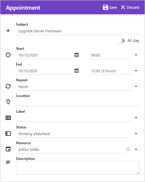
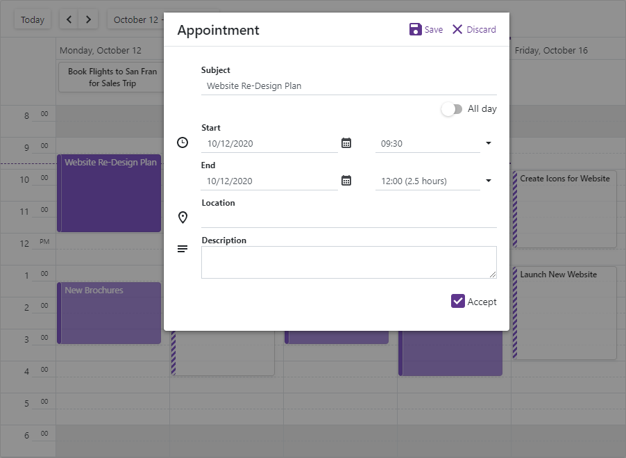
Appointment Edit Form
A Scheduler can show two forms when users create and edit appointments:
- The compact edit form - Appears when a user creates or edits an appointment.
- The pop-up (detailed) edit form - Opens when a user clicks the expand button in the compact edit form.
Use the AppointmentFormMode property to specify which form is available for users.
@using Data

<DxScheduler StartDate="@DateTime.Today"
             DataStorage="@DataStorage"
             AppointmentFormMode="SchedulerAppointmentFormMode.EditForm">
    <DxSchedulerWeekView/>
</DxScheduler>

@code {
    DxSchedulerDataStorage DataStorage = new DxSchedulerDataStorage() {
        AppointmentsSource = AppointmentCollection.GetAppointments(),
        AppointmentMappings = new DxSchedulerAppointmentMappings() {
            Type = "AppointmentType",
            Start = "StartDate",
            End = "EndDate",
            Subject = "Caption",
            AllDay = "AllDay",
            Location = "Location",
            Description = "Description",
            LabelId = "Label",
            StatusId = "Status",
            RecurrenceInfo = "Recurrence"
        }
    };
}
Custom Appointment Form
Use the following properties to create a custom appointment edit form:
- AppointmentCompactFormLayout - the layout of the compact form that appears when a user creates or edits an appointment.
- AppointmentFormLayout - the layout of the pop-up form that opens when a user clicks the expand button in the compact edit form.
You can use predefined and custom layout items to construct the layout in the same way as when you use the DxFormLayout component.
Note
The current design of the Compact Appointment Form does not support the capability to edit recurrence settings.
Predefined Layout Items
You can add the following predefined layout items to set up the layout. They correspond to the items of the default edit form.
- DxSchedulerSubjectFormLayoutItem
- DxSchedulerAllDayFormLayoutItem
- DxSchedulerStartDateFormLayoutItem
- DxSchedulerStartTimeFormLayoutItem
- DxSchedulerEndDateFormLayoutItem
- DxSchedulerEndTimeFormLayoutItem
- DxSchedulerRepeatFormLayoutItem
- DxSchedulerLocationFormLayoutItem
- DxSchedulerLabelFormLayoutItem
- DxSchedulerStatusFormLayoutItem
- DxSchedulerResourceFormLayoutItem
- DxSchedulerDescriptionFormLayoutItem
<DxScheduler StartDate="@DateTime.Today"
             DataStorage="@DataStorage"
             ActiveViewType="SchedulerViewType.WorkWeek">
    <Views>
        <DxSchedulerWorkWeekView VisibleTime="@(new DxSchedulerTimeSpanRange(TimeSpan.FromHours(8),
                                 TimeSpan.FromHours(19)))">
            @*...*@
        </DxSchedulerWorkWeekView>
    </Views>
    <AppointmentFormLayout >
        <DxSchedulerSubjectFormLayoutItem/>
        <DxSchedulerAllDayFormLayoutItem/>
        <DxSchedulerStartDateFormLayoutItem/>
        <DxSchedulerStartTimeFormLayoutItem/>
        <DxSchedulerEndDateFormLayoutItem/>
        <DxSchedulerEndTimeFormLayoutItem/>
        <DxSchedulerRepeatFormLayoutItem/>
        <DxSchedulerLocationFormLayoutItem/>
        <DxSchedulerLabelFormLayoutItem/>
        <DxSchedulerStatusFormLayoutItem/>
        <DxSchedulerResourceFormLayoutItem/>
        <DxSchedulerDescriptionFormLayoutItem/>
    </AppointmentFormLayout>
</DxScheduler>
You can customize settings of these predefined items. For instance, show or hide an icon, assign a custom icon, change a caption, and much more. Refer to an item’s member list for more information.
Custom Layout Items
If predefined items do not suit your requirements, you can use a custom layout item. Add a DxSchedulerCustomFormLayoutItem to the form layout and use its Template property to define the item content. For example, you can display an editor for a custom appointment property.
The AppointmentFormLayout and AppointmentCompactFormLayout accept a SchedulerAppointmentFormInfo object as the Context parameter. You can use this parameter in the layout item template to obtain information about an appointment’s settings.
If appointments contain custom properties, implement a SchedulerAppointmentFormInfo descendant and declare the corresponding properties in the class. Then, handle the AppointmentFormShowing event and assign a custom descendant instance to the event’s FormInfo argument.
<DxScheduler StartDate="@DateTime.Today"
             DataStorage="@DataStorage"
             ActiveViewType="SchedulerViewType.WorkWeek"
             AppointmentFormShowing="OnAppointmentFormShowing">
    @*...*@
    <AppointmentFormLayout Context="formInfo">
        @*...*@
        <DxSchedulerCustomFormLayoutItem ColSpanMd="12">
            <Template>
                <div style="margin-left: auto; margin-top: 14px;">
                    <DxCheckBox @bind-Checked="@(((CustomAppointmentFormInfo)formInfo).IsAccepted)"
                                Alignment="CheckBoxContentAlignment.Right">Accept</DxCheckBox>
                </div>
            </Template>
        </DxSchedulerCustomFormLayoutItem>
    </AppointmentFormLayout>

</DxScheduler>

@code {
    public class CustomAppointmentFormInfo : SchedulerAppointmentFormInfo {
        public CustomAppointmentFormInfo(DxSchedulerAppointmentItem AppointmentItem,
                DxSchedulerDataStorage DataStorage) : base(AppointmentItem, DataStorage) { }

        public bool IsAccepted {
            get { return (bool)CustomFields["IsAccepted"]; }
            set { CustomFields["IsAccepted"] = value; }
        }
    }

    void OnAppointmentFormShowing(SchedulerAppointmentFormEventArgs args) {
        args.FormInfo = new CustomAppointmentFormInfo(args.Appointment, DataStorage);
    }
    // ...
}
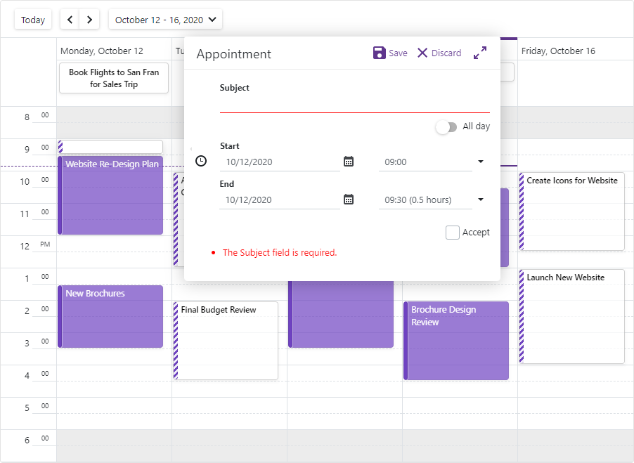
Form Validation
Do the following to enable appointment form validation:
- Implement a SchedulerAppointmentFormInfo class descendant and mark appointment properties with data annotation attributes.
- Handle the AppointmentFormShowing event and assign a custom descendant instance to the event argument’s FormInfo property.
- Set the Scheduler’s ValidateEditForm property to true.
- Add the DxSchedulerCustomFormLayoutItem to the form layout and use the ValidationSummary component in the item template to display validation messages.
Important
You should not rely on form validation alone to secure your Blazor-powered app. Form validation is designed to improve usability. A threat actor can bypass validation and send malicious data to the server. To minimize security related threats/risks, you must validate user input using multiple strategies. Refer to the following topic for more information: Validate User Input.
<DxScheduler StartDate="@DateTime.Today"
             DataStorage="@DataStorage"
             ActiveViewType="SchedulerViewType.WorkWeek"
             AppointmentFormShowing="OnAppointmentFormShowing"
             ValidateEditForm="true">
    @*...*@
    <AppointmentFormLayout>
        @*...*@
        <DxSchedulerCustomFormLayoutItem ColSpanMd="12">
            <Template>
                <ValidationSummary />
            </Template>
        </DxSchedulerCustomFormLayoutItem>
    </AppointmentFormLayout>
</DxScheduler>

@code {
    public class CustomAppointmentFormInfo : SchedulerAppointmentFormInfo {
        public CustomAppointmentFormInfo(DxSchedulerAppointmentItem AppointmentItem,
                DxSchedulerDataStorage DataStorage) : base(AppointmentItem, DataStorage) { }

        [Required]
        public override string Subject {
            get { return base.Subject; }
            set { base.Subject = value; }
        }
        // ...
    }

    void OnAppointmentFormShowing(SchedulerAppointmentFormEventArgs args) {
        args.FormInfo = new CustomAppointmentFormInfo(args.Appointment, DataStorage);
    }
    // ...
}
Complete Example
The following example demonstrates how to:
- Add the IsAccepted custom property to appointments as described in the Custom Fields section.
- Use the AppointmentFormLayout and AppointmentCompactFormLayout properties to create a layout for the detailed (pop-up) and compact edit forms.
- Add predefined layout items (Subject, All day, Start, End to both forms; Location and Description to the pop-up form).
- Add two custom layout items: the first item displays the IsAccepted property’s editor, the second item shows validation summary.
- Mark the Subject appointment property with the Required attribute.
- Set the Scheduler’s ValidateEditForm property to true to enable appointment form validation.
Pop-up (Detailed) Appointment Form
Compact Appointment Form
<DxScheduler StartDate="@DateTime.Today"
             DataStorage="@DataStorage"
             ActiveViewType="SchedulerViewType.WorkWeek"
             AppointmentFormShowing="OnAppointmentFormShowing"
             ValidateEditForm="true"
             CssClass="mw-1100">
    <Views>
        <DxSchedulerWorkWeekView VisibleTime="@(new DxSchedulerTimeSpanRange(TimeSpan.FromHours(8),
                                 TimeSpan.FromHours(19)))">
            <HorizontalAppointmentTemplate>
                <div class="demo-sc-apt @((bool)context.CustomFields["IsAccepted"] ?
                           "demo-sc-accepted " : "")" style="width: 100%;">
                    <div class="card demo-apt-bg dx-purple-color" style="width: 100%;"></div>
                    <div class="card shadow-sm p-1 demo-sc-apt-content text-white" style="width:100%;">
                        @context.Appointment.Subject
                    </div>
                </div>
            </HorizontalAppointmentTemplate>
            <VerticalAppointmentTemplate>
                <div class="shadow-sm demo-sc-apt @((bool)context.CustomFields["IsAccepted"] ?
                           "demo-sc-accepted" : "")">
                    <div class="card demo-apt-bg dx-purple-color"></div>
                    <div class="card demo-sc-apt-content text-white">
                        <div class="card demo-sc-status-container">
                            <div class="card demo-apt-status dx-purple-color"></div>
                        </div>
                        <div class="demo-apt-subject">
                            @context.Appointment.Subject
                        </div>
                    </div>
                </div>
            </VerticalAppointmentTemplate>
        </DxSchedulerWorkWeekView>
    </Views>
    <AppointmentFormLayout Context="formInfo">
        <DxSchedulerSubjectFormLayoutItem/>
        <DxSchedulerAllDayFormLayoutItem/>
        <DxSchedulerStartDateFormLayoutItem/>
        <DxSchedulerStartTimeFormLayoutItem/>
        <DxSchedulerEndDateFormLayoutItem/>
        <DxSchedulerEndTimeFormLayoutItem/>
        <DxSchedulerLocationFormLayoutItem/>
        <DxSchedulerDescriptionFormLayoutItem/>
        <DxSchedulerCustomFormLayoutItem ColSpanMd="12">
            <Template>
                <div style="margin-left: auto; margin-top: 14px;">
                    <DxCheckBox @bind-Checked="@(((CustomAppointmentFormInfo)formInfo).IsAccepted)"
                        Alignment="CheckBoxContentAlignment.Right">Accept</DxCheckBox>
                </div>
            </Template>
        </DxSchedulerCustomFormLayoutItem>
        <DxSchedulerCustomFormLayoutItem ColSpanMd="12">
            <Template>
                <ValidationSummary />
            </Template>
        </DxSchedulerCustomFormLayoutItem>
    </AppointmentFormLayout>
    <AppointmentCompactFormLayout Context="formInfo">
        <DxSchedulerSubjectFormLayoutItem></DxSchedulerSubjectFormLayoutItem>
        <DxSchedulerAllDayFormLayoutItem></DxSchedulerAllDayFormLayoutItem>
        <DxSchedulerStartDateFormLayoutItem></DxSchedulerStartDateFormLayoutItem>
        <DxSchedulerStartTimeFormLayoutItem></DxSchedulerStartTimeFormLayoutItem>
        <DxSchedulerEndDateFormLayoutItem></DxSchedulerEndDateFormLayoutItem>
        <DxSchedulerEndTimeFormLayoutItem></DxSchedulerEndTimeFormLayoutItem>
        <DxSchedulerCustomFormLayoutItem ColSpanMd="12">
            <Template>
                <div style="margin-left: auto; margin-top: 14px;">
                    <DxCheckBox @bind-Checked="@(((CustomAppointmentFormInfo)formInfo).IsAccepted)"
                        Alignment="CheckBoxContentAlignment.Right">Accept</DxCheckBox>
                </div>
            </Template>
        </DxSchedulerCustomFormLayoutItem>
        <DxSchedulerCustomFormLayoutItem ColSpanMd="12">
            <Template>
                <ValidationSummary />
            </Template>
        </DxSchedulerCustomFormLayoutItem>
    </AppointmentCompactFormLayout>
</DxScheduler>

@code {
    public class CustomAppointmentFormInfo : SchedulerAppointmentFormInfo {
        public CustomAppointmentFormInfo(DxSchedulerAppointmentItem AppointmentItem, DxSchedulerDataStorage DataStorage)
            : base(AppointmentItem, DataStorage) { }

        [Required]
        public override string Subject {
            get { return base.Subject; }
            set { base.Subject = value; }
        }

        public bool IsAccepted {
            get { return (bool)CustomFields["IsAccepted"]; }
            set { CustomFields["IsAccepted"] = value; }
        }
    }

    void OnAppointmentFormShowing(SchedulerAppointmentFormEventArgs args) {
        args.FormInfo = new CustomAppointmentFormInfo(args.Appointment, DataStorage);
    }

    DxSchedulerDataStorage DataStorage = new DxSchedulerDataStorage() {
        AppointmentsSource = AppointmentCollection.GetAppointments(),
        AppointmentMappings = new DxSchedulerAppointmentMappings() {
            Type = "AppointmentType",
            Start = "StartDate",
            End = "EndDate",
            Subject = "Caption",
            AllDay = "AllDay",
            Location = "Location",
            Description = "Description",
            CustomFieldMappings = new List<DxSchedulerCustomFieldMapping> {
                new DxSchedulerCustomFieldMapping { Name = "IsAccepted", Mapping = "Accepted" }
            }
        }
    };
}
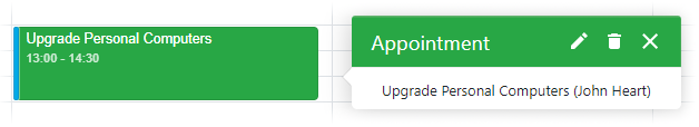
Custom Appointment Tooltip
The Scheduler shows a tooltip when a user clicks an appointment. The tooltip displays the appointment subject, start date, end date, and resource (if specified).
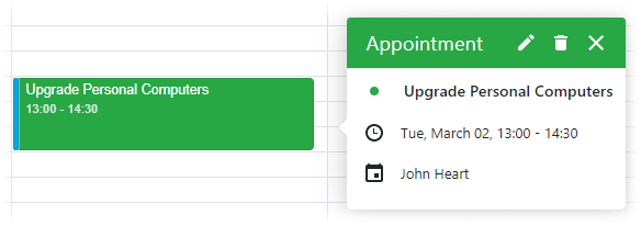
You can use the AppointmentTooltipTemplate property to customize the tooltip’s layout and appearance. The property accepts a SchedulerAppointmentTooltipInfo object as the context parameter. Use the context parameter to access appointment data.
The code below creates a custom tooltip that displays the appointment subject (context.Appointment.Subject) and resource (context.Resource.Caption).
@using Data

<DxScheduler StartDate="@DateTime.Today"
             DataStorage="@DataStorage"
             GroupType="SchedulerGroupType.Date">
    <Views>
        <DxSchedulerDayView/>
    </Views>
    <AppointmentTooltipTemplate>
        <div class="container">
            <span style="vertical-align: middle;">
                @context.Appointment.Subject
            </span>
            @if (context.Resource != null) {
                <span style="vertical-align: middle;">
                    (@context.Resource.Caption)
                </span>
            }
        </div>
    </AppointmentTooltipTemplate>
</DxScheduler>

@code {
    DxSchedulerDataStorage DataStorage = new DxSchedulerDataStorage() {
        AppointmentsSource = ResourceAppointmentCollection.GetAppointments(),
        AppointmentMappings = new DxSchedulerAppointmentMappings() {
            Type = "AppointmentType",
            Start = "StartDate",
            End = "EndDate",
            Subject = "Caption",
            AllDay = "AllDay",
            Location = "Location",
            Description = "Description",
            LabelId = "Label",
            StatusId = "Status",
            RecurrenceInfo = "Recurrence",
            ResourceId = "ResourceId"
        },
        ResourcesSource = ResourceAppointmentCollection.GetResourcesForGrouping(),
        ResourceMappings = new DxSchedulerResourceMappings() {
            Id = "Id",
            Caption = "Name",
            BackgroundCssClass = "BackgroundCss",
            TextCssClass = "TextCss"
        }
    };
}
You can also set the ShowAppointmentTooltip property to false to hide the tooltip.
Restrict User Actions
You can prevent users from creating, updating, and deleting appointments. To do this, set the AllowCreateAppointment, AllowEditAppointment, and AllowDeleteAppointment properties to false.
@using Data

<DxScheduler StartDate="@DateTime.Today"
             DataStorage="@DataStorage"
             AllowCreateAppointment="false"
             AllowEditAppointment="false"
             AllowDeleteAppointment="false">
    <DxSchedulerWeekView/>
</DxScheduler>

@code {
    DxSchedulerDataStorage DataStorage = new DxSchedulerDataStorage() {
        AppointmentsSource = AppointmentCollection.GetAppointments(),
        AppointmentMappings = new DxSchedulerAppointmentMappings() {
            Type = "AppointmentType",
            Start = "StartDate",
            End = "EndDate",
            Subject = "Caption",
            AllDay = "AllDay",
            Location = "Location",
            Description = "Description",
            LabelId = "Label",
            StatusId = "Status",
            RecurrenceInfo = "Recurrence"
        }
    };
}