DxPopup Class
A Popup component.
Namespace: DevExpress.Blazor
Assembly: DevExpress.Blazor.v21.1.dll
NuGet Package: DevExpress.Blazor
Declaration
public class DxPopup :
    ComponentBase,
    IPopupInfo,
    IAsyncDisposable
Remarks
The DevExpress Popup for Blazor allows you to show a pop-up window that overlays the current view.

Add a Popup to a Project
Follow the steps below to add the Popup component to an application:
- Use a DevExpress Project Template to create a new Blazor Server or Blazor WebAssembly application. If you use a Microsoft project template or already have a Blazor project, configure your project to incorporate DevExpress Blazor components.
- Add the
<DxPopup>…</DxPopup>markup to a Razor page. - Write code that manages the Popup’s visibility.
- Define the Popup’s content and appearance.
- Configure other options (see the sections below).
Show and Close a Popup
Implement two-way binding for the Visible property to show the Popup in code and update the property value when a user closes the Popup.
<div @onclick="@(() => PopupVisible = true)">
    <p>CLICK TO SHOW A POP-UP WINDOW</p>
</div>

<DxPopup @bind-Visible="@PopupVisible">
</DxPopup>

@code {
    bool PopupVisible { get; set; } = false;
}
You can also call the ShowAsync and CloseAsync methods to show and close the Popup asynchronously. Make sure the component has been initialized before you call the ShowAsync method. Use the IsInitialized property to check the initialization state.
User Capabilities
Users can close the Popup in the following ways:
- Click the Close button in the header.
- Click outside the Popup’s boundaries.
- Press Escape.
Set the ShowCloseButton, CloseOnOutsideClick, and CloseOnEscape properties to false to disable these user capabilities.
Content and Appearance
The Popup consists of the body and the header with the Close button. Disable the ShowHeader option to hide the header. You can also enable the ShowFooter option to display the Popup footer.
Display Text
Use the HeaderText, BodyText, and FooterText properties to specify text displayed in Popup elements. All predefined appearance settings apply to these elements.
<div @onclick="@(() => PopupVisible = true)">
    <p>CLICK TO SHOW A POP-UP WINDOW</p>
</div>

<DxPopup @bind-Visible="@PopupVisible"
         HeaderText="Header"
         BodyText="Lorem ipsum dolor sit amet, consectetur adipiscing elit. Mauris sit amet metus vel
             nisi blandit tincidunt vel efficitur purus. Nunc nec turpis tempus, accumsan orci auctor,
             imperdiet mauris. Fusce id purus magna." />

@code {
    bool PopupVisible { get; set; } = false;
}
To customize appearance of Popup elements, assign CSS classes to the HeaderCssClass, BodyCssClass, and FooterCssClass properties.
Display Custom Content
Use the HeaderContentTemplate, BodyContentTemplate, and FooterContentTemplate properties to display any UI fragment in Popup elements. A UI fragment can include formatted text, images, another component, and so on.
These templates affect the content area only. Predefined content alignment and paddings apply. The header’s content area does not include the Close button. The following image highlights the content area in red.

These templates take priority over the *Text and *CssClass properties described above.
Each template accepts an IPopupElementInfo object as the context parameter. You can use the parameter’s CloseCallback property to implement the Close button.
<div @onclick="@(() => PopupVisible = true)">
    <p>CLICK TO SHOW A POP-UP WINDOW</p>
</div>

<DxPopup @bind-Visible="@PopupVisible"
         HeaderText="Header"
         ShowFooter="true">
    <BodyContentTemplate>
        <i>
            Lorem ipsum dolor sit amet, consectetur adipiscing elit. Mauris sit amet metus vel
            nisi blandit tincidunt vel efficitur purus. Nunc nec turpis tempus, accumsan orci auctor,
            imperdiet mauris. Fusce id purus magna.
        </i>
    </BodyContentTemplate>
    <FooterContentTemplate>
        <DxButton RenderStyle="ButtonRenderStyle.Primary" Text="OK"
                  Click="@context.CloseCallback" />
    </FooterContentTemplate>
</DxPopup>

@code {
    bool PopupVisible { get; set; } = false;
}

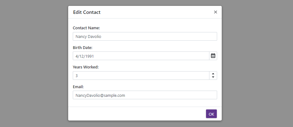
Customize Entire Elements
Specify the HeaderTemplate, BodyTemplate, and FooterTemplate properties to define content and appearance of Popup elements. Predefined appearance settings do not apply. You can display any UI fragment (formatted text, images, another component, and so on).
These templates have the highest priority over the *Text, *CssClass, and *ContentTemplate properties.
Each template accepts an IPopupElementInfo object as the context parameter. You can use the parameter’s CloseCallback property to implement the Close button.
<div @onclick="@(() => PopupVisible = true)">
    <p>CLICK TO SHOW A POP-UP WINDOW</p>
</div>

<DxPopup @bind-Visible="@PopupVisible"
         HeaderText="Edit Contact"
         ShowFooter="true">
    <BodyTemplate Context="PopupContext">
        <div style="padding-top: 1rem; padding-bottom: 1rem">
            <DxFormLayout>
                <DxFormLayoutItem Caption="Contact Name:" ColSpanMd="12">
                    <Template>
                        <DxTextBox Text="Nancy Davolio" />
                    </Template>
                </DxFormLayoutItem>
                <DxFormLayoutItem Caption="Birth Date:" ColSpanMd="12">
                    <Template>
                        <DxDateEdit Date="DateTime.Now.AddYears(-30)" />
                    </Template>
                </DxFormLayoutItem>
                <DxFormLayoutItem Caption="Years Worked:" ColSpanMd="12">
                    <Template>
                        <DxSpinEdit Value="3" />
                    </Template>
                </DxFormLayoutItem>
                <DxFormLayoutItem Caption="Email:" ColSpanMd="12">
                    <Template>
                        <DxTextBox Text="NancyDavolio@sample.com" />
                    </Template>
                </DxFormLayoutItem>
            </DxFormLayout>
        </div>
    </BodyTemplate>
    <FooterContentTemplate>
        <DxButton RenderStyle="ButtonRenderStyle.Primary" Text="OK"
                  Click="@context.CloseCallback" />
    </FooterContentTemplate>
</DxPopup>

@code {
    bool PopupVisible { get; set; } = false;
}
Alignment
The Popup is centered both horizontally and vertically on the screen. Use the HorizontalAlignment and VerticalAlignment properties to change the Popup position.
<div @onclick="@(() => PopupVisible = true)">
    <p>CLICK TO SHOW A POP-UP WINDOW</p>
</div>

<DxPopup @bind-Visible="@PopupVisible"
         HeaderText="Header"
         BodyText="Lorem ipsum dolor sit amet, consectetur adipiscing elit. Mauris sit amet metus vel
             nisi blandit tincidunt vel efficitur purus. Nunc nec turpis tempus, accumsan orci auctor,
             imperdiet mauris. Fusce id purus magna."
         HorizontalAlignment="HorizontalAlignment.Right"
         VerticalAlignment="VerticalAlignment.Bottom" />

@code {
    bool PopupVisible { get; set; } = false;
}
Size
The Popup’s width is equal to 500px on desktops. On phones and tablets, the width adapts to the viewport width. For more information, refer to the following topic: Responsive breakpoints. The Popup’s height changes to fit the content.
Use the Width and Height properties to specify the Popup size in CSS units:
- Specify the absolute width/height (for instance,
Width="300px"). - Specify the relative width/height (for instance,
Width="50%"). - Make the width/height fit the content (
Width="auto").
<div @onclick="@(() => PopupVisible = true)">
    <p>CLICK TO SHOW A POP-UP WINDOW</p>
</div>

<DxPopup @bind-Visible="@PopupVisible"
         HeaderText="Header"
         BodyText="Lorem ipsum dolor sit amet, consectetur adipiscing elit. Mauris sit amet metus vel
             nisi blandit tincidunt vel efficitur purus. Nunc nec turpis tempus, accumsan orci auctor,
             imperdiet mauris. Fusce id purus magna."
         Width="400px"
         Height="200px" />

@code {
    bool PopupVisible { get; set; } = false;
}

The MinWidth, MaxWidth, MinHeight, and MaxHeight properties allow you to define size constraints when the Popup automatically adapts to its content.
<div @onclick="@(() => PopupVisible = true)">
    <p>CLICK TO SHOW A POP-UP WINDOW</p>
</div>

<DxPopup @bind-Visible="@PopupVisible"
         HeaderText="Header"
         BodyText="@DynamicText"
         Width="auto"
         MinWidth="300px"
         MaxWidth="600px" />

@code {
    bool PopupVisible { get; set; } = false;
    string DynamicText { get; set; } // Get text from an external source.
}
When the Popup content does not fit the window’s size entirely, this content is displayed over the window’s boundaries. Set the Scrollable property to true to show scroll bars and display all content inside the window’s boundaries.
Respond to Show and Close Actions
Handle the following events to process show and close actions:
- Showing - Fires before the Popup is displayed and allows you to cancel this action.
- Shown - Fires after the Popup is displayed.
- Closing - Fires before the Popup is closed and allows you to cancel this action.
- Closed - Fires after the Popup is closed.
In the following example, neither the Close button in the header nor the custom OK button closes the Popup until a user enables the checkbox in the footer.

<div @onclick="@(() => EulaVisible = true)">
    <p>CLICK TO SHOW A POP-UP WINDOW</p>
</div>

<DxPopup @bind-Visible="@EulaVisible"
         ShowFooter="true"
         HeaderText="DevExpress EULA"
         Closing="EulaPopupClosing"
         Closed="EulaPopupClosed">
    <BodyContentTemplate>
        <p>
            The terms of our license are fully outlined/described in the Developer Express Inc End User
            License Agreement (EULA) included with our product installations. Before you can install and use
            a Developer Express Inc product, you must read, understand and accept the terms/conditions of
            our EULAs. <a target="" _blank"" rel="" noopener noreferrer"" href=""
                          https: //www.devexpress.com/support/eulas/"">More info...</a>
        </p>
    </BodyContentTemplate>
    <FooterContentTemplate Context="Context">
        <DxCheckBox style="margin-left: 0; margin-right: auto;" @bind-Checked="@EulaAccepted">
            I accept the terms of the EULA
        </DxCheckBox>
        <DxButton RenderStyle="ButtonRenderStyle.Primary" Text="OK" Click="Context.CloseCallback" />
    </FooterContentTemplate>
</DxPopup>
@code {
    bool EulaAccepted { get; set; }
    bool EulaVisible { get; set; }

    void EulaPopupClosed(PopupClosedEventArgs args) {
        EulaAccepted = false;
    }
    void EulaPopupClosing(PopupClosingEventArgs args) {
        if (args.CloseReason == PopupCloseReason.CloseButtonClick & !EulaAccepted)
            args.Cancel = true;
    }
}
Multiple Popups
You can show multiple Popups simultaneously. Their Z-indices are calculated based on the display order. To change a Popup’s Z-index, specify the ZIndex property.
The following example creates a Popup that users can close only after they enable the checkbox. Another Popup appears if users do not enable the checkbox.

<div @onclick="@(() => EulaVisible = true)">
    <p>CLICK TO SHOW A POP-UP WINDOW</p>
</div>

<DxPopup @bind-Visible="@EulaVisible"
         ShowFooter="true"
         HeaderText="DevExpress EULA"
         Closing="EulaPopupClosing"
         Closed="EulaPopupClosed">
    <BodyContentTemplate>
        <p>
            The terms of our license are fully outlined/described in the Developer Express Inc End User
            License Agreement (EULA) included with our product installations. Before you can install and use
            a Developer Express Inc product, you must read, understand and accept the terms/conditions of
            our EULAs. <a target="" _blank"" rel="" noopener noreferrer"" href=""
                          https: //www.devexpress.com/support/eulas/"">More info...</a>
        </p>
    </BodyContentTemplate>
    <FooterContentTemplate Context="Context">
        <DxCheckBox style="margin-left: 0; margin-right: auto;" @bind-Checked="@EulaAccepted">
            I accept the terms of the EULA
        </DxCheckBox>
        <DxButton RenderStyle="ButtonRenderStyle.Primary" Text="OK" Click="Context.CloseCallback" />
    </FooterContentTemplate>
</DxPopup>
<DxPopup @bind-Visible="@MessageBoxVisible"
         ShowFooter="true"
         HeaderText="DevExpress EULA"
         BodyText="You must read and accept the terms of the EULA to continue.">
    <FooterContentTemplate Context="Context">
        <DxButton RenderStyle="ButtonRenderStyle.Primary" Text="OK" Click="Context.CloseCallback" />
    </FooterContentTemplate>
</DxPopup>
@code {
    bool EulaAccepted { get; set; }
    bool EulaVisible { get; set; }
    bool MessageBoxVisible { get; set; }

    void EulaPopupClosed() {
        EulaAccepted = false;
    }
    void EulaPopupClosing(PopupClosingEventArgs args) {
        if (!EulaAccepted) {
            args.Cancel = true;
            MessageBoxVisible = true;
        }
    }
}