ProgressPanel.WaitAnimationType Property
Gets or sets the wait animation’s type.
Namespace: DevExpress.XtraWaitForm
Assembly: DevExpress.XtraEditors.v26.1.dll
Declaration
[DefaultValue(WaitingAnimatorType.Default)]
[DXCategory("Behavior")]
public WaitingAnimatorType WaitAnimationType { get; set; }Property Value
| Type | Default | Description |
|---|---|---|
| DevExpress.Utils.Animation.WaitingAnimatorType | Default | The wait animation’s type. |
Remarks
The WaitAnimationType property allows you to choose the following wait indicator modes.
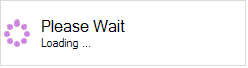
Default - the ProgressPanel displays the default animated image from the current skin. See the Look And Feel and Skinning section to learn more about the skin mechanism. The figure below shows the animated image in the DevExpress Style skin.
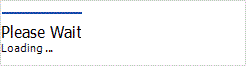
Line - the ProgressPanel displays the Office inspired line wait animation as in the figure below.
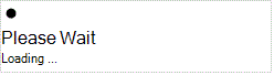
Ring - the ProgressPanel displays the Office inspired circle wait indicator as shown below.
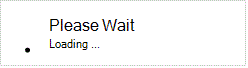
Bar - the ProgressPanel displays the bar wait indicator as shown below.
The code sample below illustrates how to add a progress panel with ring-type animation to a form.
using DevExpress.XtraWaitForm;

..

ProgressPanel progressPanel1 = new ProgressPanel();
progressPanel1.Caption = "Loading";
progressPanel1.Description = "Please wait...";
progressPanel1.WaitAnimationType = DevExpress.Utils.Animation.WaitingAnimatorType.Ring;
progressPanel1.Parent = this;
progressPanel1.Top = 100;
progressPanel1.Left = 100;
this.Controls.Add(progressPanel1);
progressPanel1.Show();
progressPanel1.BringToFront();