RadioGroup Class
Combines multiple options (radio buttons) into a group that supports selecting one of several options.
Namespace: DevExpress.XtraEditors
Assembly: DevExpress.XtraEditors.v20.2.dll
NuGet Package: DevExpress.Win.Navigation
Declaration
Related API Members
The following members return RadioGroup objects:
Remarks
The RadioGroup editor allows an end-user to select one of several options. Selecting an item deselects the one previously selected, so only one item can be selected at a time.
An end-user can switch between group buttons by clicking the required button with the mouse or by pressing the arrow keys. The Page Up and Page Down buttons set the first and last items respectively.
Radio buttons in the control are represented by RadioGroupItem objects. To create a radio group control, create a RadioGroup object and add RadioGroupItem items to the RepositoryItemRadioGroup.Items collection (accessible via the control’s RadioGroup.Properties property).
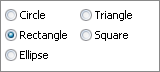
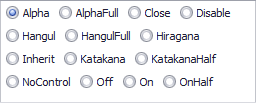
Use the RepositoryItemRadioGroup.ItemsLayout property to specify how items are arranged. Two item arrangement modes are supported:
Column (Default)
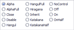
Flow
On screen, radio buttons are identified by specific display captions. Use the RadioGroupItem.Description property to set an item’s caption. Each radio button must be associated with a specific value via the RadioGroupItem.Value property. On selecting an item, its value is automatically assigned to the control’s value specified by the BaseEdit.EditValue property.
Radio group item display captions cannot be localized in the manner standard RadioButton controls can. See this article to learn more.
To get the selected item, use the RadioGroup.SelectedIndex property. This represents the selected item’s index in the RepositoryItemRadioGroup.Items collection. To change the selected item programmatically, you can use the RadioGroup.SelectedIndex property or directly set the editor’s BaseEdit.EditValue property.
CheckEdit controls can also be used to represent a group of radio buttons. See the RepositoryItemCheckEdit.RadioGroupIndex topic to learn more.
Pager Navigation
The RadioGroup and WindowsUIButtonPanel can be used as a pager for the following controls:
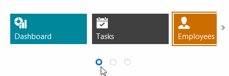
The pager automatically splits the target control’s content into pages, and provides navigation buttons to scroll to corresponding pages. The pager navigation functionality is implemented as a Behavior and can be added to your controls using the BehaviorManager component.
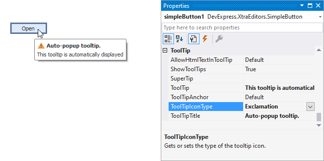
Tooltips
DevExpress controls support regular and super tooltips. If the ShowToolTips option is enabled, tooltips are shown when the mouse pointer hovers the control.
Use the following properties to specify a regular tooltip’s content:
- ToolTip — a regular tooltip’s text. If the text is not specified, the tooltip is not displayed even if the title is specified. You can use line breaks in regular tooltips. Use the AllowHtmlTextInToolTip property to specify whether to parse HTML tags in the text. HTML tags allow you to format the text: size, style, hyperlinks, etc.
- ToolTipTitle — a regular tooltip’s title. If the title is not specified, it is not displayed.
ToolTipIconType — a regular tooltip’s predefined icon. Use the controller’s IconSize property to specify the image size.
To display a custom image in all regular tooltips, use the controller’s ImageList and ImageIndex properties.
To display a custom image in a particular regular tooltip, handle the BeforeShow event. Use the ImageOptions event argument to assign a raster or vector image to the processed tooltip.
To assign a super tooltip to a control, use the SuperTip property. Enable the AllowHtmlText property to use HTML tags in the super tooltip.
To replace regular tooltips with super tooltips, set the ToolTipController.ToolTipType property to SuperTip. The controller automatically converts regular tooltips to super tooltips. To access this property, you can use the DefaultToolTipController component or a custom controller assigned to the ToolTipController property. See Tooltips for more information.
Example
The following code shows how to add items to a RadioGroup and then select one of the items. To select an item, the item’s value is assigned to the editor’s BaseEdit.EditValue property.
using DevExpress.XtraEditors.Controls;

// Create five items.
object[] itemValues = new object[] {10, 11, 12, 13, 14};
string [] itemDescriptions = new string [] {"Circle", "Rectangle", "Ellipse", "Triangle", "Square"};
for(int i = 0; i < itemValues.Length; i++) {
    radioGroup1.Properties.Items.Add(new RadioGroupItem(itemValues[i], itemDescriptions[i]));
}
//Select the Rectangle item.
radioGroup1.EditValue = 11;
Related GitHub Examples
The following code snippet (auto-collected from DevExpress Examples) contains a reference to the RadioGroup class.
Note
The algorithm used to collect these code examples remains a work in progress. Accordingly, the links and snippets below may produce inaccurate results. If you encounter an issue with code examples below, please use the feedback form on this page to report the issue.