BaseControl Class
Implements the functionality common for all controls in the library.
Namespace: DevExpress.XtraEditors
Assembly: DevExpress.XtraEditors.v20.2.dll
NuGet Package: DevExpress.Win.Navigation
Declaration
public abstract class BaseControl :
    ControlBase,
    IDXFocusController,
    IToolTipControlClient,
    ISupportLookAndFeel,
    ISupportStyleController,
    IXtraResizableControl,
    ISupportXtraAnimation,
    ISupportToolTipsForm,
    ISupportDXSkinColorsEx,
ISupportDXSkinColorsRemarks
When developing applications using DevExpress controls, you can customize the appearance and hint options for controls using a common mechanism. A more important thing is that you can provide centralized control over these settings. You change a single property to affect the appearance or hint settings of all controls at once. The DefaultLookAndFeel, ToolTipController and StyleController components are provided for this purpose. These components allow you to specify paint style settings, hint settings and appearance settings of controls respectively. The BaseControl class implements functionality allowing you to specify such settings for individual controls and to bind controls to components so they are centrally controlled. Refer to the BaseControl.LookAndFeel, BaseControl.ToolTipController and BaseControl.StyleController properties description for details.
Tooltips
DevExpress controls support regular and super tooltips. If the ShowToolTips option is enabled, tooltips are shown when the mouse pointer hovers the control.
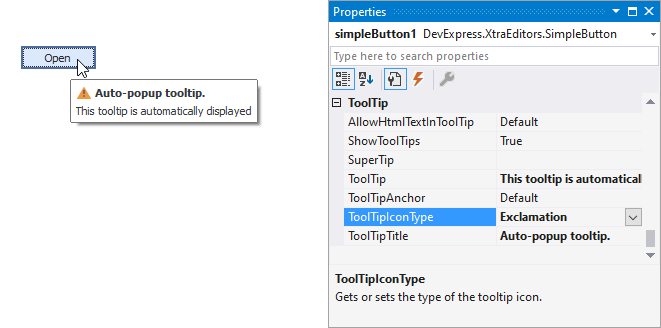
Use the following properties to specify a regular tooltip’s content:
- ToolTip — a regular tooltip’s text. If the text is not specified, the tooltip is not displayed even if the title is specified. You can use line breaks in regular tooltips. Use the AllowHtmlTextInToolTip property to specify whether to parse HTML tags in the text. HTML tags allow you to format the text: size, style, hyperlinks, etc.
- ToolTipTitle — a regular tooltip’s title. If the title is not specified, it is not displayed.
ToolTipIconType — a regular tooltip’s predefined icon. Use the controller’s IconSize property to specify the image size.
To display a custom image in all regular tooltips, use the controller’s ImageList and ImageIndex properties.
To display a custom image in a particular regular tooltip, handle the BeforeShow event. Use the ImageOptions event argument to assign a raster or vector image to the processed tooltip.
To assign a super tooltip to a control, use the SuperTip property. Enable the AllowHtmlText property to use HTML tags in the super tooltip.
To replace regular tooltips with super tooltips, set the ToolTipController.ToolTipType property to SuperTip. The controller automatically converts regular tooltips to super tooltips. To access this property, you can use the DefaultToolTipController component or a custom controller assigned to the ToolTipController property. See Tooltips for more information.