FilterControl Class
Allows users to build filter criteria and apply them to controls and data sources.
Namespace: DevExpress.XtraEditors
Assembly: DevExpress.XtraEditors.v20.2.dll
NuGet Package: DevExpress.Win.Navigation
Declaration
Related API Members
The following members return FilterControl objects:
Remarks
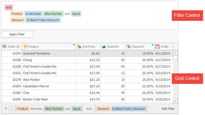
The FilterControl allows users to build a filter criterion and apply it to the attached control or data source.
Note
The XtraGrid demo shows the DevExpress.DataAccess.UI.FilterEditorControl that extends the FilterContol‘s functionality. The FilterEditorControl.FilterControl property provides access to the FilterContol object.
Supported Controls
The FilterControl supports the following controls, components, and data sources:
- DevExpress.XtraVerticalGrid.VGridControl
- DevExpress.XtraPivotGrid.PivotGridControl
- DevExpress.XtraEditors.Filtering.IFilteredComponent
- System.Windows.Forms.BindingSource
- System.Data.DataTable
- System.ComponentModel.IBindingListView
Note
The filter editor in the grid control and in the tree list provides similar functionality. You can also attach a stand-alone FilterControl to them.
Binding to Source Control
The SourceControl property specifies the data control or data source to which the FilterControl is attached.
When the filter criteria changes in the source control (for example, by the user or in code), the FilterControl automatically reflects the changes.
Filter Criteria
The FilterCriteria property gets or sets the CriteriaOperator object that specifies the filter criteria. The FilterString property specifies the string expression that corresponds to the filter criteria. See Criteria Language Syntax for more information.
When the filter criteria changes, the FilterControl does not automatically apply it to the source control. Call the ApplyFilter() method to apply the filter criteria. To clear the filter criteria and apply it, call the ClearFilter() method.
If the ReadOnly option is enabled, users cannot edit filter criteria. You can still edit the filter criteria in code.
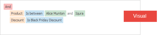
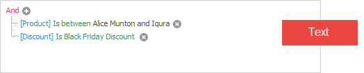
Visual and Text Criteria Display Style
In Visual edit mode, the static (Shared in VB) WindowsFormsSettings.FilterCriteriaDisplayStyle property specifies whether to enable the Visual or Text criteria display style.
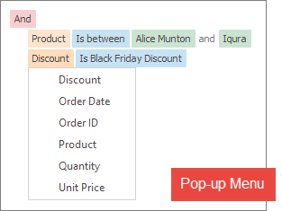
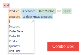
Pop-up Menu or Combo Box to Edit Operators and Operands
The UseMenuForOperandsAndOperators property specifies whether to use a pop-up menu or a combo box to edit operators and operands. The combo box displays a search box in the drop-down list and the vertical scroll bar (when the item count exceeds the list’s capacity).
Unbound Mode
You can also use the FilterControl even if it is not bound to a source control (the SourceControl property equals null). Users can build filter criteria that you can get from the FilterCriteria or FilterString property. In unbound mode, populate the FilterColumns collection with columns by which data should be filtered (this collection is populated automatically in bound mode).
Tooltips
DevExpress controls support regular and super tooltips. If the ShowToolTips option is enabled, tooltips are shown when the mouse pointer hovers the control.
Use the following properties to specify a regular tooltip’s content:
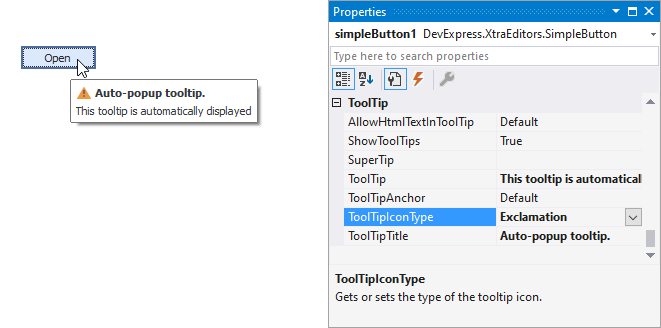
- ToolTip — a regular tooltip’s text. If the text is not specified, the tooltip is not displayed even if the title is specified. You can use line breaks in regular tooltips. Use the AllowHtmlTextInToolTip property to specify whether to parse HTML tags in the text. HTML tags allow you to format the text: size, style, hyperlinks, etc.
- ToolTipTitle — a regular tooltip’s title. If the title is not specified, it is not displayed.
ToolTipIconType — a regular tooltip’s predefined icon. Use the controller’s IconSize property to specify the image size.
To display a custom image in all regular tooltips, use the controller’s ImageList and ImageIndex properties.
To display a custom image in a particular regular tooltip, handle the BeforeShow event. Use the ImageOptions event argument to assign a raster or vector image to the processed tooltip.
To assign a super tooltip to a control, use the SuperTip property. Enable the AllowHtmlText property to use HTML tags in the super tooltip.
To replace regular tooltips with super tooltips, set the ToolTipController.ToolTipType property to SuperTip. The controller automatically converts regular tooltips to super tooltips. To access this property, you can use the DefaultToolTipController component or a custom controller assigned to the ToolTipController property. See Tooltips for more information.