Pager Navigation Behavior
- 4 minutes to read
The Pager Navigation Behavior can set up a RadioGroup or WindowsUIButtonPanel as a pager for a set of controls. The pager automatically splits the target control’s contents into pages, and provides navigation buttons to scroll to corresponding pages.
Supported controls
You can attach the Behavior to the following controls:
How to Attach the Behavior to Controls in the Designer
Ensure your form contains a client control (see Supported controls above) and a pager control (RadioGroup or WindowsUIButtonPanel).
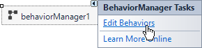
Drop the BehaviorManager component from Visual Studio’s Toolbox onto the form.
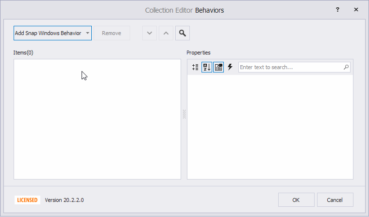
Click Edit Behaviors in the component’s smart tag menu to invoke the Behaviors collection editor.
Add Pager Navigation Behavior and set the following properties:
- Target - specifies the client control.
- Pager - specifies the pager control.
Customize RadioGroup Pager Options
The following customizations are useful if the pager is a RadioGroup.
- Set RadioGroup.Properties.ItemsLayout to Flow to arrange items in a row.
- Set RadioGroup.Properties.BorderStyle to NoBorder to hide the border.
- Set RadioGroup.Properties.ItemHorzAlignment to Center to display radio buttons at the control’s center.
- Set RadioGroup.BackColor to Color.Transparent to apply a transparent background.
Demo: Radio Group module in the XtraEditors MainDemo
Customize Pager Items
Pager Navigation Behavior automatically generates a set of pager items (buttons) required to scroll through the client control. Handle the CustomizePagerItem event to customize the pager items. This event fires every time a pager item is generated.
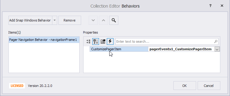
The CustomizePagerItem event has the following parameters:
- Item - Returns the generated pager item. If the pager is a WindowsUIButtonPanel, the pager item is a WindowsUIButton object. If the pager is a RadioGroup, the pager item is a RadioGroupItem object.
- Page - This property is applicable if the client control is a NavigationFrame. It returns the page (NavigationPage) that corresponds to the pager item. The Page property returns null in other cases.
Example
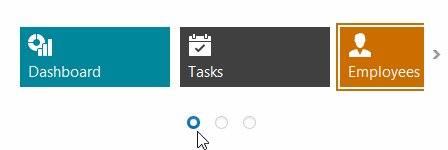
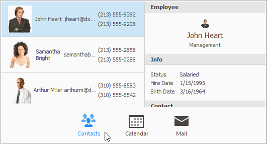
This example assumes that a WindowsUIButtonPanel (displayed at the bottom) is a pager for a NavigationFrame. The NavigationFrame control has three pages (NavigationPage objects) called “Contacts”, “Calendar”, and “Mail”. The example shows how to handle the CustomizePagerItem event to assign images and captions to pager items (WindowsUIButton objects) that correspond to these pages.
using DevExpress.XtraBars.Docking2010;

// The source of images to display in WindowsUIButtons.
windowsUIButtonPanel1.Images = svgImageCollection1;
// Captions to display in WindowsUIButtons.
navigationPage1.Tag = "Contacts";
navigationPage2.Tag = "Calendar";
navigationPage3.Tag = "Mail";

private void pagerEvents1_CustomizePagerItem(object sender, CustomizePagerItemEventArgs e) {
    WindowsUIButton btn = e.Item as WindowsUIButton;
    WindowsUIButtonsPanel btnPanel = btn.GetOwner() as WindowsUIButtonsPanel;
    NavigationPage page = e.Page as NavigationPage;
    if (btn == null || btnPanel == null || page == null) return;
    // The zero-based index of the currently processed page and pager item.
    int pageIndex = btnPanel.Buttons.IndexOf(btn);
    // The button's caption.
    btn.Caption = page.Tag.ToString();
    btn.UseCaption = true;
    // The index of an image from the windowsUIButtonPanel1.Images collection.
    btn.ImageOptions.ImageIndex = pageIndex;
}
How to Attach the Behavior to Controls in Code
The code example below shows how to attach the Pager Navigation Behavior to controls, specify its settings, and subscribe to the CustomizePagerItem event.
using DevExpress.Utils.Behaviors;
using DevExpress.Utils.Behaviors.Common;

BehaviorManager bm = new BehaviorManager(this.components);
bm.Attach<PagerBehavior>(navigationFrame1, behavior => {
    behavior.Properties.Pager = windowsUIButtonPanel1;
    behavior.CustomizePagerItem += Behavior_CustomizePagerItem;
});

private void Behavior_CustomizePagerItem(object sender, DevExpress.Utils.CustomizePagerItemEventArgs e) {
    //...
}


// Use the Detach method to remove the Behavior.
bm.Detach<PagerBehavior>(navigationFrame1);