BaseEdit Class
Serves as the base for all editors that can be used for inplace (such as within the XtraGrid) editing.
Namespace: DevExpress.XtraEditors
Assembly: DevExpress.XtraEditors.v20.2.dll
NuGet Package: DevExpress.Win.Navigation
Declaration
[DefaultBindingProperty("EditValue")]
public class BaseEdit :
    BaseControl,
IProcessInplaceEditValueChangedRemarks
The BaseEdit class implements basic functionality for editors that can be used for inplace editing in container controls provided by DevExpress. In particular, this functionality includes the ability to create an editor using settings specified by the editor’s associated repository item. When using a standalone editor, you can access its settings (its associated repository item) via the BaseEdit.Properties property. To use an editor for inplace editing, you will only need to create an appropriate type of repository item. Repository items contain all the editor settings and provide a means for creating editors based on their settings.
Note that since the BaseEdit class derives from the Control class, it synchronizes most settings declared by the Control class with settings specified by its associated repository item.
To create your own custom editor that can be used for inplace editing within controls provided by DevExpress, you must inherit your class from the BaseEdit class (or any other BaseEdit descendant if you wish to use existing functionality). Refer to the Custom Editors topic for additional information.
Tooltips
DevExpress controls support regular and super tooltips. If the ShowToolTips option is enabled, tooltips are shown when the mouse pointer hovers the control.
Use the following properties to specify a regular tooltip’s content:
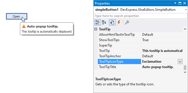
- ToolTip — a regular tooltip’s text. If the text is not specified, the tooltip is not displayed even if the title is specified. You can use line breaks in regular tooltips. Use the AllowHtmlTextInToolTip property to specify whether to parse HTML tags in the text. HTML tags allow you to format the text: size, style, hyperlinks, etc.
- ToolTipTitle — a regular tooltip’s title. If the title is not specified, it is not displayed.
ToolTipIconType — a regular tooltip’s predefined icon. Use the controller’s IconSize property to specify the image size.
To display a custom image in all regular tooltips, use the controller’s ImageList and ImageIndex properties.
To display a custom image in a particular regular tooltip, handle the BeforeShow event. Use the ImageOptions event argument to assign a raster or vector image to the processed tooltip.
To assign a super tooltip to a control, use the SuperTip property. Enable the AllowHtmlText property to use HTML tags in the super tooltip.
To replace regular tooltips with super tooltips, set the ToolTipController.ToolTipType property to SuperTip. The controller automatically converts regular tooltips to super tooltips. To access this property, you can use the DefaultToolTipController component or a custom controller assigned to the ToolTipController property. See Tooltips for more information.
Related GitHub Examples
The following code snippet (auto-collected from DevExpress Examples) contains a reference to the BaseEdit class.
Note
The algorithm used to collect these code examples remains a work in progress. Accordingly, the links and snippets below may produce inaccurate results. If you encounter an issue with code examples below, please use the feedback form on this page to report the issue.