SvgImageBox Class
Allows you to customize and display an SVG image and enables end-user interaction with individual image elements.
Namespace: DevExpress.XtraEditors
Assembly: DevExpress.Utils.v20.2.dll
NuGet Packages: DevExpress.Utils, DevExpress.Wpf.Core
Declaration
public class SvgImageBox :
    ControlBase,
    ISupportInitialize,
    ISvgImageBox,
    ISupportDXSkinColors,
    IDirectXClient,
    IContextItemCollectionOwner,
    IContextItemCollectionOptionsOwner,
    ISupportContextItemsCursor,
    IToolTipControlClient,
    ISupportToolTipsForm,
IXtraResizableControlRemarks
Both the SvgImageBox and DevExpress.XtraEditors.PictureEdit controls can display SVG images. Compared to the PictureEdit, the SvgImageBox provides the following additional features:
- Design-time and runtime access to individual graphical image elements (rectangles, circles, paths, etc.)
- Customization of the elements’ visibility and appearance settings
- Element hot-tracking
- Element selection
- Events allow you to respond to clicks and right-clicks on elements. For instance, you can show a context menu.
Demos
Display an SVG Image
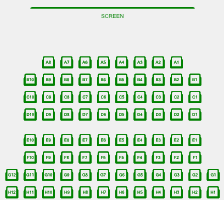
You can specify an SVG image and its zoom mode at design time and runtime. Use the SvgImageBox.SvgImage and SvgImageBox.SizeMode properties.
svgImageBox1.SvgImage = DevExpress.Utils.Svg.SvgImage.FromFile("theater.svg");
svgImageBox1.SizeMode = DevExpress.XtraEditors.SvgImageSizeMode.Squeeze;
Access and Customize Image Elements
An SVG image typically consists of multiple elements, which can be of two types:
- Regular elements - Render graphical primitives (rectangles, circles, contours, text, etc.)
- Group elements - Combine regular and other group elements. These are not visual elements.
Image elements are presented by SvgImageItem class objects. If an SvgImageItem is a group element, its SvgImageItem.IsGroup setting returns true.
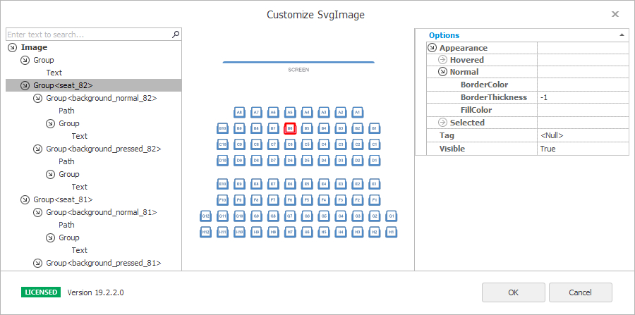
At design time, click the control’s smart tag and select Customize.
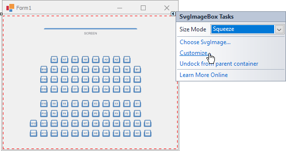
This action opens the control’s designer, which allows you to access the hierarchical structure of the image items and change their appearance settings and visibility.
To allow users to customize image items at runtime, you can open this customization dialog in code, as demonstrated below. Ensure your project references the DevExpress.XtraDialogs assembly.
using (var customizationForm = new DevExpress.Utils.Design.SvgImageBoxCustomizationForm(svgImageBox1)) {
    if (customizationForm.ShowDialog(this) == DialogResult.OK) {
        //...
    }
}
Note
For information on how the SvgImageBox displays image elements defined via the “use” element, see the SvgImageItem.Id topic.
In code, you can access the image elements by iterating through the following item collections:
RootItems - Provides access to a collection of root (bottommost) SVG items. Each item in this collection is an SvgImageItem class object.
SvgImageItem.Items - Gets the current group’s children.
svgImageBox1.RootItems[0].Visible = false;
svgImageBox1.RootItems[7].Items[0].Visible = false;
Identify Image Elements
To access individual items in code, you first need to know an item’s identifier. The following properties can be helpful in this case.
SvgImageItem.Id - Gets or sets the item’s unique identifier. The SVG image format allows IDs to be assigned to items via the id attribute. SvgImageItems that correspond to elements with missing
idattributes have their Id properties set to null.SvgImageItem.Tag - Use this property to associate custom data with the item. If image items in the source SVG file have empty IDs, use the Tag property to specify custom IDs (when required).
Find Image Elements
Given that you know an item’s ID or Tag, you can find this item using the following API:
- SvgImageBox.FindItemById(String)
- SvgImageBox.FindItemByTag(Object)
- SvgImageBox.FindItem(Predicate<SvgImageItem>)
- SvgImageBox.FindItems(Predicate<SvgImageItem>)
- SvgImageItem.FindAncestorById(String)
- SvgImageItem.FindAncestorByTag(Object)
- SvgImageItem.FindDescendantById(String)
- SvgImageItem.FindDescendantByTag(Object)
- SvgImageItem.FindAncestor(Predicate<SvgImageItem>)
- SvgImageItem.FindAncestors(Predicate<SvgImageItem>)
- SvgImageItem.FindDescendant(Predicate<SvgImageItem>)
- SvgImageItem.FindDescendants(Predicate<SvgImageItem>)
Example
The following code searches for items whose IDs start with the “background_pressed” sub-string and then hides these items.
var items = svgImageBox1.FindItems(item => item.Id != null && item.Id.StartsWith("background_pressed"));
items.ForEach(item => item.Visible = false);
Customize Appearance Settings of Image Elements
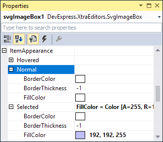
Use the following properties to customize items’ appearance settings in the normal, hovered and selected states.
SvgImageBox.ItemAppearance - The default appearance settings applied to all image items.
The same appearance settings are accessible when you select the
Imageroot node in the hierarchy pane in the Designer.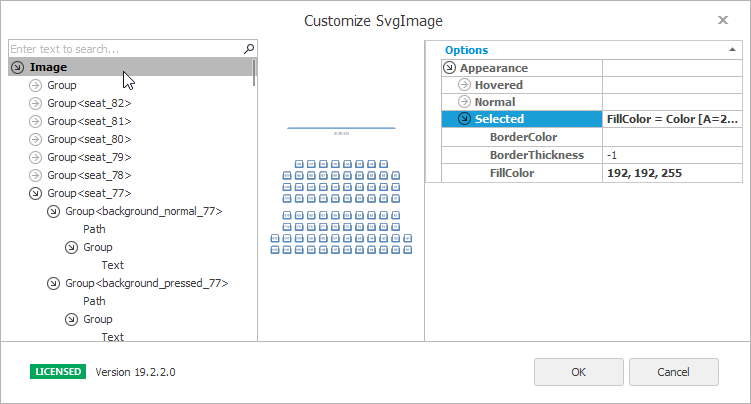
The following code specifies the Green color as the default background for all image items.
SvgImageItem.Appearance - A specific item’s appearance settings, which override the default appearance settings. You can customize the appearance settings of individual items in the Designer and in code.
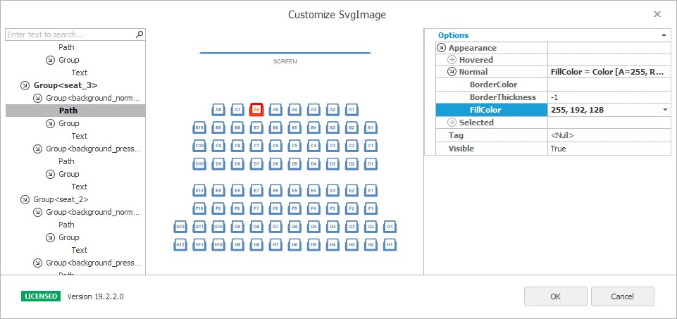
The following example locates an item whose ID equals to “seat_3” and changes the item’s background color.
Item Hot-tracking
The SvgImageBox control allows you to respond to the mouse cursor moving over image items. When the mouse cursor enters an image element’s path or bounds, this element becomes “hovered”.

Hovered elements can display tooltips. See this property for more information: SvgImageBox.ToolTipController.
You can access the currently hovered item with the SvgImageBox.HoveredItem property. To test whether the item is hovered, see SvgImageItem.Hovered.
Hovered elements are painted according to the appearance settings specified by the SvgImageBox.ItemAppearance.Hovered and SvgImageItem.Appearance.Hovered properties. These appearance settings are initially empty. Thus, hovered items are not highlighted by default.
svgImageBox1.ItemAppearance.Hovered.BorderColor = Color.FromArgb(255, 128, 128);
svgImageBox1.ItemAppearance.Hovered.BorderThickness = 1;
The following events fire when the mouse cursor moves over image items:
- SvgImageBox.QueryHoveredItem - Allows you to specify a custom item as “hovered” when you move the mouse cursor over items, regardless of their visibility. For instance, you can specify a group as “hovered” when you hover over the group’s item.
- SvgImageBox.ItemEnter - Fires when the mouse cursor enters the item’s graphical path or bounding rectangle.
- SvgImageBox.ItemLeave - Fires when the mouse cursor leaves the item’s graphical path or bounding rectangle.
Hot-tracking by Graphical Path or Bounding Rectangle
The SvgImageBox.ItemHitTestType property specifies whether to perform hit-testing by items’ graphical paths or bounding boxes. The property accepts the following values:
Precise - An item is detected when a point is within the item’s graphical path. Groups do not have visible contours, and, thus, they cannot be hit-tested and selected in this mode.
BoundingBox - An item is detected when a point is within the item’s bounding rectangle. Groups are hit-tested in this mode when a point is within a rectangle within which all child items lie. This hit-test mode allows groups to be hovered (HoveredItem) and selected.
Note
The SvgImageBox control initially allows users to hot-track and then select any primitive visual element (text, path objects, rectangles, etc.) with the mouse. In default Precise hit-test mode, groups are not hot-tracked and selected. See the SvgImageBox.QueryHoveredItem topic for an example of how to treat (hover over and select) groups and their inner visual primitives as a whole.
Item Selection
When a user clicks an item, it is automatically selected. There is no visual difference between selected and non-selected items, unless you specify distinct appearance settings for selected items via the SvgImageBox.ItemAppearance.Selected and/or SvgImageItem.Appearance.Selected property.
svgImageBox1.ItemAppearance.Selected.BorderColor = Color.FromArgb(192, 192, 255);
svgImageBox1.ItemAppearance.Selected.BorderThickness = 0.8F;

The SvgImageBox control supports two selection modes (SvgImageBox.OptionsSelection.SelectionMode):
- Multiple (default) - A user can select multiple items by clicking on them. The UseCtrlToMultiSelect property specifies whether the CTRL key needs to be pressed to select items in this mode.
- Single - A user can select one item. When he/she clicks a new item, the previously selected item is deselected.
To access currently selected items, select/deselect items and respond to item selection changes, use the following API:
- SvgImageBox.Selection - Provides access to the currently selected items.
The following code locates and selects an item by its ID (SvgImageItem.Id).
- SvgImageBox.Select - Selects the specified item.
- SvgImageBox.Unselect - Deselects the specified item.
- SvgImageItem.Selected - Gets or sets whether the item is selected.
- SvgImageBox.SelectionChanging - Fires when the item selection is about to be changed. Allows you to cancel the current operation..
- SvgImageBox.SelectionChanged - A notification event, which is raised after the item selection has been changed.
Note
Groups are not selected by default when a user clicks within their bounds, since groups are not visual elements; they are just containers of visual primitives. If you need to treat (hover over and select) a group and its inner visual primitives as a whole, enable BoundingBox hit-test mode and handle the SvgImageBox.QueryHoveredItem event, as demonstrated in the example below.
Example
The SvgImageBox control initially allows users to hover and select primitive visual elements (text, path objects, rectangles, etc.) with the mouse. This example prevents primitive elements from being hovered/selected. A user will be able to only hover and select entire groups. The example also shows how to access the selection in code.
Note
The complete sample code is available in the SvgImage Box module in the XtraEditors MainDemo.
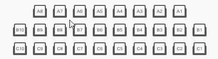
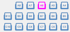
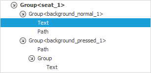
Assume that an SVG image contains ‘seat’ image elements. Each ‘seat’ element is a group that consists of multiple elements (text, path objects and nested groups).

The structure of this image element is shown below:
To allow entire groups (seats) to be hovered and selected, use the following steps.
- Enable the BoundingBox hit-test type via the SvgImageBox.ItemHitTestType property. This hit-test mode allows groups to be hit-tested, and thus hovered and selected.
- Specify the appearance settings to paint the hovered and selected image elements.
Handle the SvgImageBox.QueryHoveredItem event. When a user hovers over an inner element of a ‘seat’ group, the QueryHoveredItem event handler sets the ‘seat’ group as hovered instead. If a user then clicks the hovered element with the mouse, this element (the ‘seat’ group) is selected.
Access selected elements (‘seat’ groups) with the SvgImageBox.Selection property
svgImageBox.ItemAppearance.Selected.FillColor = DevExpress.LookAndFeel.DXSkinColors.IconColors.Blue;
svgImageBox.ItemAppearance.Hovered.FillColor = DevExpress.LookAndFeel.DXSkinColors.IconColors.Blue;
svgImageBox.ItemHitTestType = DevExpress.XtraEditors.ItemHitTestType.BoundingBox;
//...
// SvgImageBox.QueryHoveredItem event handler.
void OnSvgImageBoxQueryHoveredItem(object sender, SvgImageQueryHoveredItemEventArgs e) {
    if(e.HoveredItem != null && !CheckSeatId(e.HoveredItem))
        e.HoveredItem = e.HoveredItem.FindAncestors(a => CheckSeatId(a)).FirstOrDefault();
}
bool CheckSeatId(SvgImageItem svgImageItem) {
    return svgImageItem.Id != null && svgImageItem.Id.StartsWith("seat");
}

// SvgImageBox.SelectionChanged event handler.
// Access selected elements.
void OnSvgImageBoxSelectionChanged(object sender, EventArgs e) {
    selectedItemsListBox.Items.Clear();
    foreach(var item in svgImageBox.Selection) {
        string itemDisplayName = string.Format("Seat number: {0}", ((string)item.Tag).ToUpper());
        selectedItemsListBox.Items.Add(itemDisplayName);
    }
}
You can find the complete sample code in the SvgImage Box module in the XtraEditors MainDemo.
Item Click and Right-Click
The following events allow you to perform actions when an item is clicked and right-clicked:
- SvgImageBox.ItemClick - Fires when an item is clicked.
- SvgImageBox.PopupMenuShowing - Fires when a user right-clicks with the mouse. Allows you to display a context menu for image items.
Example
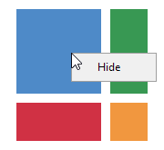
The following example shows how to handle the SvgImageBox.PopupMenuShowing event to display a context menu for image items. The menu contains commands to hide and show image items.
private void svgImageBox1_PopupMenuShowing(object sender, DevExpress.XtraEditors.SvgImagePopupMenuShowingEventArgs e) {
    SvgImageBox control = sender as SvgImageBox;
    SvgImageItem item = e.Item;
    // If you hover over a hidden item, the e.Item event parameter returns null.
    // Use the GetItemsAt method to get a hidden item at the clicked point.
    if (item == null)
        item = control.GetItemsAt(e.Point).FirstOrDefault();
    if (item == null) return;
    string menuItemCaption = item.ActualVisible ? "Hide" : "Show";
    DXMenuItem menuItem = new DXMenuCheckItem(menuItemCaption);
    menuItem.Click += MenuItem_Click;
    menuItem.Tag = item;
    e.Menu.Items.Add(menuItem);
}

private void MenuItem_Click(object sender, EventArgs e) {
    DXMenuItem menuItem = sender as DXMenuItem;
    SvgImageItem item = menuItem.Tag as SvgImageItem;
    item.Visible = !item.Visible;
}