TrackBarControl Class
Displays a scale with tickmarks. Users can drag a thumb to change the current value.
Namespace: DevExpress.XtraEditors
Assembly: DevExpress.XtraEditors.v20.2.dll
NuGet Package: DevExpress.Win.Navigation
Declaration
public class TrackBarControl :
    BaseEdit,
    IXtraResizableControl,
    ISupportInitialize,
IGestureClientRemarks
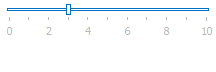
The figure below illustrates a Track Bar Control.
Main Settings
- Properties.Minimum and RepositoryItemTrackBar.Maximum - specify the value range.
- TrackBarControl.Value or TrackBarControl.EditValue - current value (thumb position).
- Properties.Orientation - allows you to choose between horizontal and vertical control orientations.
- Properties.InvertLayout - specifies whether the Step Bar arranges steps from left to right (a normal layout) or from right to left (an inverted layout). For vertical Track Bars, a normal layout is bottom-up, and an inverted step layout is top-down.
Value Progression Settings
- Properties.SmallChange - a small-increment increase or decrease in value. The control’s slider moves in small-increment steps when a user presses an arrow key.
- Properties.LargeChange - a large-increment increase or decrease in value. The control’s slider moves in large-increment steps when a user presses the Page Up or Page Down key.
- Properties.SmallChangeUseMode - specifies whether a user can spin the mouse wheel to change the control value by a small increment.
Manage the Control Value in Code
- Value - assign a value to this property to move the slider to a specific position.
- MoveBegin, MoveLeft, MoveLargeLeft, MoveLargeRight, MoveRight, MoveEnd - methods to gradually change the control value.
- TrackBarControl.ValueChanged and RepositoryItem.EditValueChanged - events that fire when a Track Bar value changes. The code sample below displays a warning message when a user increases the Track Bar value above eight.
private void TrackBarControl1_ValueChanged(object sender, EventArgs e) {
    TrackBarControl tbc = sender as TrackBarControl;
    if (tbc.OldEditValue != null && (int)tbc.OldEditValue < 8 && tbc.Value >= 8)
        XtraMessageBox.Show(
            "We reccomend that you keep this setting at Level 7 or less", "Warning");
}
Tickmarks and Labels
- Properties.TickStyle - specifies whether a control should display tickmarks on both sides of a scale, on one side only, or hide them completely.
- Properties.TickFrequency - the distance between adjacent tickmarks.
- Properties.ShowLabels - gets or sets whether a control shows labels next to tickmarks. Default labels are value numbers (1, 2, 3, etc.). You can edit the Labels collection to replace them with custom strings.
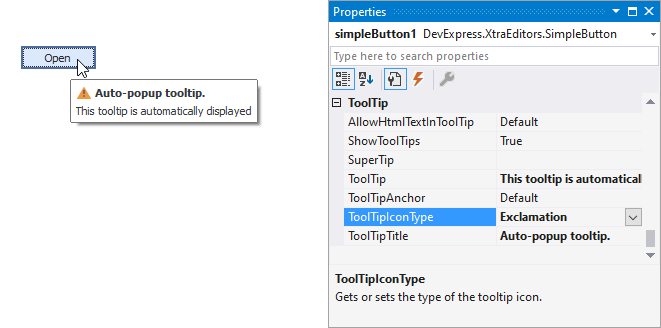
Tooltips
DevExpress controls support regular and super tooltips. If the ShowToolTips option is enabled, tooltips are shown when the mouse pointer hovers the control.
Use the following properties to specify a regular tooltip’s content:
- ToolTip — a regular tooltip’s text. If the text is not specified, the tooltip is not displayed even if the title is specified. You can use line breaks in regular tooltips. Use the AllowHtmlTextInToolTip property to specify whether to parse HTML tags in the text. HTML tags allow you to format the text: size, style, hyperlinks, etc.
- ToolTipTitle — a regular tooltip’s title. If the title is not specified, it is not displayed.
ToolTipIconType — a regular tooltip’s predefined icon. Use the controller’s IconSize property to specify the image size.
To display a custom image in all regular tooltips, use the controller’s ImageList and ImageIndex properties.
To display a custom image in a particular regular tooltip, handle the BeforeShow event. Use the ImageOptions event argument to assign a raster or vector image to the processed tooltip.
To assign a super tooltip to a control, use the SuperTip property. Enable the AllowHtmlText property to use HTML tags in the super tooltip.
To replace regular tooltips with super tooltips, set the ToolTipController.ToolTipType property to SuperTip. The controller automatically converts regular tooltips to super tooltips. To access this property, you can use the DefaultToolTipController component or a custom controller assigned to the ToolTipController property. See Tooltips for more information.