TileControl Class
The control that manages Windows UI-inspired tiles. Using this component, you can create both static and animated live tiles in your applications.
Namespace: DevExpress.XtraEditors
Assembly: DevExpress.XtraEditors.v20.2.dll
NuGet Package: DevExpress.Win.Navigation
Declaration
public class TileControl :
    Control,
    ITileControl,
    ITileControlUpdateSmartTag,
    ITileControlProperties,
    ISupportXtraAnimation,
    ISupportLookAndFeel,
    IAppearanceOwner,
    IXtraSerializable,
    IMouseWheelScrollClient,
    IMouseWheelSupport,
    IToolTipControlClient,
    IContextItemCollectionOptionsOwner,
    IContextItemCollectionOwner,
    ISupportAccessibilityNotifyClients,
    ISupportDesignerRegistration,
    ISupportPageNavigation,
    IDirectXClient,
    ISupportAsyncScrollAnimation,
    ISupportDXSkinColors,
    ISupportImageDragDrop,
    ISupportXtraSerializer,
    IXtraSerializableLayout,
    IStringImageProvider,
IXtraSerializableLayoutExRemarks
The Tile Control, inspired by the Windows 10 UI from Microsoft, helps you easily integrate live tiles into your applications. See the Tile Control topic to learn more.
TileControl consists of two main visual elements - TileGroups and TileItems. Refer to the Tile Groups and Items topic for more info.
The following code illustrates how to create a Tile Control at runtime. The control has one group with one Tile inside.
//Form1.cs
TileControl tileControl = new TileControl { Dock = DockStyle.Fill, Parent = this };
TileGroup tileGroup = new TileGroup();
TileItem tileItem = new TileItem();
TileItemElement tileItemElement = new TileItemElement { Text = "Some text" };
tileItem.Elements.Add(tileItemElement);
tileGroup.Items.Add(tileItem);
tileControl.Groups.Add(tileGroup);
Pager Navigation
The RadioGroup and WindowsUIButtonPanel can be used as a pager for the following controls:
TileControl- TileBar
- NavigationFrame
- ImageSlider
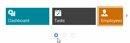
The pager automatically splits the target control’s content into pages, and provides navigation buttons to scroll to corresponding pages. The pager navigation functionality is implemented as a Behavior and can be added to your controls using the BehaviorManager component.