CheckEdit Class
Allows an end-user to select between the unchecked, checked and (optionally) indeterminate state. Multiple check boxes can be combined into a radio group.
Namespace: DevExpress.XtraEditors
Assembly: DevExpress.XtraEditors.v20.2.dll
NuGet Package: DevExpress.Win.Navigation
Declaration
Remarks
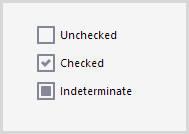
States
The check box supports the following states:
- Unchecked;
- Checked;
- Indeterminate (only if the RepositoryItemCheckEdit.AllowGrayed option is enabled).
To specify the check box state, use the following properties:
- CheckEdit.CheckState — you can assign the Unchecked, Checked or Indeterminate enumeration value to this property;
- CheckEdit.Checked — you can assign a boolean value to this property (you cannot enable the indeterminate state this way);
CheckEdit.EditValue — you can assign any object to this property. The check box is:
- unchecked if this property is set to true or the value specified by the Properties.ValueUnchecked property (see RepositoryItemCheckEdit.ValueUnchecked);
- checked if this property is set to true or the value specified by the Properties.ValueChecked property (see RepositoryItemCheckEdit.ValueChecked);
- indeterminate if this property is set to null (Nothing in VB), or the value specified by the Properties.ValueGrayed property (see RepositoryItemCheckEdit.ValueGrayed), or neither the ValueUnchecked nor ValueChecked property value;
To respond to check state changes, handle the CheckEdit.CheckStateChanged, CheckEdit.CheckedChanged or BaseEdit.EditValueChanged event.
If the check box is bound to a data source field, ensure that the types of the ValueChecked, ValueUnchecked or ValueGrayed values match the field type. The example below shows how to set these properties to byte values:
checkEdit1.Properties.ValueChecked = (byte)2;
checkEdit1.Properties.ValueGrayed = (byte)1;
checkEdit1.Properties.ValueUnchecked = (byte)0;
Styles
Use the Properties.CheckBoxOptions.Style (see RepositoryItemCheckEdit.CheckBoxOptions) property to specify what the check box looks like:
- Default — the style is specified by the Properties.CheckStyle property (see RepositoryItemCheckEdit.CheckStyle);
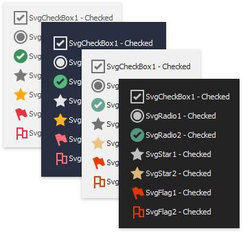
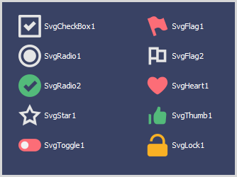
Svg[Glyph] — a vector glyph scaled without loss of quality according to the current DPI setting;
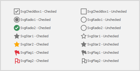
Checkbox — a regular check box;
When this style is applied, you can specify how the check box is rendered in the indeterminate state using the Properties.NullStyle property (see RepositoryItemCheckEdit.NullStyle).
Tip
You can also use the CheckedListBoxControl control to implement a list of options.
Radio — a button in a radio group — a group of mutually exclusive options;
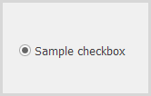
To combine check boxes in a radio group, use the Properties.RadioGroupIndex property (see RepositoryItemCheckEdit.RadioGroupIndex).
Tip
You can also use the RadioGroup control to implement a group of mutually exclusive options.
Custom — any custom glyph specified with Properties.ImageOptions (see RepositoryItemCheckEdit.ImageOptions).
Check boxes are rendered according to the currently applied skin and palette.
Options
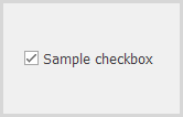
To specify the caption, use the following properties:
- Text (see BaseCheckEdit.Text);
- Properties.Caption (see BaseRepositoryItemCheckEdit.Caption).
To specify whether the glyph is aligned to the left or right relative to the caption, use the Properties.GlyphAlignment property (see BaseRepositoryItemCheckEdit.GlyphAlignment).
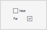
The caption is hidden if the glyph is aligned to the center.
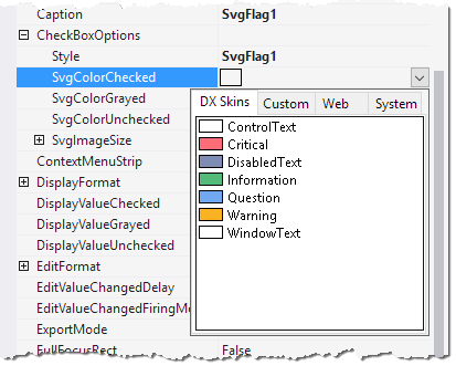
If an Svg[Glyph] style is applied, you can specify the vector glyph size and colors using the Properties.CheckBoxOptions properties (see RepositoryItemCheckEdit.CheckBoxOptions):
SvgColorUnchecked, SvgColorChecked, SvgColorGrayed — the colors used to paint vector glyphs in the corresponding states. By default, vector glyphs are colored according to the current skin and palette.
Instead of regular colors (e.g., Red, Green), you can use adaptive colors — colors that change depending on the currently applied skin.
SvgImageSize— the size of vector glyphs. The default glyph size is 18x18 pixels on a 100% DPI screen. Vector glyphs are automatically scaled according to the DPI setting without loss of quality.
Tooltips
DevExpress controls support regular and super tooltips. If the ShowToolTips option is enabled, tooltips are shown when the mouse pointer hovers the control.
Use the following properties to specify a regular tooltip’s content:
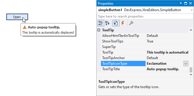
- ToolTip — a regular tooltip’s text. If the text is not specified, the tooltip is not displayed even if the title is specified. You can use line breaks in regular tooltips. Use the AllowHtmlTextInToolTip property to specify whether to parse HTML tags in the text. HTML tags allow you to format the text: size, style, hyperlinks, etc.
- ToolTipTitle — a regular tooltip’s title. If the title is not specified, it is not displayed.
ToolTipIconType — a regular tooltip’s predefined icon. Use the controller’s IconSize property to specify the image size.
To display a custom image in all regular tooltips, use the controller’s ImageList and ImageIndex properties.
To display a custom image in a particular regular tooltip, handle the BeforeShow event. Use the ImageOptions event argument to assign a raster or vector image to the processed tooltip.
To assign a super tooltip to a control, use the SuperTip property. Enable the AllowHtmlText property to use HTML tags in the super tooltip.
To replace regular tooltips with super tooltips, set the ToolTipController.ToolTipType property to SuperTip. The controller automatically converts regular tooltips to super tooltips. To access this property, you can use the DefaultToolTipController component or a custom controller assigned to the ToolTipController property. See Tooltips for more information.
Example
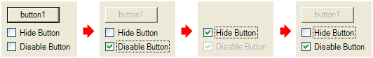
This example demonstrates how to programmatically create two check editors, initialize their properties and assign the same handler for their CheckEdit.CheckedChanged events. The created check editors will be used to control the visibility and availability of a standard button control. The example implies that the button is already placed onto a form.
Changing the check state of the first check editor affects both the button’s visibility and the second check editor’s availability. The second check editor specifies the availability of the button for end-users.
The image below displays the example application.
using DevExpress.XtraEditors;
using DevExpress.Utils;

private void CreateCheckEditors() {
    // creating and initializing the first check editor
    CheckEdit chEdit1 = new CheckEdit();
    chEdit1.Properties.Caption = "Hide Button";
    chEdit1.Name = "chEdit1";
    chEdit1.Location = new System.Drawing.Point(6, 35);
    chEdit1.Width = 100;
    // setting the editor's check state depending upon the button's visibility
    if (!(button1.Visible)) chEdit1.Checked = true;
    // assigning a handler for the CheckChanged event of the first check editor
    chEdit1.CheckedChanged += new EventHandler(CheckedChanged);
    this.Controls.Add((Control)chEdit1);

    // creating and initializing the second check editor
    CheckEdit chEdit2 = new CheckEdit();
    chEdit2.Properties.Caption = "Disable Button";
    chEdit2.Name = "chEdit2";
    chEdit2.Location = new System.Drawing.Point(6, 55);
    chEdit2.Width = 100;
    // setting the editor's check state depending upon the button's availability
    if (!(button1.Enabled)) chEdit2.Checked = true;
    if (!(button1.Visible)) chEdit2.Enabled = false;
    // assigning a handler for the CheckChanged event of the second check editor
    chEdit2.CheckedChanged += new EventHandler(CheckedChanged);
    this.Controls.Add((Control)chEdit2);
}

private void CheckedChanged(object sender, System.EventArgs e) {
    CheckEdit edit = sender as CheckEdit;
    switch (edit.Checked) {
        case true:
            if (edit == GetCheckEdit("chEdit1")){
                // hiding the button
                button1.Visible = false;
                // disabling the second check editor
                GetCheckEdit("chEdit2").Enabled = false;
            }
            else if (edit == GetCheckEdit("chEdit2")){
                // enabling the button
                button1.Enabled = false;
            }
            break;
        case false:
            if (edit == GetCheckEdit("chEdit1")){
                // showing the button
                button1.Visible = true;
                // enabling the second check editor
                GetCheckEdit("chEdit2").Enabled = true;
            }
            else if (edit == GetCheckEdit("chEdit2")){
                // disabling the button
                button1.Enabled = true;
            }
            break;
    }
}

private CheckEdit GetCheckEdit(string editName){
    foreach(Control control in this.Controls){
        if ((control is CheckEdit) && (control.Name == editName))
            return control as CheckEdit;
    }
    return null;
}
Related GitHub Examples
The following code snippets (auto-collected from DevExpress Examples) contain references to the CheckEdit class.
Note
The algorithm used to collect these code examples remains a work in progress. Accordingly, the links and snippets below may produce inaccurate results. If you encounter an issue with code examples below, please use the feedback form on this page to report the issue.